
Neutral is the most timeless, restful palette a bedroom can wear — and the easiest to get wrong. The single risk is flatness: beige-on-beige can read boring. The fix is texture and tonal layering. Get that right and neutral becomes quietly luxurious. These 37 neutral bedroom ideas show how.
A neutral room fails on value, not on colour
When a neutral bedroom looks flat, the instinct is to blame the palette — not enough colour, too much beige. That's almost never the actual problem. The problem is value: how light or dark each surface is, independent of its hue.
Colour has three properties. Hue is what we name it. Saturation is how intense it is. Value is how light or dark. In a colourful room, hue does most of the structural work — your eye separates the blue chair from the red rug without any help. Strip the hue out, as a neutral scheme does, and value becomes the only tool left for building structure. If every surface in the room sits at roughly the same lightness, the eye has nothing to hold on to, and the room reads as a fog.
This is why two neutral bedrooms with almost identical palettes can look completely different. The one that works has a genuine spread of values. The one that doesn't has cream walls, cream bedding, a cream rug and pale wood — all technically different colours, all landing at the same brightness.
The black-and-white photograph test
There's a diagnostic for this that costs nothing and takes ten seconds, borrowed from painters who use it to check the structure of a composition.
Photograph your room and convert the picture to black and white. Your phone will do it in the editing screen. What you're looking at now is pure value, with hue removed.
A room with good structure still reads clearly in greyscale: you can see where the bed ends and the wall begins, the rug has an edge, the headboard separates from what's behind it. A flat room turns into a single grey mass with vague shapes in it — and that's exactly how it feels to stand in, even though your eye "sees" the colours.
The fix follows from the diagnosis. Aim for three distinct steps: something clearly light, something clearly mid, something clearly dark. In most neutral bedrooms the light and mid are already there and the dark is missing entirely — which is why adding one dark element, a walnut nightstand or a charcoal throw, so often transforms a room that seemed to need repainting.
Texture is the second axis
Once value gives the room structure, texture gives it interest — and in a neutral scheme it has to do the job colour would otherwise do.
The useful way to think about it is by how each material handles light. Matte surfaces absorb and soften: plaster, linen, wool, unglazed ceramic. Reflective surfaces catch a highlight: glass, glazed tile, polished metal, silk. Directional surfaces change with your viewing angle: velvet, boucle, sheepskin, brushed wood. A neutral room needs some of all three, because it's the difference between them that the eye reads as richness.
Practically, that means a room with linen bedding, a wool throw, a rattan or timber element, one ceramic or stone object and a single warm metal will look considered — even if every one of those things is the same shade of oatmeal. The materials are doing what a colour scheme normally does.
The one thing to keep an eye on is repetition. Five different woven textiles read as one texture. Vary the scale as well as the material: a chunky knit next to a fine linen registers as contrast, two mid-weight weaves do not.
Keep the undertones on one side
Neutrals are never truly neutral — every one of them leans warm or cool, and mixing the two families is what makes a room look accidental rather than restful.
Warm neutrals carry yellow, red or brown: cream, oatmeal, greige, mushroom, sand. Cool neutrals carry blue or green: pure white, ash, dove grey, taupe with a violet base. Both make good rooms. What doesn't work is a warm cream wall beside a cool grey rug — the eye reads the mismatch as dirt on one of them, usually the warmer one.
Test the same way you'd test any colour: hold each sample against a sheet of white printer paper. The lean shows up immediately, and once you've sorted your materials into two piles you'll usually find one or two items are the reason the room never quite settled.
Then let the light agree with your choice. Warm neutrals want 2700 K; cool ones can take 3000 K without going clinical. Below CRI 90 all neutrals flatten, because there's no saturation left to survive a gappy spectrum.
37 neutral bedroom ideas — and why each works

1. Sleek Modern Neutrals
Clean-lined furniture in soft tones is calm and timeless.

2. Earthy Tones & Texture
Woven and wooden textures are what keep an earthy neutral room from falling flat.

3. Scandinavian Neutral
Pale linens and light wood are the essence of calm, minimal neutral design.

4. Subtle Pastel Accents
A whisper of pastel warms a neutral scheme without breaking its calm.
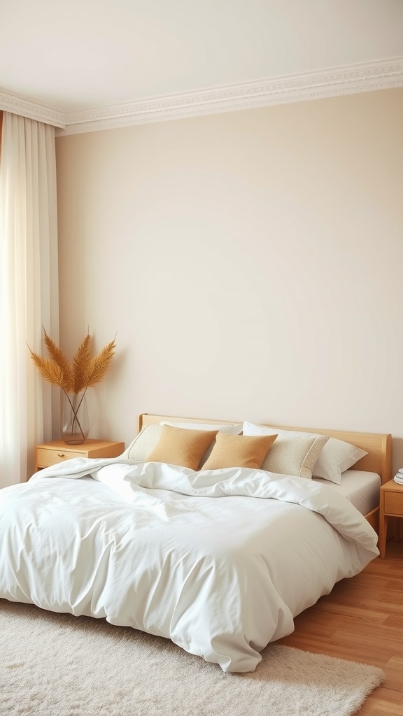
5. Calming Beige
Beige is soothing and endlessly liveable — layer textures so it doesn't read flat.

6. Natural Light Emphasis
Neutrals come alive in daylight — keep window treatments minimal.

7. Grey & White Symmetry
Symmetry brings calm order to a restrained grey-and-white room.

8. Layered Neutral Bedding
Layering shades and textures makes the bed itself the room's warmth.

9. Warm Taupe
Taupe is beige with more depth — grounded, warm and sophisticated.

10. White & Cream
Pairing white with cream adds subtle contrast that keeps a pale room interesting.
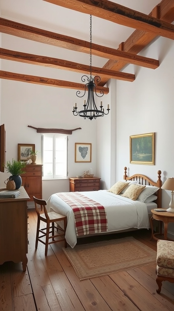
11. Rustic Neutrals
Wood beams and rough textures give neutrals rustic warmth and character.
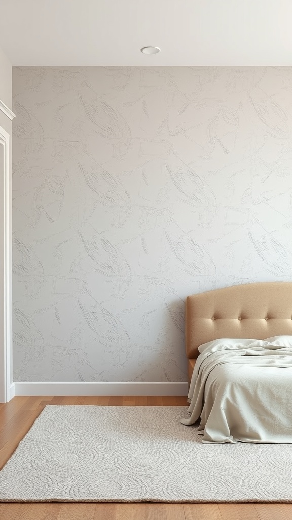
12. Textured Accent Wall
A textured neutral wall adds depth where a flat one would feel bland.
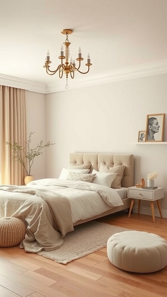
13. Monochromatic Beige
A tonal beige scheme is chic and calm when layered richly in texture.

14. Tonal Layering
Building up close, muted tones is the secret to a rich, non-flat neutral room.
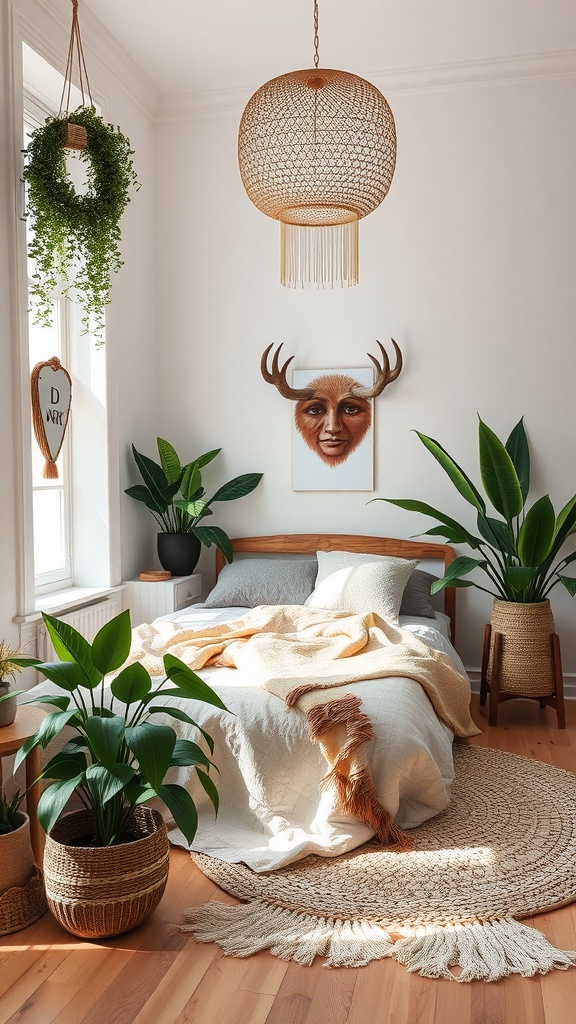
15. Neutral Boho
Plants and woven textures give neutrals a relaxed, layered boho warmth.
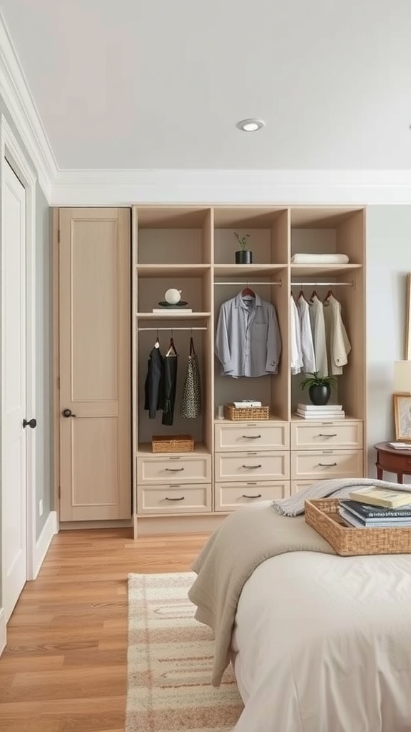
16. Light-Wood Closet
Neutral storage keeps a calm room cohesive and clutter-free.
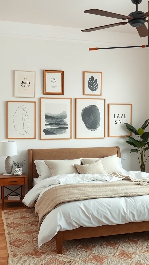
17. Neutral Art
Soft-toned art adds interest while keeping the palette serene.
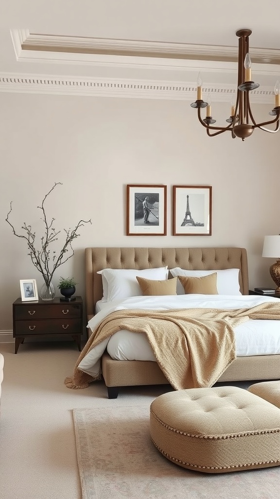
18. Understated Elegance
A tufted bed and soft bedding show how luxurious restraint can be.

19. Comforting Reading Nook
Neutral tones make the calmest possible spot to read and unwind.
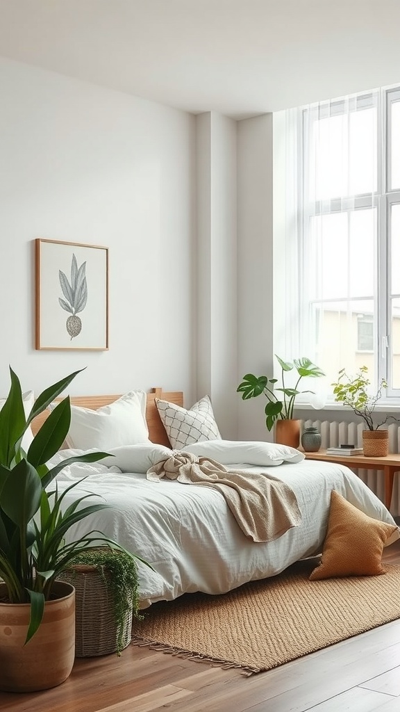
20. Organic Elements
Plants and natural materials keep a neutral room feeling alive.

21. Floor & Wall Harmony
Warm wood floors under muted walls make a beautifully cohesive neutral base.
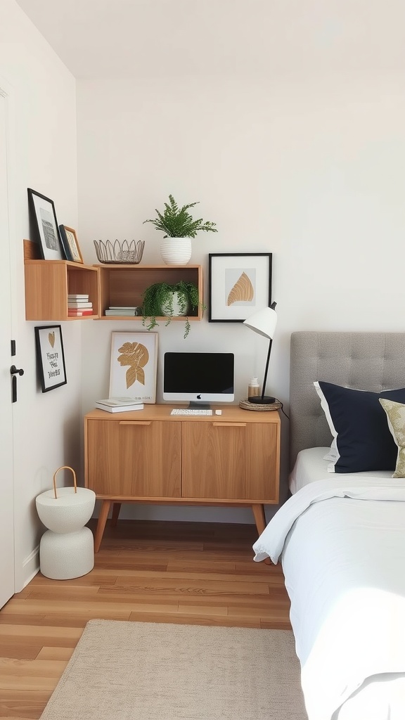
22. Neutral Workspace
A tonal desk corner blends seamlessly, so work doesn't disrupt the calm.

23. Luxurious Neutral Fabrics
Quality fabrics are where neutral rooms earn their "quiet luxury."

24. Boho-Chic Accessories
Textured accessories add personality without breaking the neutral palette.

25. Sculptural Lighting
A sculptural fixture adds form and interest to a pared-back neutral room.

26. Textured Wall Treatment
Relief and pattern on a white wall bring depth without adding colour.

27. Neutral Colour Blocking
Blocks of close neutral tones add subtle structure and interest.

28. Layered Rugs
Layering warm-toned rugs adds texture and softness underfoot.

29. Floor-to-Ceiling Windows
Big windows let daylight bring a neutral room to life.
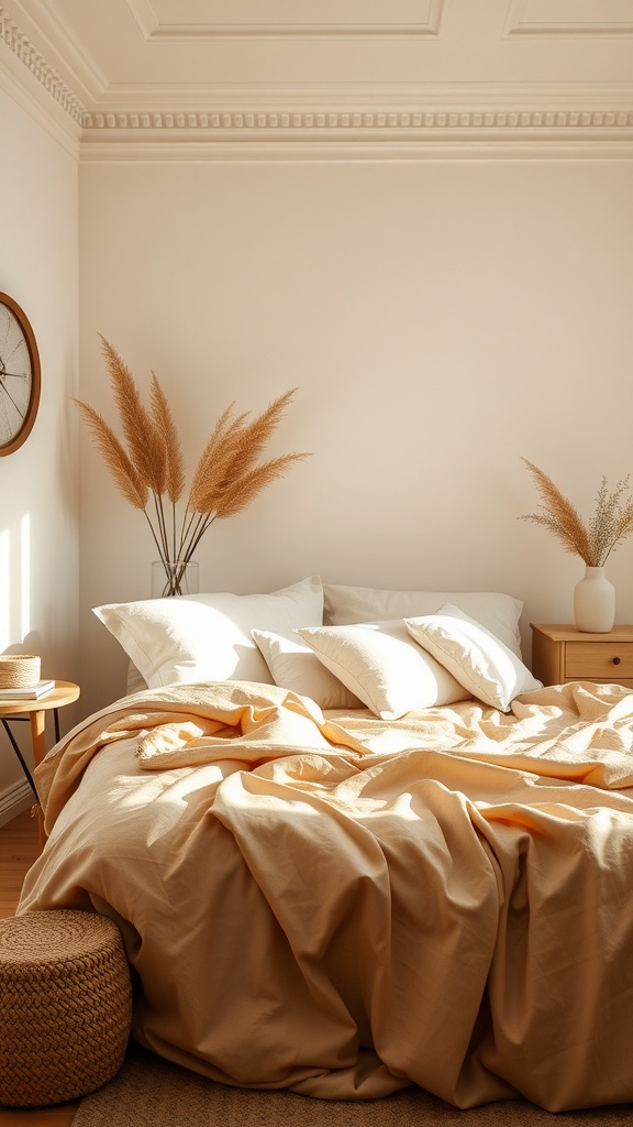
30. Warm Textiles
Warm-toned textiles keep neutrals feeling cosy rather than cool.

31. Silk Accents
A touch of sheen lifts matte neutrals into something elegant.
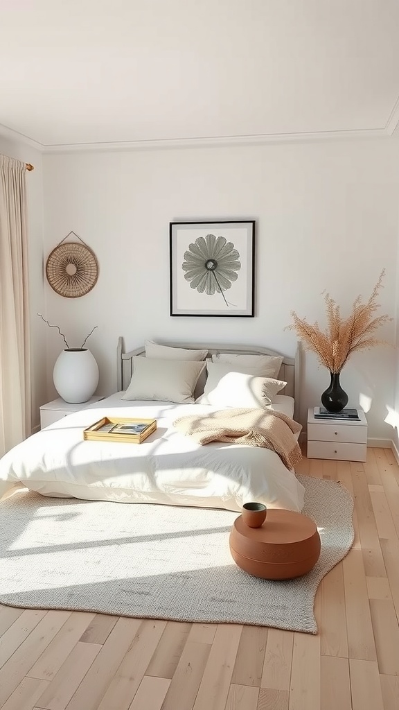
32. Tranquil Zen
Neutrals plus soft light and natural accents make the calmest of retreats.

33. Vintage Touches
Vintage pieces add character and story to an otherwise minimal room.

34. Personal Touches
Meaningful objects keep a neutral room feeling personal, not showroom-blank.
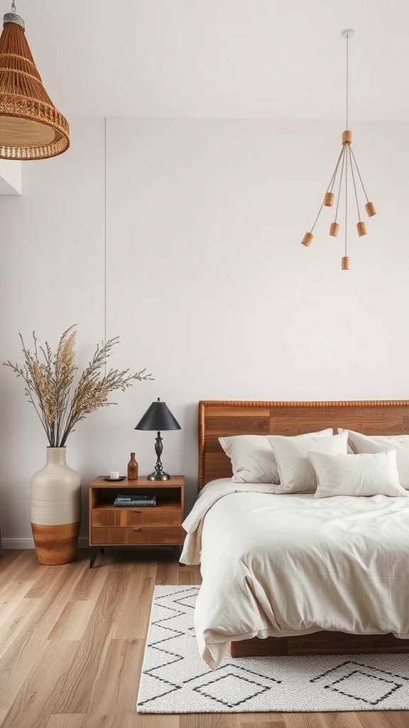
35. Modern Rustic Fusion
Wood and clean lines together make neutrals feel current and warm.
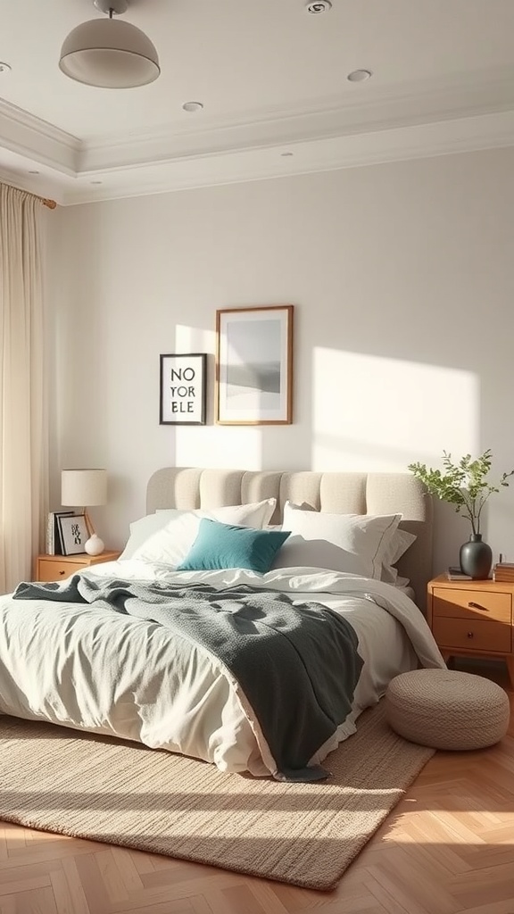
36. Cohesive Decor
When every element shares the palette, the whole room feels serene and intentional.

37. Plush Rug & Soft Light
A deep rug and warm light are the finishing touches that make neutral truly cosy.
Building a neutral scheme in five decisions
An order of operations, because neutral rooms assembled piecemeal are exactly the ones that end up flat.
One: pick your temperature. Warm or cool. Everything else follows from this, and changing your mind halfway is what produces the muddled rooms. Warm is the safer choice for a bedroom in almost every climate and orientation.
Two: set the lightest value. Usually the walls and ceiling. This is the room's baseline, and it should be genuinely light — not a mid-tone pretending.
Three: choose the dark anchor. One element clearly darker than everything else: a headboard, a timber floor, a charcoal rug, curtains in a deep tone. Without it the room has no floor to stand on. This is the step most people skip.
Four: fill the middle. Bedding, upholstery, smaller furniture — this is where oatmeal, greige and taupe live, and where you can be most relaxed, because the structure is already set.
Five: add the textures. Now, not earlier. With the values decided you can choose materials for how they feel rather than hoping they'll rescue a flat scheme.
Run the black-and-white photograph at the end. If the three values read clearly, the room will work in any light.
Common neutral-bedroom mistakes
No dark element anywhere. The single most common failure. Cream and beige at the same value, wall to wall, and the room dissolves. One dark anchor fixes more than any amount of styling.
Mixing warm and cool neutrals. The second most common. Pick a side and check every sample against white paper before it enters the room.
Smooth everything. Painted walls, cotton bedding, laminate floor, no weave anywhere. Neutral without texture is the definition of flat.
Too many textures at the same scale. Five woven things read as one. Vary the weight — fine against chunky, matte against a single reflective surface.
Cheap light. Under low-CRI bulbs neutrals lose what little chroma they have and turn grey-brown. This is the cheapest correction available and it's routinely overlooked.
Confusing neutral with beige. Neutral is a strategy, not a colour. Off-blacks, warm whites, deep browns and greiges are all neutral, and a room using their full range is far more interesting than one built entirely from the middle of it.
Final thought
Neutral is the most timeless palette a bedroom can wear, and the easiest to get wrong — because it removes the tool most people rely on without telling them what to use instead.
The answer is value first, texture second, undertone consistency throughout. Get a genuine light, a genuine mid and a genuine dark into the room, give the materials something to say to each other, and keep every neutral on the same side of warm or cool. Do that and the room stops being beige. It becomes quiet, which is what you wanted all along.

Sources & principles referenced
- Hue, saturation and value as separate properties, and value as the structural tool in a palette without hue contrast.
- The greyscale photograph test used by painters to check compositional value structure.
- Three-step value structure — a clear light, mid and dark — as the minimum for a legible neutral room.
- Material behaviour under light: absorbent, reflective and directional surfaces.
- Scale contrast in textiles: fine weaves against chunky ones rather than several mid-weight ones.
- Warm neutrals (cream, oatmeal, greige) versus cool ones (ash, dove, violet-based taupe), and the muddying effect of mixing families.
- Undertone testing against white paper.
- 2700–3000 K lighting at CRI 90 or above; low-CRI light flattening low-chroma surfaces.