
Purple is two colours in one bedroom. Soft lavender is one of the most calming, sleep-friendly shades there is; deep plum and amethyst are rich, regal and dramatic. Knowing which you want — and how to balance it — is the whole game. These 30 purple bedroom ideas cover both ends.
Purple is two different decisions wearing one name
No other colour splits this cleanly. Soft lavender and deep aubergine share a name and almost nothing else — not the mood they produce, not the rooms they suit, not the way you have to handle them. Choosing "purple" without choosing which purple is how most of these rooms go wrong.
Lavender and lilac are pale, cool and low in saturation. They behave like tinted neutrals: quiet on large surfaces, easy to live with, genuinely restful. If the goal is a room that helps you wind down, this end of the range is one of the best colours available.
Plum, aubergine and amethyst are the opposite: saturated, absorbing, theatrical. They read as luxury and they cocoon, but they demand the same commitments a dark room always does — layered warm light, contrast to break them up, texture so they don't go flat.
Decide which room you're making before you look at a single swatch. Nearly every disappointing purple bedroom is one where the deep version was chosen for the mood of the pale one, or the other way round.
The undertone problem: red-purple or blue-purple
Once you've picked a depth, the second decision does the rest of the work. Every purple leans toward red or toward blue, and the two behave completely differently in a room.
Red-leaning purples — mauve, plum, aubergine — carry warmth. They sit naturally with wood, brass, cream and terracotta, and they hold up under warm lamplight without going grey. These are the easier purples to live with, and the ones that read as expensive rather than novel.
Blue-leaning purples — periwinkle, violet, true lilac — are cooler and cleaner. They pair with grey, silver, white and pale wood, and they can look crisp and modern. But they chill fast: put a blue-purple in a north-facing room under cool bulbs and you get something closer to hospital than to boudoir.
Test the lean the way you'd test any colour: hold the sample against a sheet of white paper, then against something clearly warm — a piece of oak, a cream towel. The bias jumps out immediately, and it's far more reliable than the name on the tin.
Purple is the colour most changed by your light bulbs
This is the part almost no purple advice mentions, and it explains a great many "the paint looked completely different at home" stories.
Colour is only ever what a surface reflects out of the light it receives. Daylight contains the full spectrum, so a purple surface has plenty of both red and blue wavelengths to work with. Most domestic LED bulbs do not: they build white light from a blue emitter and a phosphor coating, and the result has real gaps — typically weak in deep red and uneven across the violet end. A purple that was balanced in the shop can lose its red component under those bulbs and slide toward grey or blue.
Two practical consequences. First, judge purple samples in the room, at night, under the bulbs you actually own — not in daylight and not in the shop. Second, buy bulbs with a colour rendering index of 90 or above; below that, the gaps in the spectrum are wide enough to visibly flatten saturated colours, and purple is the one that suffers most.
Warm bulbs at 2700 K also help red-leaning purples considerably, and hurt blue-leaning ones slightly — another reason to settle the undertone question first.
What to put next to it
Purple needs relief in a way that blue and green don't, because at full saturation it holds the eye without offering anywhere to rest.
The safest partner is a warm neutral: cream, oatmeal, undyed linen. Against deep plum this reads as classic rather than dated, and it does the job of contrast without introducing a second opinion.
Metals matter more than usual here. Brass and antique gold warm purple and make it read rich; chrome and cold silver push it toward the cool, clinical end. If you have a blue-leaning purple and it feels chilly, swapping the hardware is a smaller intervention than repainting.
Wood — mid oak or walnut — is the most reliable third element, and green is the most interesting one: olive or forest against aubergine is a genuinely handsome combination, both colours deep enough that neither has to win.
What to avoid: purple with black and nothing else, which turns funereal, and purple with strong yellow, which is technically its complement and practically exhausting in a room you sleep in.
30 purple bedroom ideas — and why each works
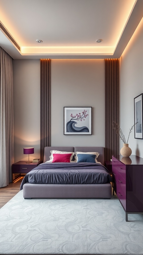
1. Amethyst Accent Furniture
A jewel-toned piece brings deep purple in as an accent while the walls stay calm.
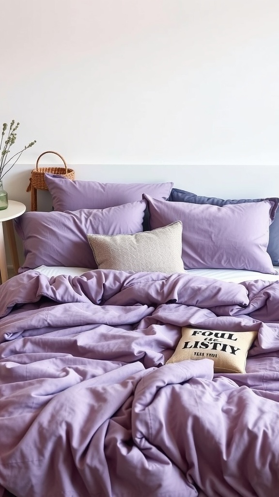
2. Plush Purple Bedding
Layering purple shades on the bed adds depth without committing the whole room.
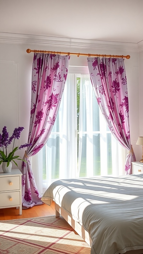
3. Floral Purple Curtains
Florals soften purple into something light and romantic.
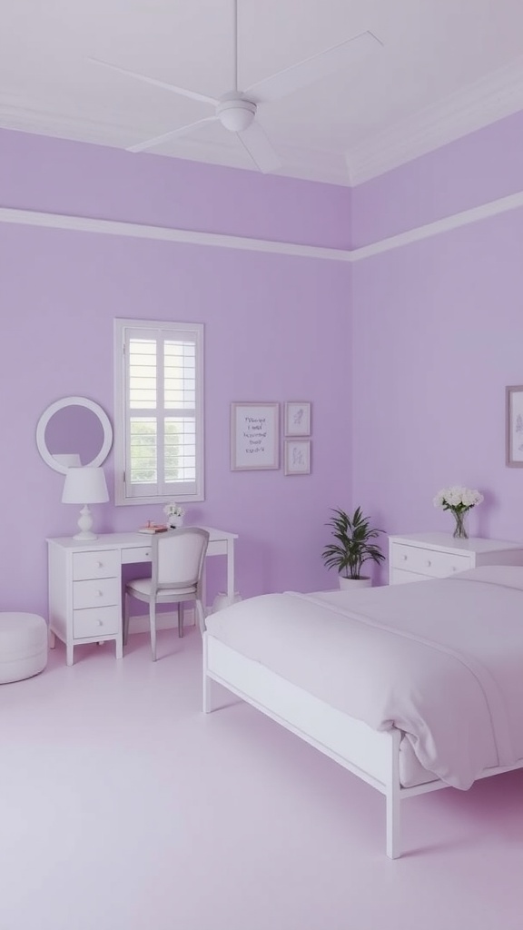
4. Lavender Walls
Lavender with white is the most restful, sleep-friendly way to use purple.
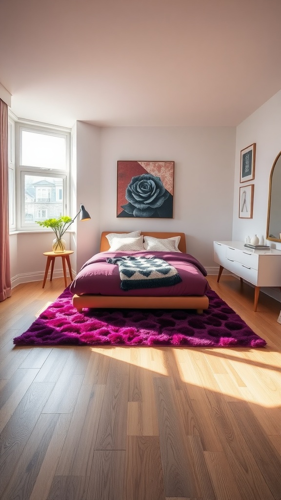
5. Purple Rug
A purple rug grounds the room with colour underfoot while walls stay light and airy.
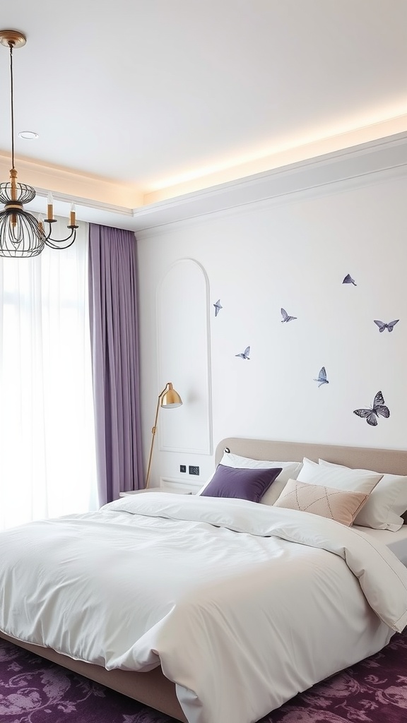
6. Minimalist Purple
A little lavender against white keeps purple modern and uncluttered.
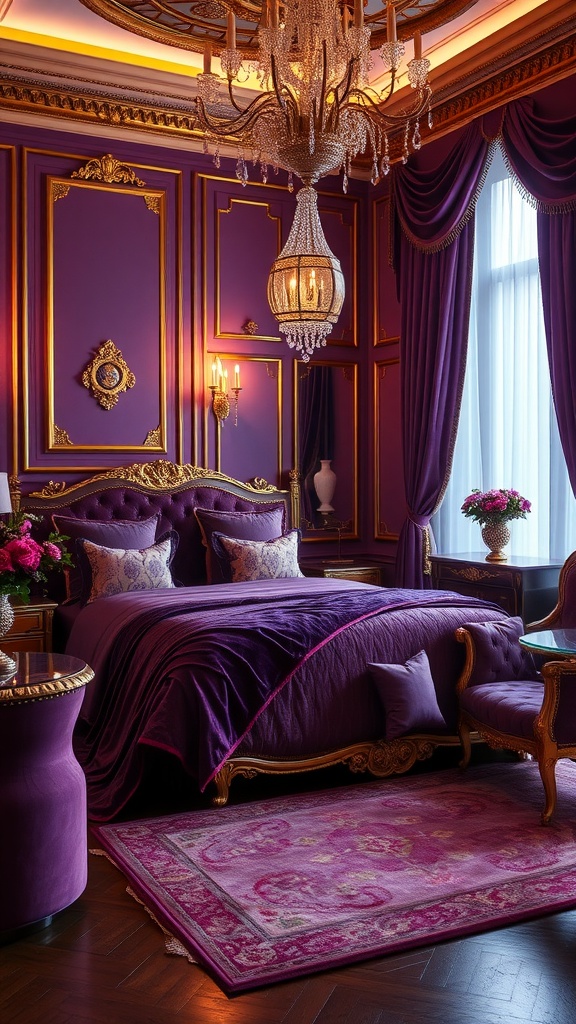
7. Purple & Gold
Gold is deep purple's regal partner — the pairing reads pure luxury.
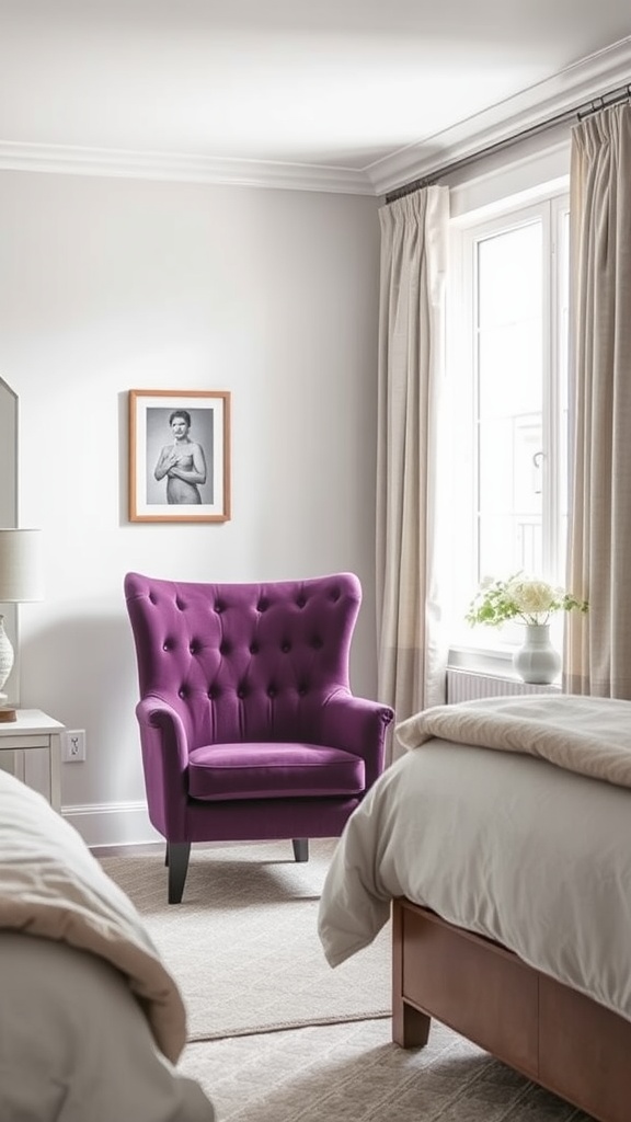
8. Deep Purple Chair
One rich chair delivers drama; beige and light bedding keep it balanced.
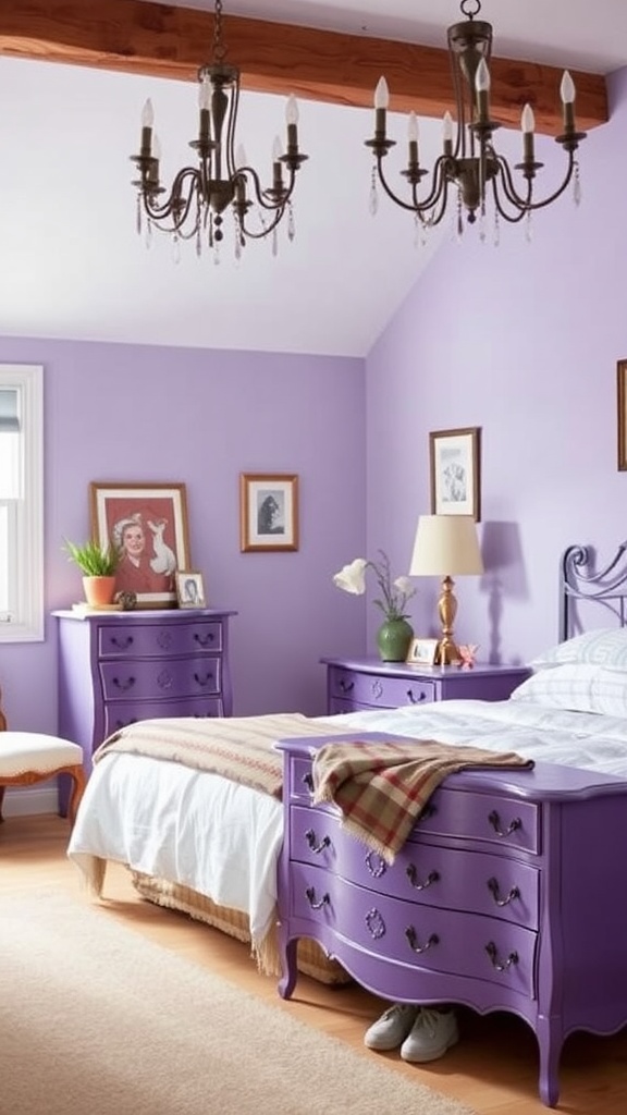
9. Vintage Purple Dresser
Warm wood accents soften vintage purple furniture into something cosy.
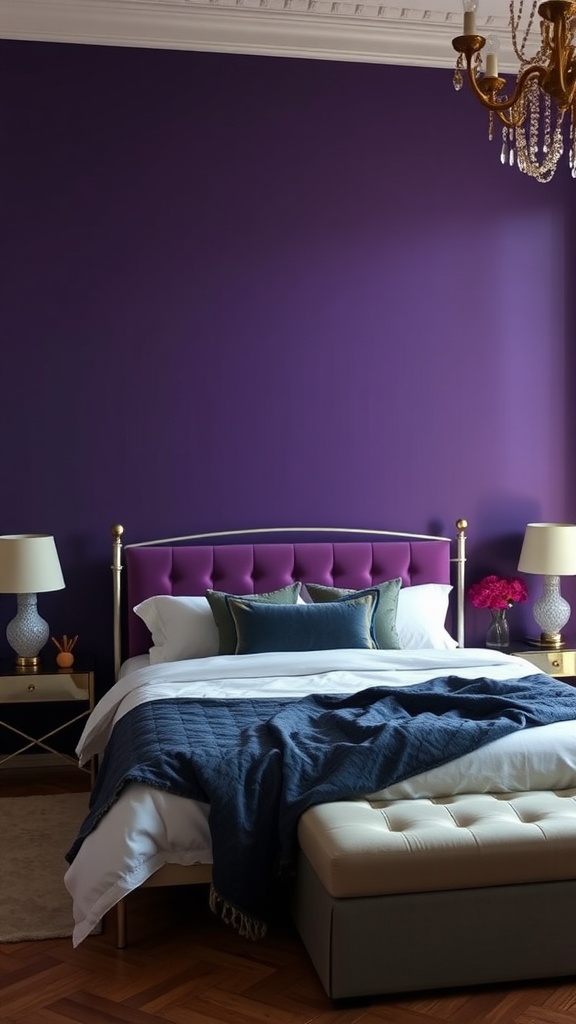
10. Deep Purple Statement Wall
One plum wall behind the bed is dramatic and doubles as the headboard's backing.
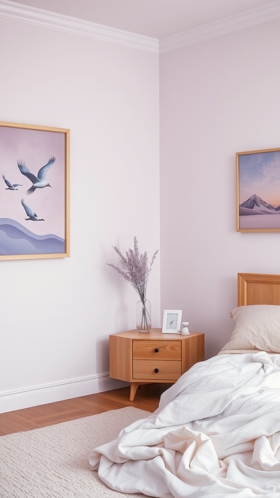
11. Pastel Purple
Pastel purple walls are gentle and calming, a soft alternative to lavender.
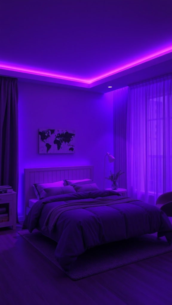
12. Purple & Grey Mood Lighting
Grey grounds purple; use purple-tinted light for atmosphere, not for reading.
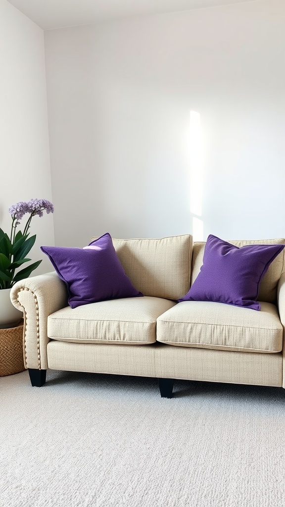
13. Purple Throw Pillows
The easiest purple — accents on a neutral base you can swap any time.
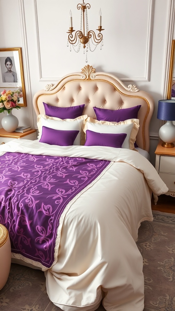
14. Purple & Cream
Cream warms purple and keeps it from feeling heavy.
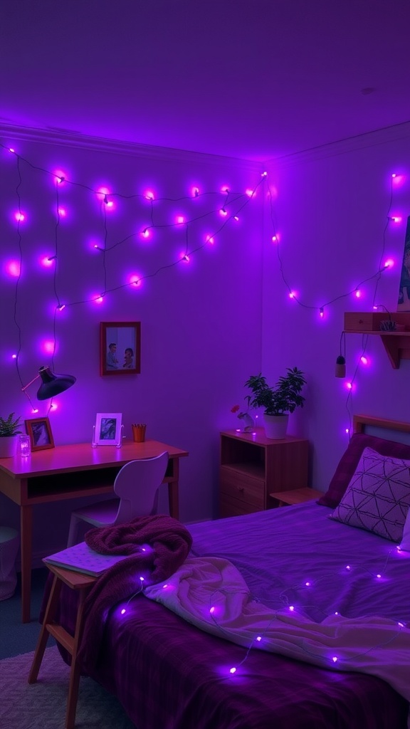
15. Purple Fairy Lights
A dreamy accent glow — keep a warm main light so the room stays cosy.
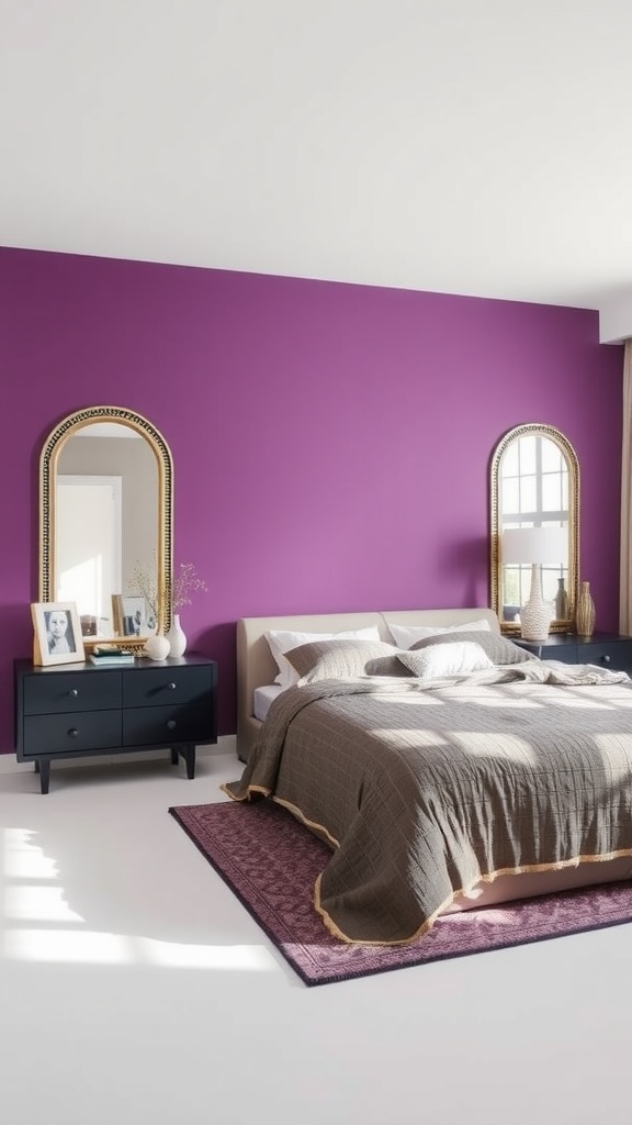
16. Purple Wall with Mirrors
Flanking mirrors bounce light back onto a deep purple wall, keeping it from feeling dark.
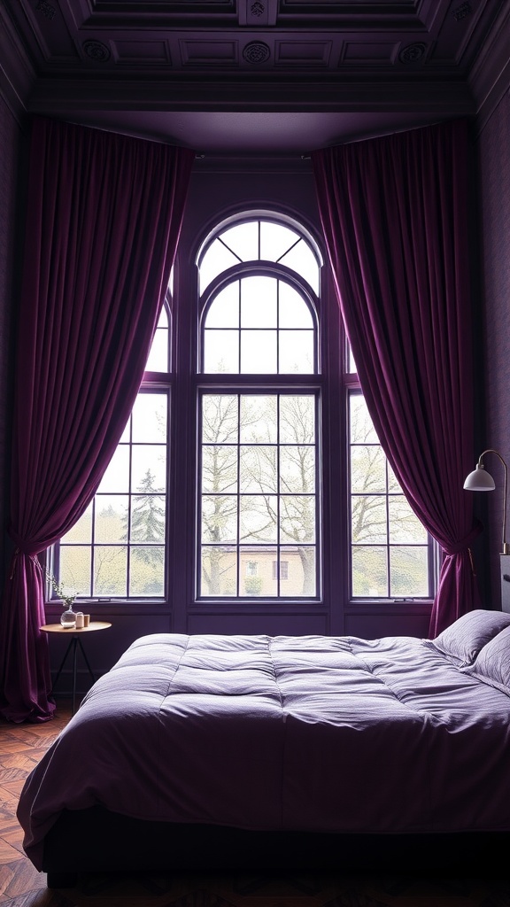
17. Purple Velvet Curtains
Velvet gives purple a rich, tactile depth that reads luxurious.
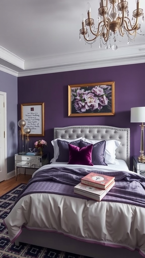
18. Purple & Silver
Silver gives purple a cooler, glamorous edge — warm the lighting to balance.
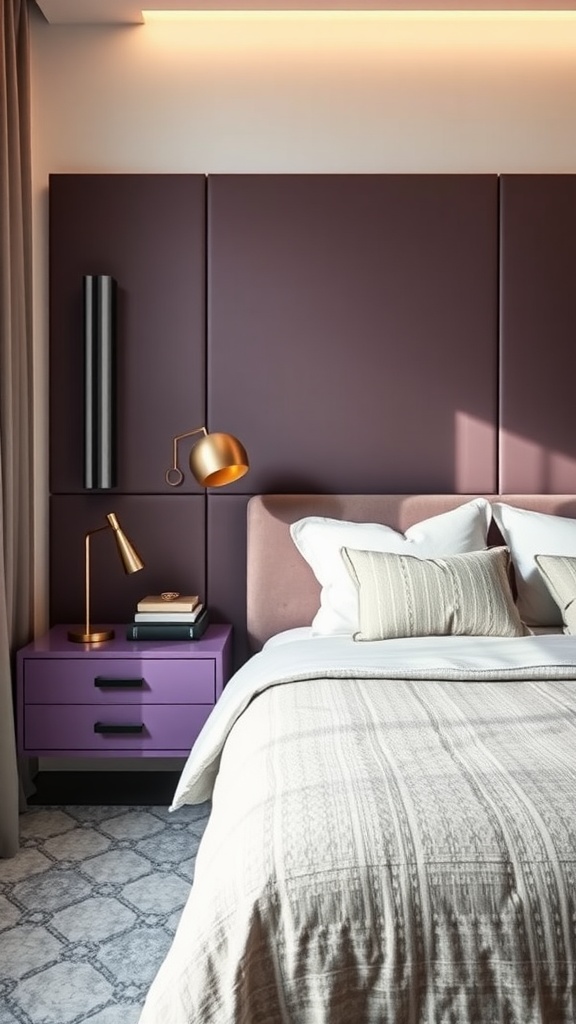
19. Purple Nightstands
Purple furniture adds the colour as an accent while the walls stay neutral.
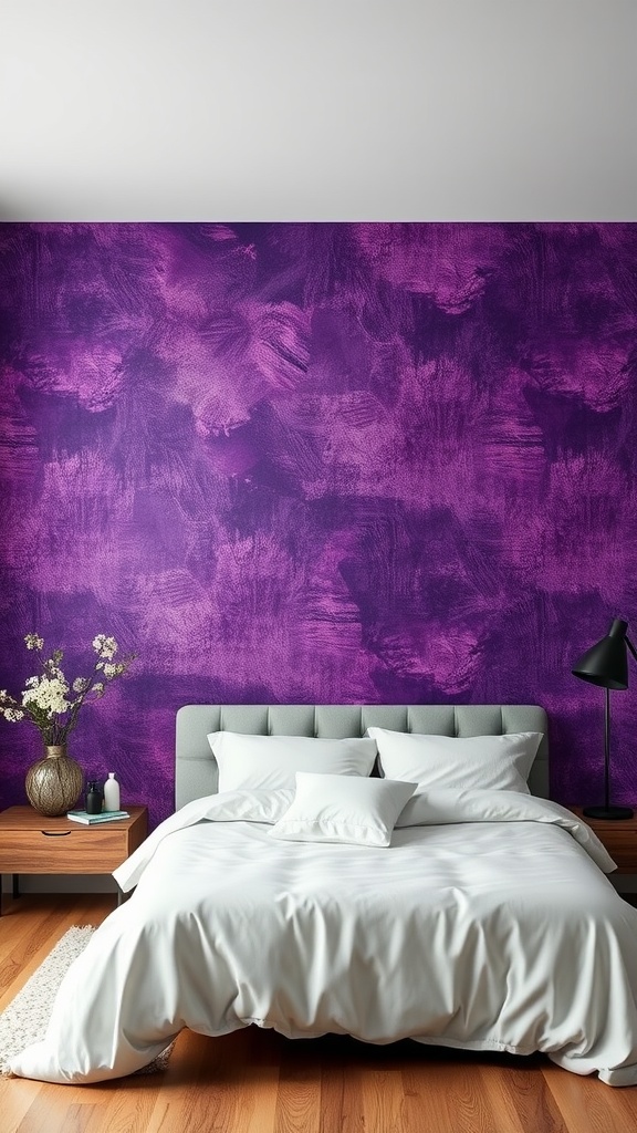
20. Textured Purple Wallpaper
Texture stops a purple wall from feeling flat; grey bedding balances it.
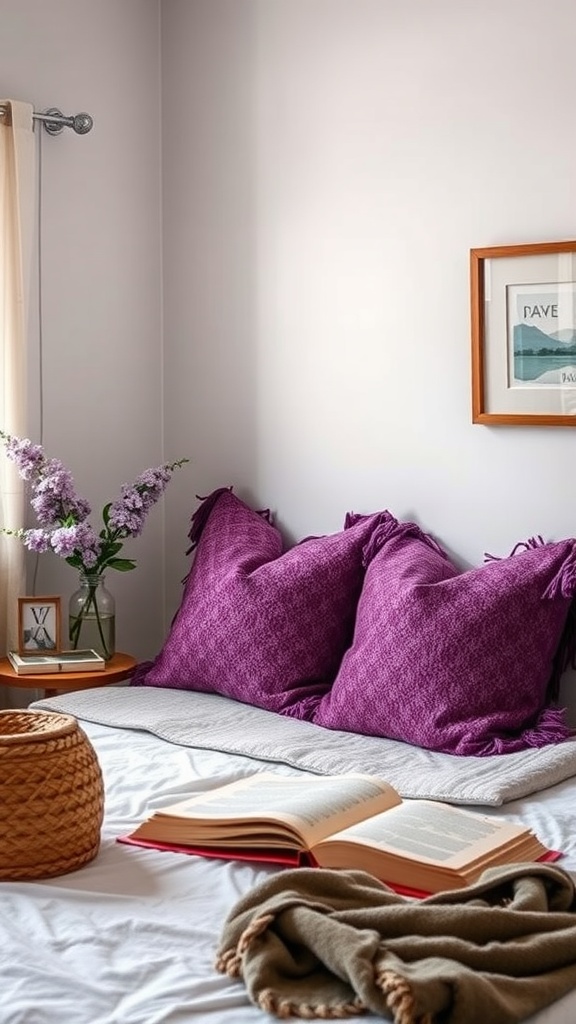
21. Purple Reading Nook
Contained to a corner, purple adds a rich, calm spot to relax.
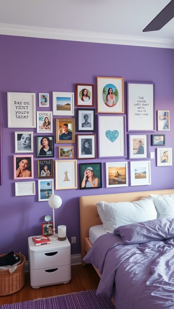
22. Purple Gallery Wall
Bring purple to the wall in art, keeping the room itself light.
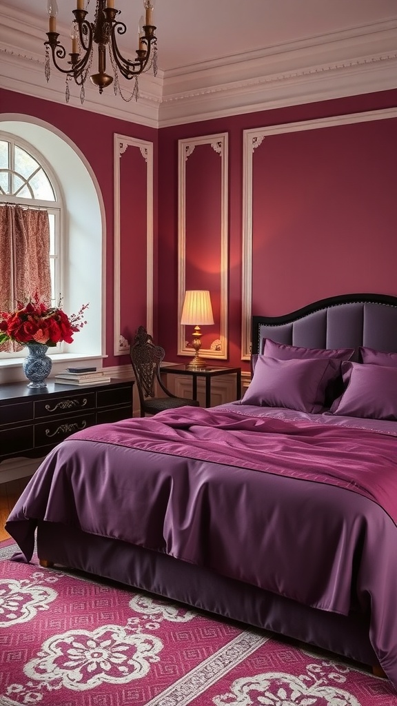
23. Rich Plum Bedding
Deep plum on the bed is luxurious; warm light keeps it inviting.
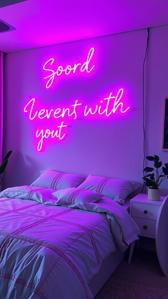
24. Purple Neon
A neon accent is playful and modern — great for a teen or creative room.
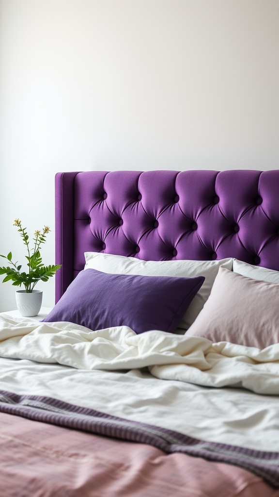
25. Purple Headboard
A cushioned purple headboard is a rich focal point and a soft backrest in one.
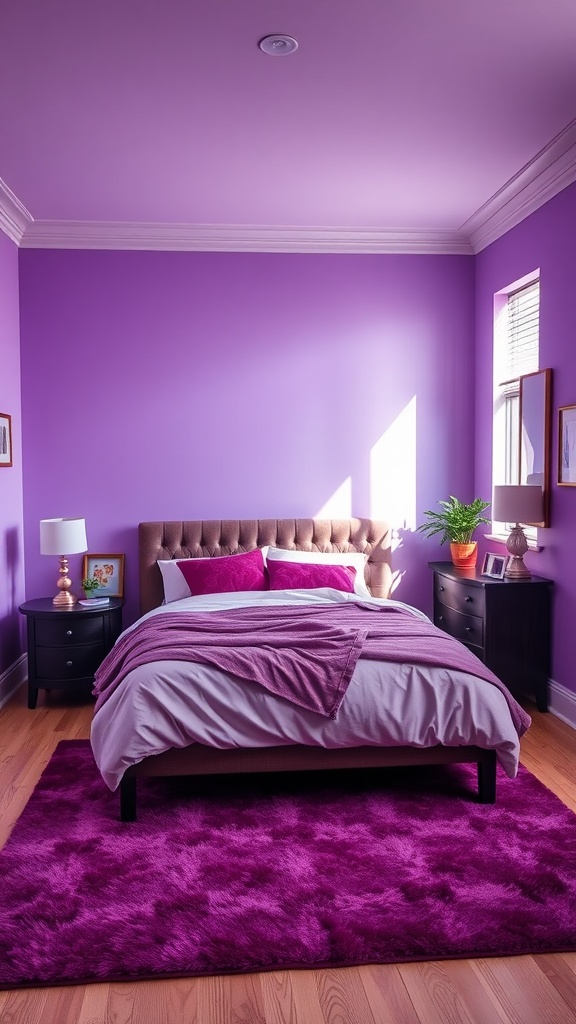
26. Bold & Light Purple
Mixing lavender with deeper purple adds depth and keeps the scheme from feeling flat.
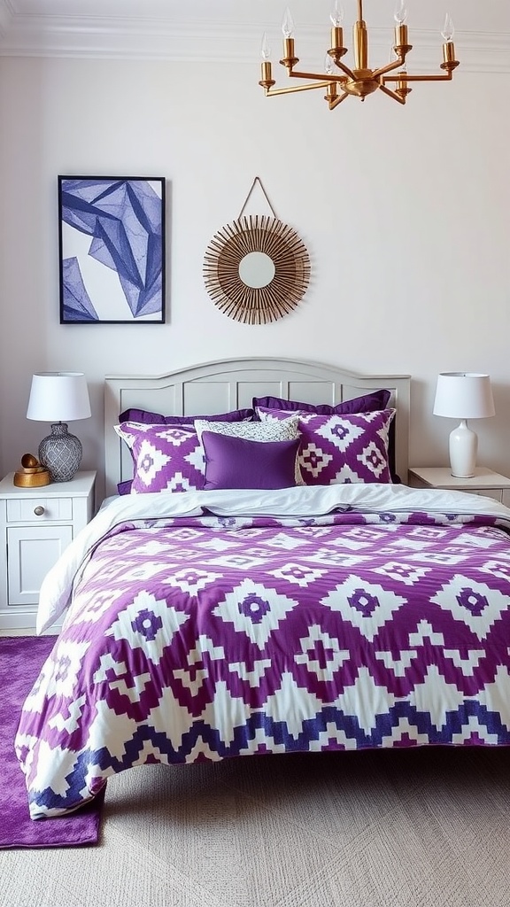
27. Geometric Purple
Geometric pattern gives purple a contemporary, structured edge.
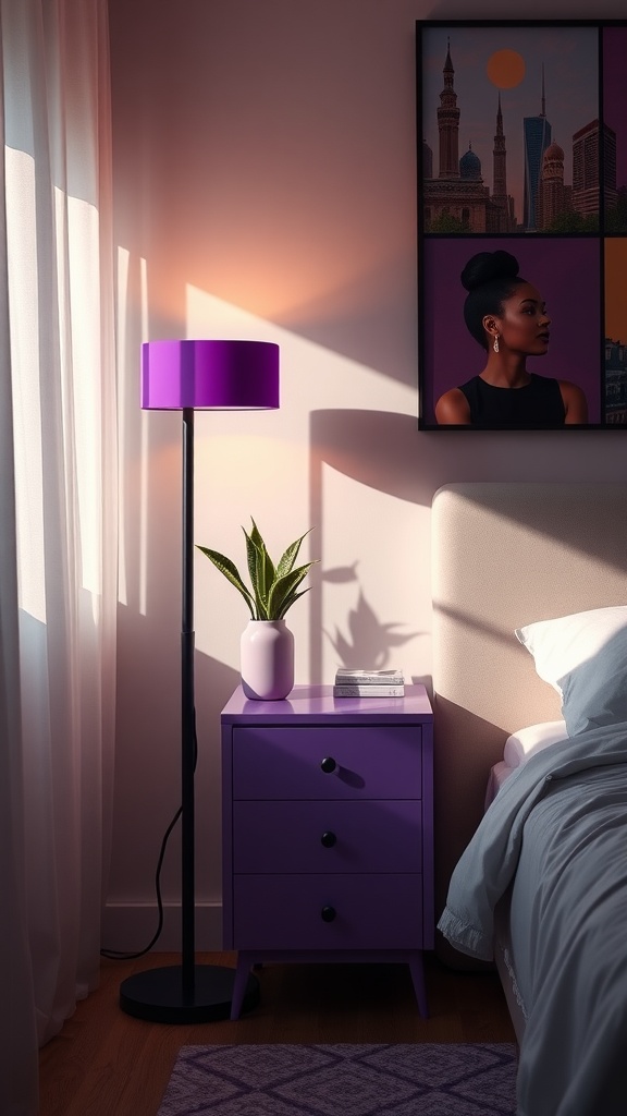
28. Purple Floor Lamp
A purple fixture adds colour and a warm glow in one accent piece.
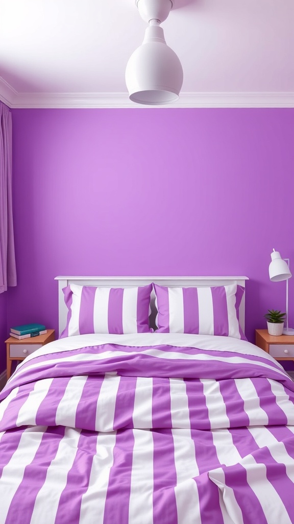
29. Purple & White Stripes
Crisp stripes lighten purple's mood for a fresher, more casual look.
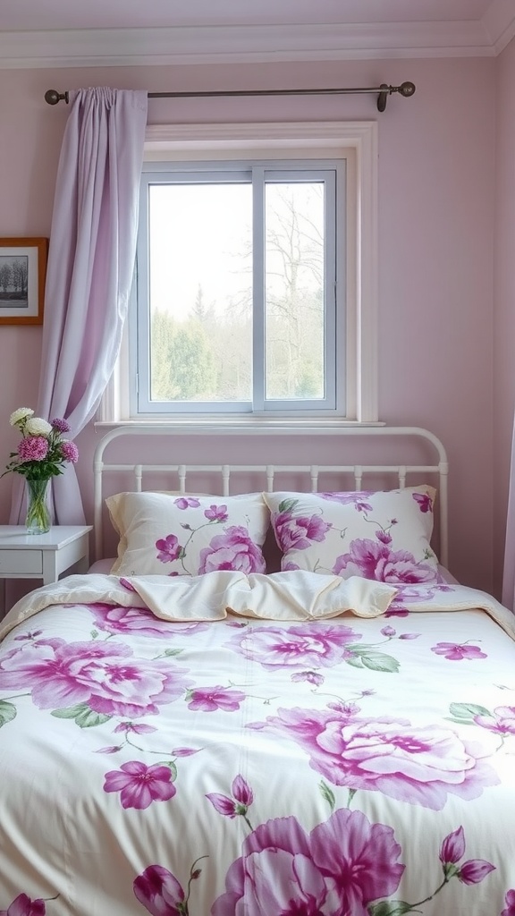
30. Floral Purple Bedding
Floral purple on a white frame is romantic, soft and easy to live with.
Choosing your purple by what you want from the room
Work backwards from the outcome rather than forwards from the swatch.
For sleep. Pale lavender with a red lean, on the walls or just in the bedding, and nothing above 2700 K after dark. Low saturation is doing the work here — it's quiet enough that your eye stops registering it, which is exactly what you want from a room whose main job happens with your eyes shut.
For drama. Aubergine or plum on all four walls, matte finish, brass fittings, at least three warm light sources and one genuinely light element — cream bedding, a pale rug — so the room has contrast. This is the version that photographs like a hotel, and it needs the full lighting commitment or it collapses into a dim box.
For a small or dark room. Keep purple off the largest surfaces and put it in textiles: curtains, bedding, a headboard. You get the colour without asking a room short on light to also absorb it.
For a child's or teenager's room. Lilac on one wall, everything else neutral. It's the version that survives a change of mind, and repainting one wall in four years is a much smaller job than repainting four.
If you're renting. Purple is unusually well suited to a textile-only approach, because its character comes through even in small quantities. A plum velvet throw and two cushions read unmistakably purple; the same restraint in beige would read as nothing at all.
Common purple-bedroom mistakes
Deep purple with no relief. Plum walls, plum bedding, plum curtains and no light-toned element anywhere. Balance aubergine with cream, oatmeal or gold, or the room reads as heavy rather than rich.
The wrong purple for the goal. Choosing amethyst for a room meant to be calming, or pale lilac for one meant to feel dramatic. The two ends of this colour do genuinely different jobs.
Cool accents only. Silver and chrome against an already cool purple push the whole room toward clinical. Warm the metals, warm the bulbs, or both.
Judging the colour in daylight only. Purple shifts more than any other hue between daylight and domestic LED. If you only ever saw the sample at noon, you have seen half of it.
Too many purples. Lilac walls, plum cushions, violet throw, mauve curtains. Pick one purple and one depth; let the other colours in the room be something else entirely.
Final thought
Purple lets you choose your mood more explicitly than almost any other colour: airy and calming at the pale end, rich and enveloping at the deep one. What it won't tolerate is indecision — the rooms that fail are the ones that took a bit of both.
So pick your depth, settle the undertone against a sheet of white paper, check it at night under your own bulbs, and give it one warm neutral to lean on. Do that and purple stops being the risky choice everyone treats it as.

Sources & principles referenced
- The split between low-saturation lavender and saturated plum as two distinct decorating decisions.
- Red-leaning versus blue-leaning purples and their behaviour beside wood, brass, grey and silver.
- Undertone testing against white paper and against a known warm material.
- Spectral gaps in phosphor-converted LED lighting, and why saturated purples shift more than other hues under domestic bulbs.
- Colour rendering index of 90 or above as the threshold for judging saturated colour indoors.
- Warm 2700 K lighting and its differing effect on warm and cool purples.
- Contrast requirements for dark, absorbing wall colours.
- Textile-only colour as a reversible approach in rented rooms.