

A grey bed is the ultimate flexible anchor: calm, versatile and a blank canvas you can style a dozen ways. Its only weakness is that grey can drift cold and flat. The fix is warm undertones, warm light, and one warm partner. These 32 bedroom ideas featuring grey beds show the range.
The undertone decides everything
Grey is not one colour. Every grey leans somewhere — blue, green, violet, brown — and that lean, not the depth, decides whether the bed reads as calm or clinical.
The test takes ten seconds and works in any shop. Hold the fabric against a sheet of plain printer paper. Against true white, a warm grey shows its brown or yellow bias and looks softer; a cool grey suddenly reads blue or violet and looks harder. Do it in daylight if you possibly can — showroom lighting is chosen to flatter, and a grey that looks warm under a warm halogen spot can turn steely the moment it reaches your north-facing bedroom.
Warm greys — greige, mushroom, anything with a brown base — sit comfortably beside wood, cream and skin tones, which is why they read cosy. Cool blue-greys are sharper and work in rooms with plenty of light and something warm nearby to balance them. Neither is wrong. What goes wrong is mixing them: a warm greige bed against cool grey walls makes both look slightly dirty, because the eye reads the difference as a mistake rather than a choice.
A grey bed is a fabric decision, not a colour decision
This is the part that gets missed. On a wall, grey arrives as paint and behaves predictably. On a bed it arrives as upholstery — and the weave changes the colour more than the swatch number does.
Velvet has a pile that catches light at different angles, so a single velvet headboard shows several values of the same grey at once. That's why velvet reads rich and why it photographs well. It also shows every crush mark, which some people read as character and others as wear.
Linen and linen blends scatter light rather than reflecting it, so the colour stays flat and matte. The effect is relaxed and slightly rumpled by design — linen wrinkles, and a linen bed that never wrinkles is polyester.
Boucle and heavy weaves add shadow at the surface, which warms a cool grey without changing the dye at all. If you like a colour but find it cold, the same colour in a chunkier weave will often solve it.
Flat performance weaves are the most practical and the least interesting: durable, wipeable, and visually inert. Sensible in a household with children or animals; worth pairing with a textured throw so the bed isn't the flattest object in the room.
Give it something warm to hold on to
A grey bed in a grey room with grey curtains is the failure mode, and it happens because grey is easy to agree on. The bed needs a partner with actual warmth in it.
Wood is the simplest — oak, walnut or ash in the floor, a bedside table or a frame detail. Brass is the next, especially in lighting and handles, because it puts a warm highlight at eye level. After that it's a question of how much colour you want: blush and clay soften grey without fighting it, mustard and ochre lift it, and deep green sits beside it without either colour dominating.
Light finishes the job. A grey bed under 2700 K light looks calm; the same bed under 4000 K reads like office furniture. If your bedroom has ever felt slightly institutional and you couldn't say why, check the bulbs before you blame the bed.
32 grey-bed bedroom ideas — and why each works
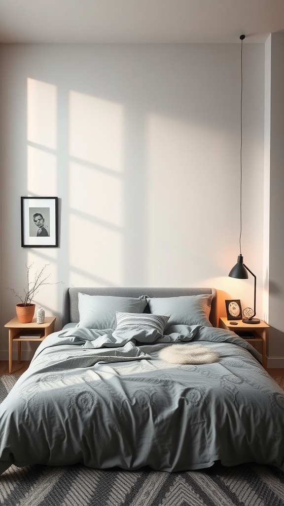
1. Cozy Minimalism
A grey bed is the perfect calm centrepiece for a pared-back room.
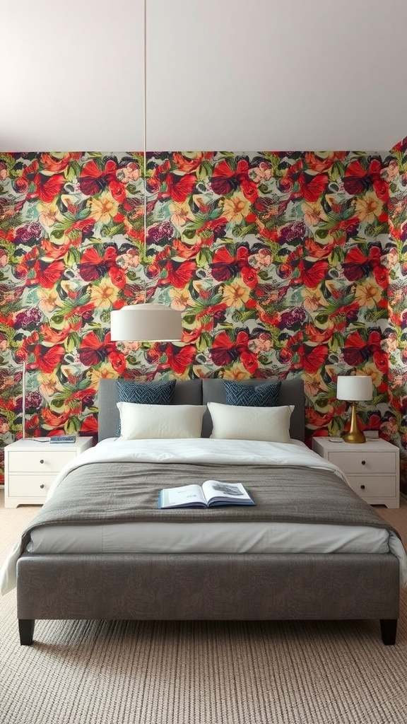
2. Grey Bed & Bold Wallpaper
Neutral grey lets a bold wallpaper shine without competing.
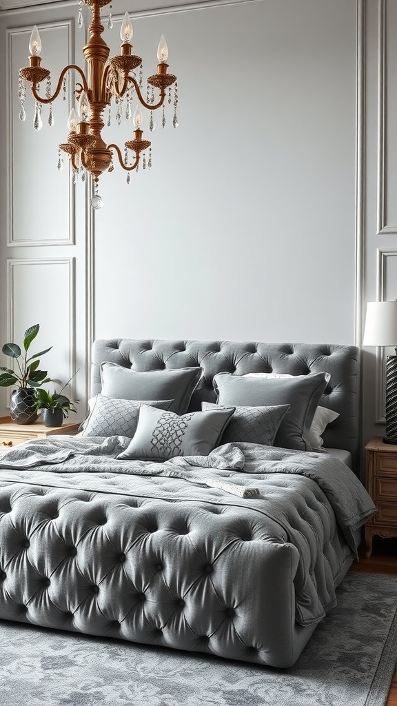
3. Grey Velvet
Velvet gives grey depth and a luxe, tactile richness.
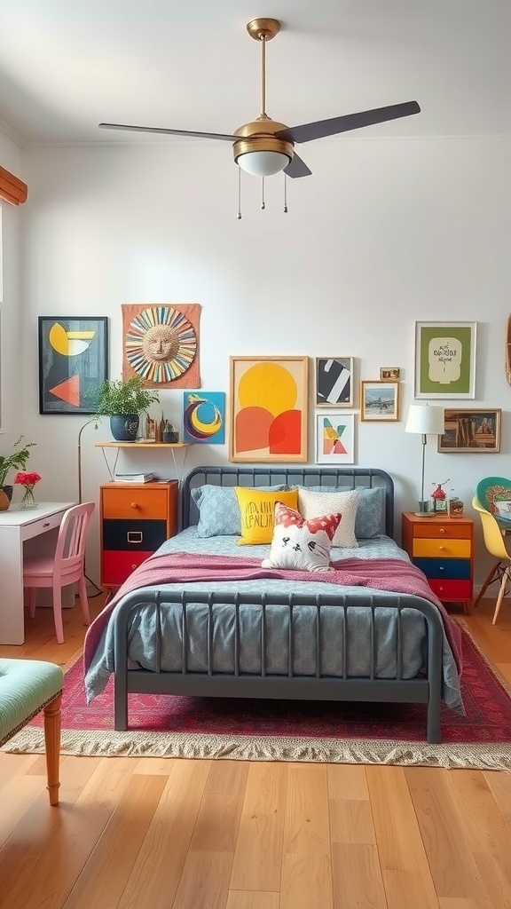
4. Eclectic Around Grey
Grey is the calm anchor that lets colourful, eclectic decor work.
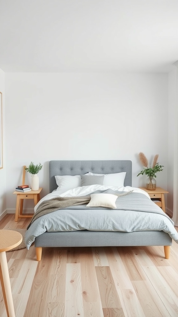
5. Scandinavian Grey
Grey with white and light wood is the heart of cosy Scandi design.

6. Industrial Grey
Grey suits industrial brick and metal — warm the lighting so it stays inviting.
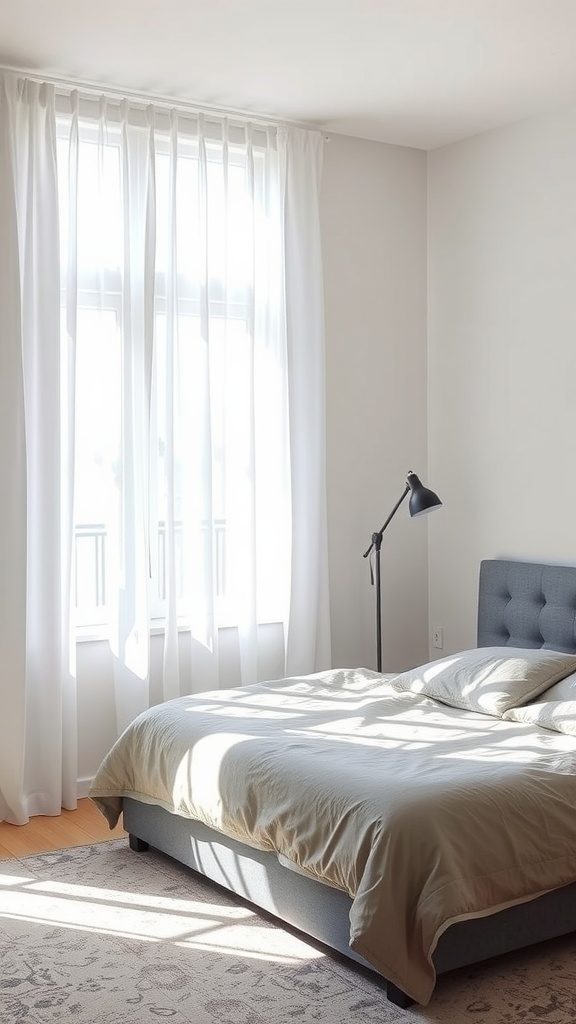
7. Bright & Airy Grey
Plenty of daylight keeps a grey bed feeling fresh, not gloomy.
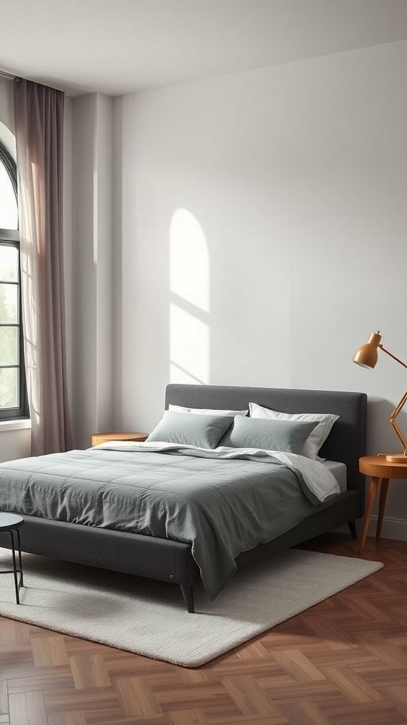
8. Dark Grey on Light Walls
A charcoal bed anchors the room; wood accents warm the contrast.
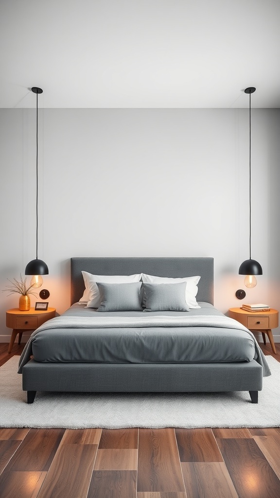
9. Grey with Artful Lighting
A statement light adds warmth and personality to a minimal grey room.
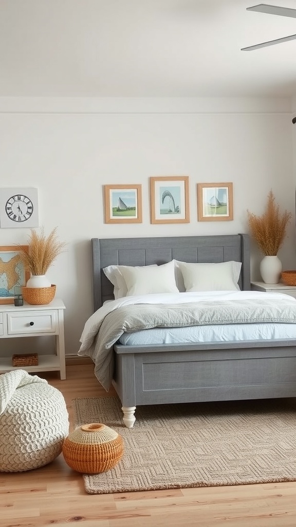
10. Coastal Grey
Grey with white and coastal touches is soft, breezy and calm.
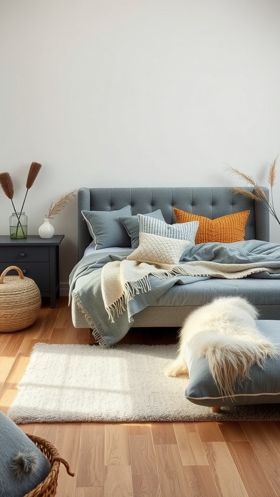
11. Grey with Cozy Textiles
Layered pillows and throws add the warmth a plain grey bed can lack.
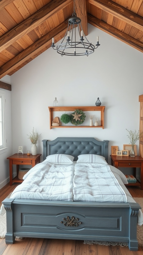
12. Rustic Grey
Natural wood is grey's best warm-up, giving it rustic character.
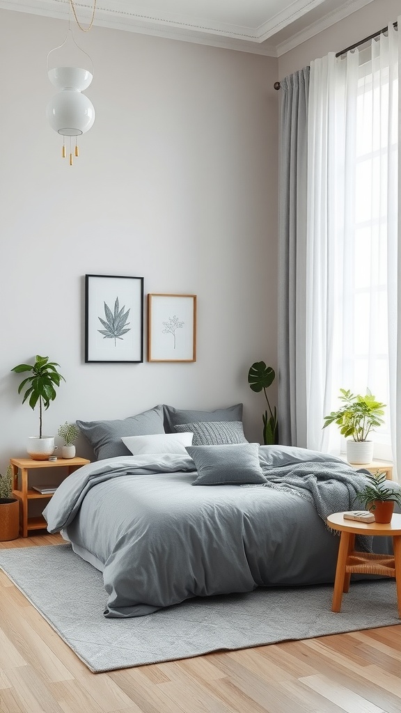
13. Zen Grey
Grey with plants and soft textiles makes a serene, restful retreat.
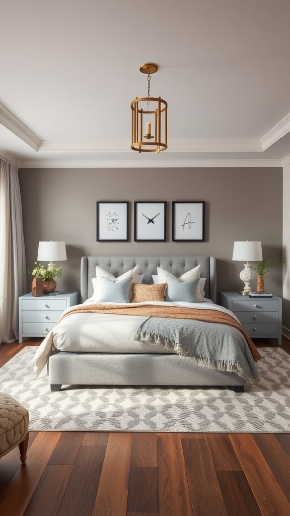
14. Transitional Grey
Soft pastels and warm wood make grey feel gentle and welcoming.
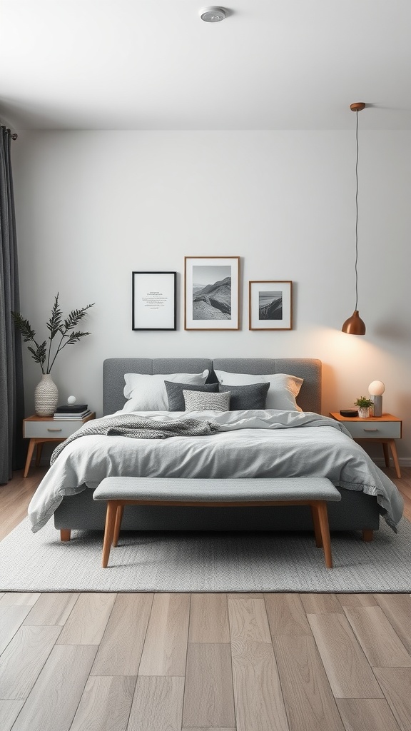
15. Monochromatic Grey
Tonal greys layered with texture make a sophisticated monochrome scheme.

16. Layered Textures
Texture is what keeps a grey bed from ever reading flat.
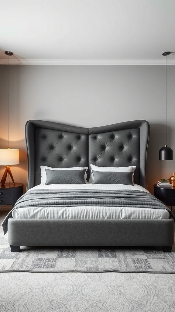
17. Statement Headboard
A sculptural grey headboard adds interest without adding colour.
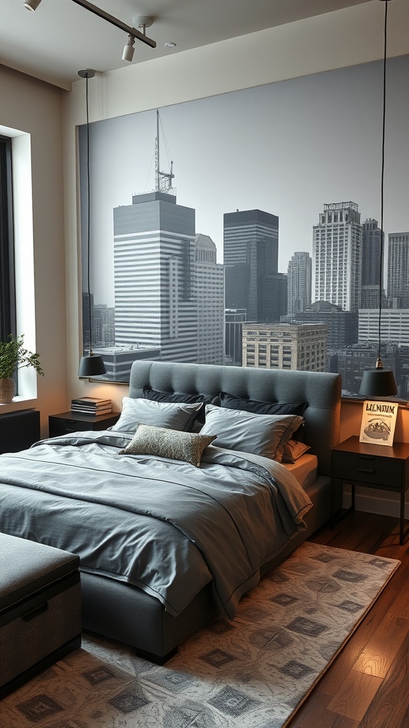
18. Urban Loft Grey
Grey is the natural palette for a cool, modern loft feel.
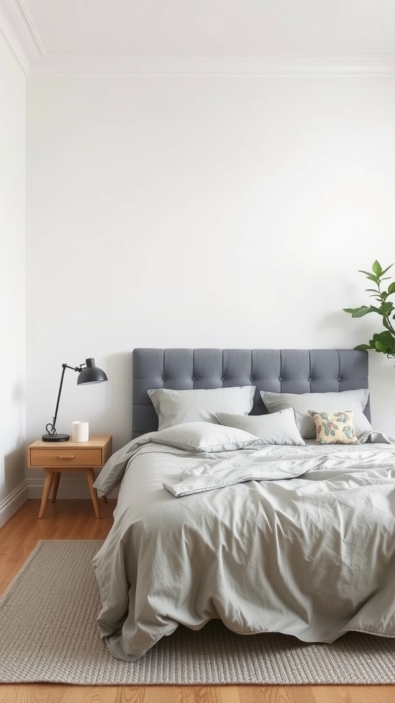
19. Neutral Palette
Grey slots effortlessly into any neutral scheme as a calm anchor.
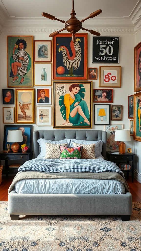
20. Maximalist with Grey
A grey bed grounds a busy, maximalist room so it doesn't overwhelm.
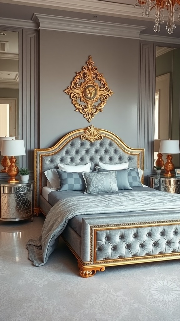
21. Grey & Gold Glam
Gold accents warm grey instantly and lift it into glamour.
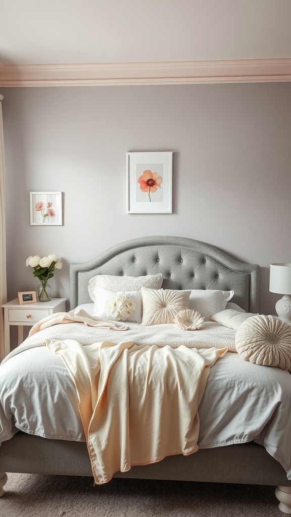
22. Floral Accents
Florals bring soft, warm colour to a grey base.
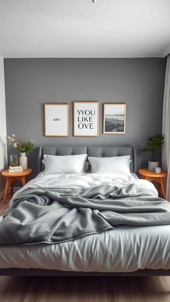
23. Gender-Neutral Grey
Grey is the ultimate versatile, universally liveable choice.
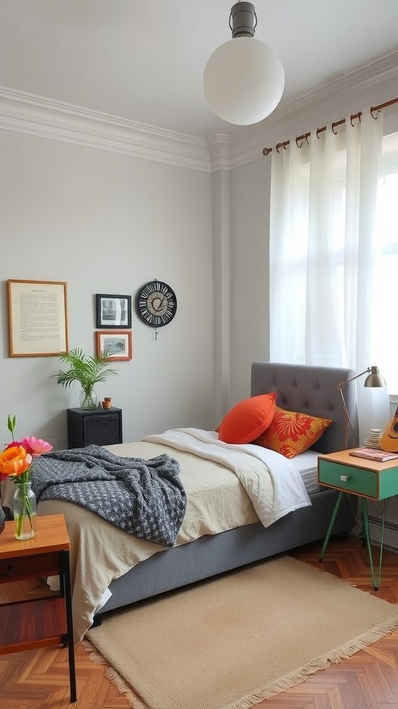
24. Vintage Grey
Colourful vintage accents pop beautifully against calm grey.
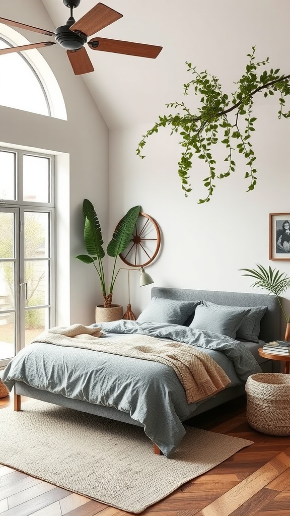
25. Outdoor-Inspired Grey
Grey with plants and warm tones connects the room to nature.
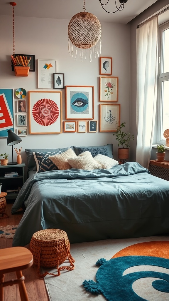
26. Artistic Grey
Grey is the quiet backdrop that lets bold art and rugs sing.
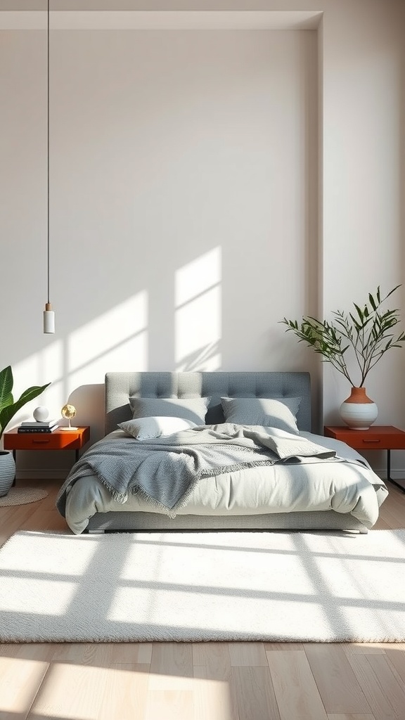
27. Grey with a Colour Pop
One vivid accent — like orange nightstands — comes alive against grey.
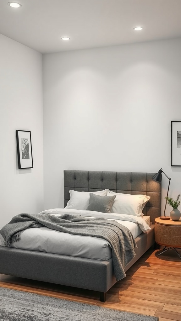
28. Function Meets Style
Grey's flexibility makes it easy to build a practical, good-looking room around.
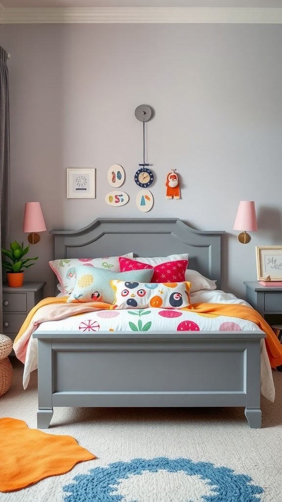
29. Grey with Mixed Bedding
A grey base lets you mix cheerful, mismatched bedding without chaos.
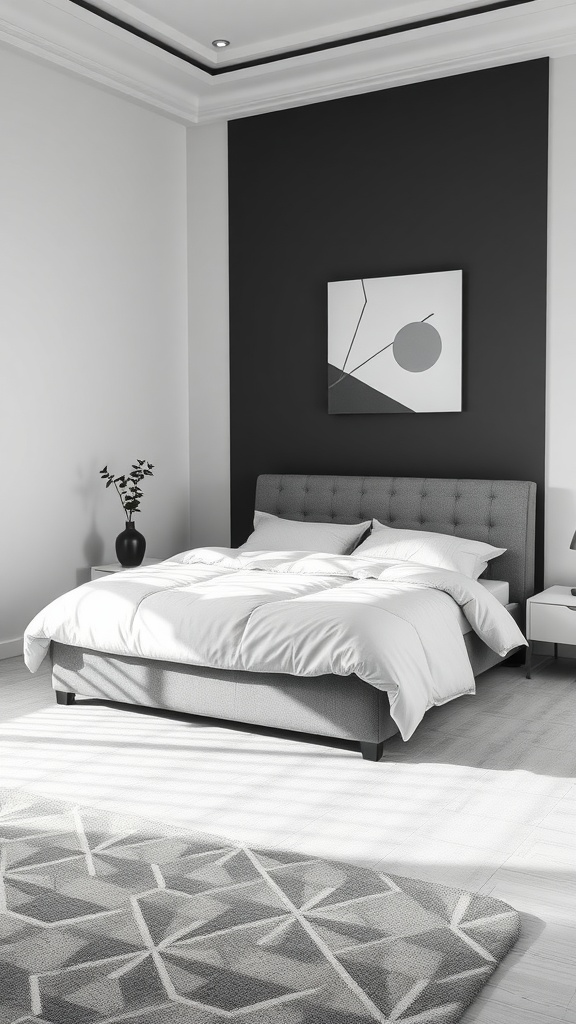
30. Contemporary Patterns
Geometric patterns add energy while grey keeps the room grounded.
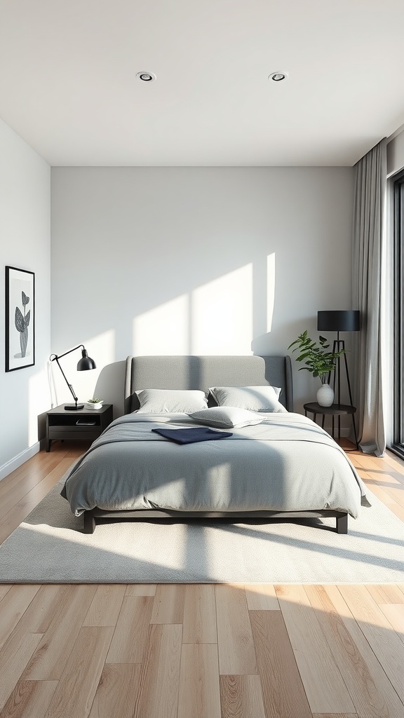
31. Modern Minimalist
Grey and natural light together are calm, clean and timeless.
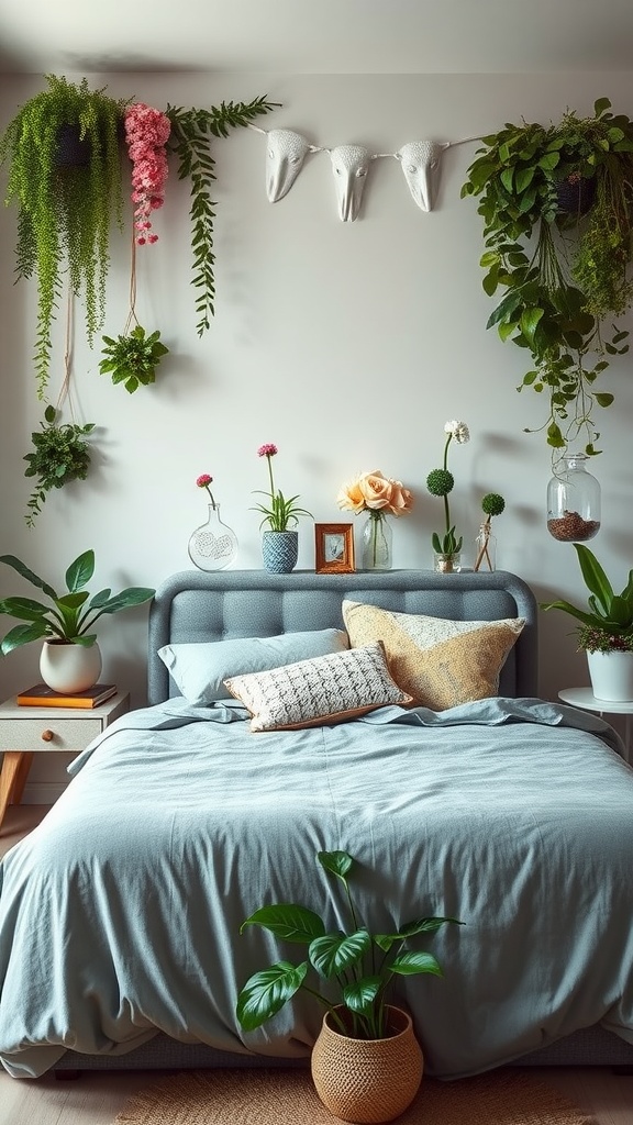
32. Garden-Inspired Grey
Greenery is the easiest way to warm grey and bring it to life.
Buying a grey upholstered bed: what to actually check
Upholstered beds are bought from photographs more often than any other large piece of furniture, and the things that determine whether you still like it in three years are rarely in the photograph.
Ask for the rub count. Upholstery fabrics are tested for abrasion — the Martindale figure. Anything from around 15,000 rubs is fine for a headboard you lean against; below that, expect the areas where your shoulders land to go shiny. Beds are gentler on fabric than sofas, but headboards get more contact than people expect.
Check whether the cover comes off. Removable, washable covers are the single biggest difference between a light-coloured bed that still looks good after a few years and one that doesn't. Where the cover is fixed, ask what the manufacturer recommends for cleaning before you find out the hard way.
Look at the fabric in daylight, twice. Once against white paper for the undertone, once at the time of day you're most often in the room. Grey is the colour most transformed by light temperature, and a bed is a decade-long commitment to a decision made in a shop.
Consider what the base does to the room. A grey bed on a solid plinth reads heavier and lands like a block; the same bed on visible legs lets the floor run underneath and feels lighter. In a small room the legs are usually worth it — and they make cleaning underneath possible, which the plinth version quietly does not.
Fade matters if the bed faces a window. Dyed fabrics in direct sun lose colour unevenly, and on a large flat headboard the difference between the lit half and the shaded half eventually becomes visible. If the bed sits in strong daylight, ask about lightfastness or plan on a curtain.
What bedding actually works on a grey bed
The bed frame is the fixed decision; the bedding is how you change your mind twice a year. Four combinations do most of the work.
White with texture. The default, and it earns the position — crisp white against grey is clean without being cold, provided the white brings some weave with it. Flat white percale on a flat grey headboard is the one version to avoid.
Cream and oatmeal. Warmer than white and more forgiving on a warm greige bed. This is the combination that reads expensive in photographs, because nothing in it is competing.
Tonal grey, two shades apart. Works, but only if both greys share an undertone and the values are clearly different — same family, different depth. Too close and the bed vanishes into the bedding.
One saturated colour. Rust, olive, ochre, deep blue. Grey is the most accommodating background there is, so a single strong colour in the throw or pillows will carry the whole scheme, and you can swap it for the cost of one item.
Common grey-bedroom mistakes
Mixing warm and cool greys. The most common and the least obvious. Two greys from different families in the same room make each other look wrong. Pick a lane — warm or cool — and keep every grey in the room on that side.
No warm partner at all. Grey bed, grey walls, grey carpet, white bedding. Technically coordinated, emotionally flat. One wood, brass or clay element changes the whole room.
Cool light. 4000 K and up drains the last warmth out of grey. Warm bulbs are the cheapest fix on this list.
Treating grey as neutral enough to skip texture. Beige and cream get away with being smooth. Grey doesn't — without weave, pile or knit in the room it reads as an absence of decision rather than a decision.
Matching the bed to the walls exactly. When the headboard is the same grey as the wall behind it, the bed disappears and the room loses its focal point. Either go a couple of shades apart or accept that the bed is now background.
Final thought
A grey bed genuinely is the flexible anchor it's sold as — it will carry a dozen different schemes and outlast every one of them. Its only real weakness is that grey drifts cold when nothing in the room pushes back.
So choose the undertone deliberately, let the weave do the warming, and give it one wood or brass companion at eye level. Do that and the bed stops being the grey thing in the room and becomes the quiet thing everything else is arranged around — which is what you wanted from it in the first place.

Sources & principles referenced
- Undertone testing against plain white paper, and why showroom lighting misleads.
- Warm greys (greige, brown-based) versus cool blue-greys, and the effect of mixing the two families.
- How weave changes perceived colour: velvet pile catching light at multiple angles, linen scattering it, boucle adding surface shadow.
- Martindale abrasion ratings as a durability guide for headboard upholstery.
- Removable covers and cleanability in light-coloured upholstery.
- Lightfastness and uneven fading on large upholstered surfaces in direct sun.
- Plinth bases versus visible legs, and the visual weight each gives a bed.
- Warm 2700 K lighting versus cooler 4000 K on grey surfaces.