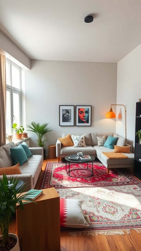

Modern studio design has a reputation problem: too often it means white walls, hard surfaces and a space that photographs well but feels like a showroom to live in. A genuinely good modern studio apartment keeps the clean lines and the discipline, then adds back the warmth that makes one room liveable. These 10 cozy modern studio apartment interior design ideas focus on that balance — atmosphere, colour and the psychology of living somewhere you can't walk away from.
What "modern" should mean in a studio
In a one-room home, modernism's core principles happen to be genuinely practical rather than merely stylistic:
- Clean lines and simple forms — fewer visual interruptions in a space where you see everything at once.
- Function first — every piece justified by use, because there's no room for anything that isn't.
- Concealed storage and technology — visible clutter and cables have nowhere to hide in a studio.
- Negative space — deliberate emptiness, which reads as calm rather than as space you've failed to fill.
What modernism doesn't require is coldness. The difference between a modern studio that feels serene and one that feels clinical comes down to three additions: warm wood, natural texture and 2700 K lighting. Miss those and you've built an office.
Using colour to shape a single room
Colour does specific work in a studio that it doesn't need to do elsewhere. Because there are no walls to define areas, colour temperature becomes a tool for setting mood across the whole space at once.
Warm neutrals — peach, clay, oatmeal, soft terracotta — reflect light kindly and make a small apartment feel welcoming rather than institutional. Cool greys and stark whites are the default in new-build studios and the most common reason they feel unwelcoming; warming the base palette is often the single biggest improvement available.
Apply the 60-30-10 rule across the entire apartment rather than per zone, and keep to three or four colours total. Then use one saturated accent — a chair, a throw, a piece of art — repeated two or three times so it reads as intentional.
Think vertically, not just for storage
Most studio advice treats vertical space purely as extra shelving. It's also a design tool. Drawing the eye upward makes a low, small apartment feel taller: full-height curtains hung close to the ceiling, tall narrow shelving, art hung in a vertical arrangement, and pendant lights that occupy the upper volume all stretch the room visually.
The same logic applies in reverse at floor level — furniture on visible legs lets the floor run underneath and continue, which reads as more space than the identical piece sitting flush.
The psychology of one-room living
This is the part most studio guides skip. In a studio there's nowhere to go when you want a change of scene — you sleep, work, eat and relax within the same four walls, and that has a real effect on how the space needs to be designed.
Two responses help. First, build in a retreat nook: a single chair with its own lamp, positioned so it faces away from the bed and the desk. Even in a small studio, having one spot that isn't associated with sleeping or working gives you somewhere to mentally switch off.
Second, make the transitions deliberate. Being able to close a curtain on the bed, turn off the desk lamp and switch on a different light changes the room's mode. In a house those transitions happen by walking between rooms; in a studio you have to design them in.
Minimalism as an active discipline
In a studio, minimalism isn't an aesthetic preference — it's maintenance. There's no spare room, no loft and no garage absorbing overflow, so possessions accumulate visibly and immediately.
The practical version: one in, one out. Anything that enters the apartment displaces something that leaves. Combine that with storing by frequency — daily items at easy reach, occasional items high or deep — and a studio stays workable long-term rather than gradually filling until it feels half its size.
10 modern studio apartment ideas — and why each works
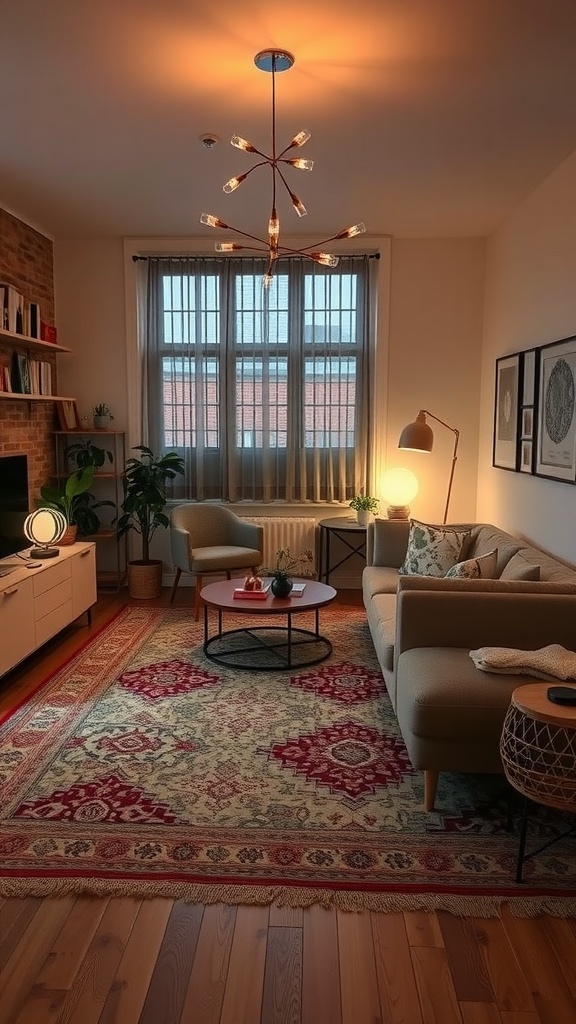
1. Define Areas with Rugs and Light
The two most effective zoning tools require no building work and no permission. A rug marks the living area's footprint; independently switched lighting lets you activate one zone while leaving another dark.
That lighting control matters more than it sounds. Being able to light the seating area alone in the evening — with the sleeping and working zones unlit — makes a studio feel like a small living room rather than a bedsit with the lights on.

2. Warm the Base Palette
Soft peach, clay and warm oatmeal reflect light in a way cool grey simply doesn't. In a modern studio — usually delivered with white walls and hard flooring — warming the base colour is the highest-impact change available.
Note how a single saturated accent, here the orange chair, does the work of an entire colour scheme. One strong colour repeated a couple of times reads as designed; four competing colours in one room reads as unresolved.
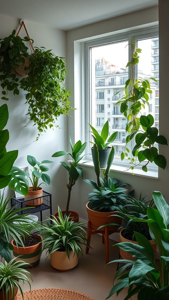
3. A Concentrated Plant Corner
Grouping plants in one dense corner is more effective in a studio than scattering them around. A single lush cluster reads as a deliberate feature — a garden corner — while the same plants spread thinly across the apartment just look like clutter.
It also concentrates the care: one spot to water, one spot with the right light. Choose species suited to your actual light levels, and vary the heights so the group has shape.
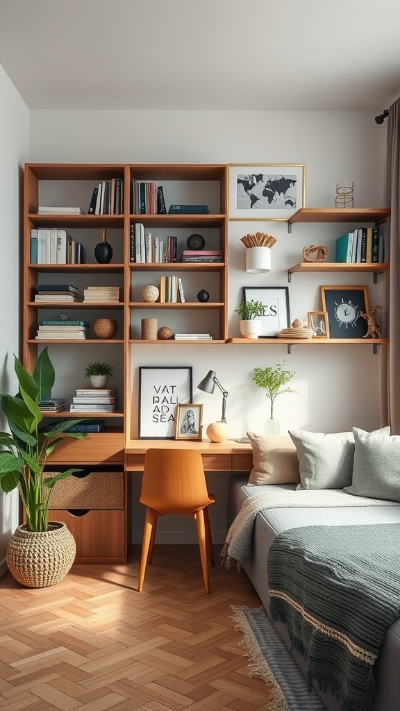
4. Build Upward
Wall-mounted shelving above a desk uses volume the floor can't spare, and taking storage high draws the eye upward, which makes a small apartment feel taller.
Wall-mounting the workspace itself is the sharpest version of this: a floating desk gives you a working surface with essentially no floor footprint, and the wall above it becomes storage rather than blank space.
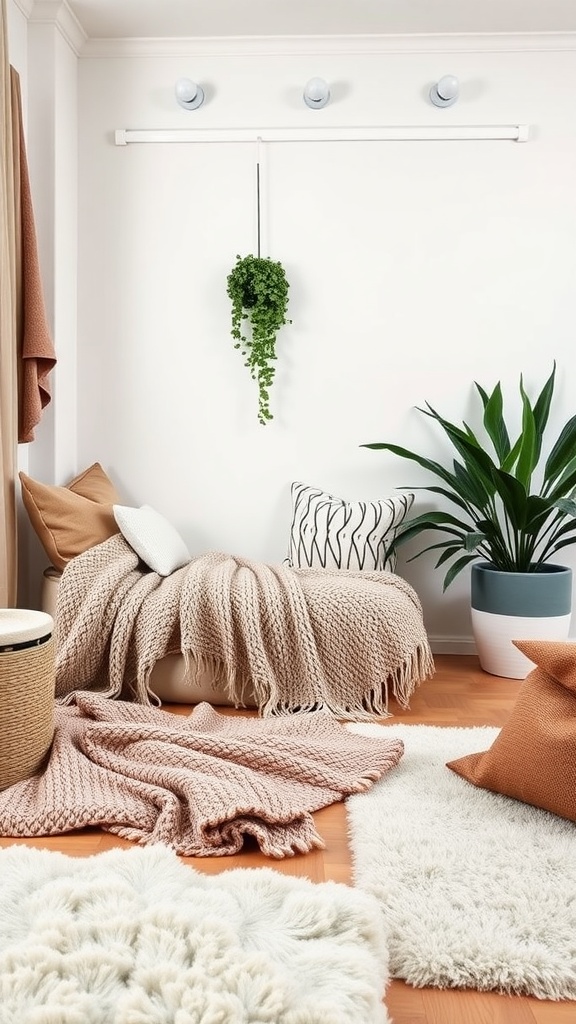
5. Texture Against Hard Surfaces
Modern studios are typically full of hard, reflective materials — laminate floors, plaster walls, glass and metal. That makes them acoustically live and visually cold. Textiles correct both at once.
Layer materials that genuinely differ to the touch: chunky knit against smooth linen against wool. In a restrained modern palette, texture is doing the work colour would otherwise do — and it's what separates warm minimalism from a waiting room.
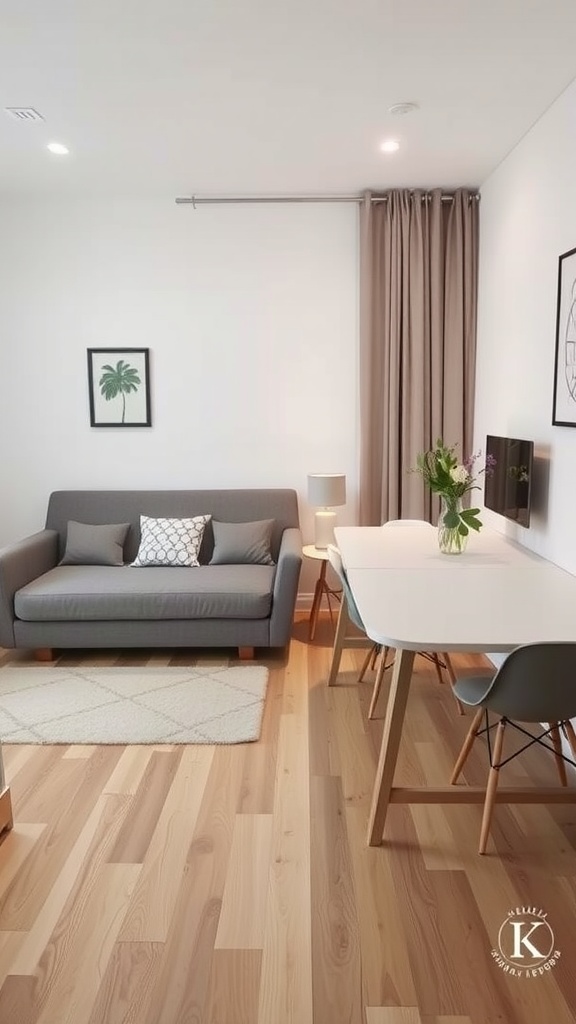
6. Furniture on Legs
A detail worth deliberately specifying: pieces raised on visible legs let the floor run continuously underneath, which reads as noticeably more space than the identical item sitting flush to the ground.
It's why mid-century furniture suits studios so well — the raised, slim-legged forms were designed for compact post-war apartments facing exactly this problem.
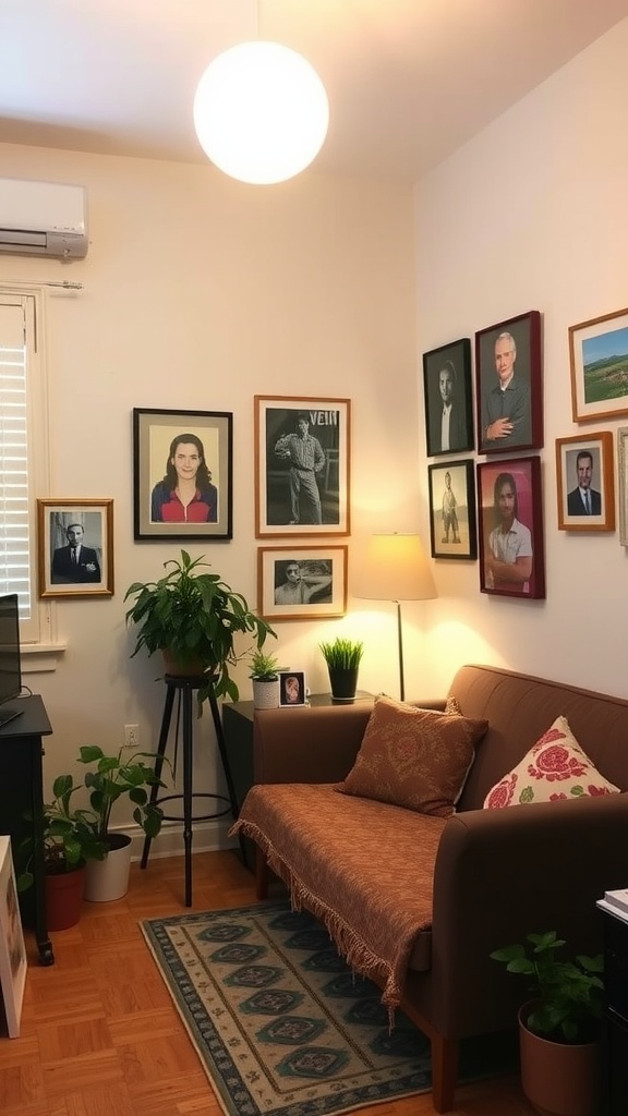
7. Personality Without Footprint
Minimal doesn't have to mean anonymous, and in a studio the walls are where personality can live for free. Framed photographs and art occupy no floor and can also reinforce zoning — a gallery above the sofa marks that area as the living zone.
Hang so the cluster's centre sits around 145–150 cm from the floor, and keep the framing consistent so a collection reads as curated rather than accumulated.
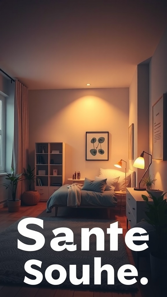
8. Warm Light in the Sleeping Zone
The sleeping area needs its own light that you can use without illuminating the whole apartment — a bedside lamp or a wall light at 2700 K or lower, ideally dimmable.
This is genuinely functional in a studio. Warm, low light in the evening supports winding down, and being able to light only the bed area signals to your brain that the apartment has shifted from daytime mode to night.
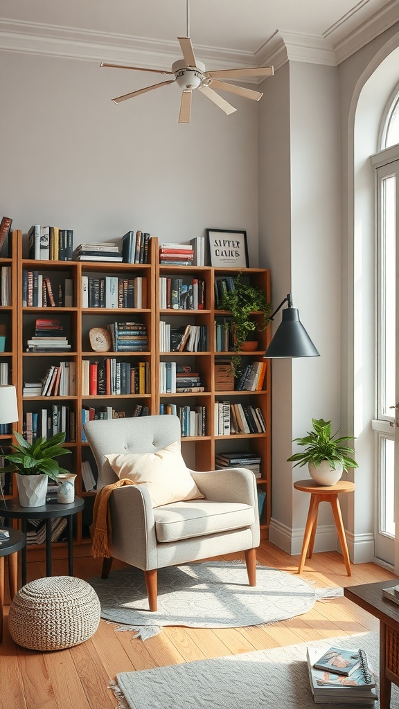
9. A Retreat Nook
The most valuable square metre in a studio. A single chair with its own lamp and a few books — positioned facing away from the bed and the desk — gives you somewhere that isn't associated with sleeping or working.
In a house you get that change of scene by walking into another room. In a studio you have to build it, and it's worth the floor space it costs.
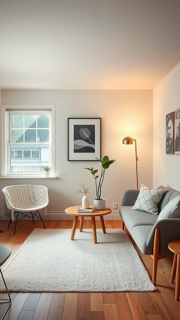
10. Restraint, Held Deliberately
A few well-chosen pieces with space around them beat a room filled to capacity. In a studio this isn't a style choice so much as a requirement — there's no overflow storage, so what you own is what you see.
A round coffee table is a small but useful detail here: with no corners to catch, it suits tight circulation better than a rectangular one and makes the walkway around it feel more generous.
Modern studio FAQ
How do I stop a modern studio feeling cold? Three additions fix nearly every case: warm wood, layered natural textiles and 2700 K lighting. Cold modern interiors almost always fail on those rather than on the furniture itself.
What colours suit a modern studio? A warm neutral base — oatmeal, clay, soft peach or warm greige — with natural wood, plus one saturated accent repeated a few times. Keep the whole apartment to three or four colours, since you see every zone at once.
How do I host guests in a studio? Plan for flexible seating: a pouf or two that store away, a nesting side table, and floor cushions. If people stay over, the sofa needs to be genuinely comfortable to sleep on — test it before buying rather than assuming.
How do I work from home in a studio without it taking over? Give the desk a clear boundary — a rug, a screen, or position it against a shelving unit — and light it separately so you can switch the workspace off visually at the end of the day. Clearing the desk each evening matters more than its size.
Is minimalism necessary in a studio? Some version of it, yes. Not as an aesthetic, but because there's no spare room absorbing overflow. A one-in-one-out habit is what keeps a studio from gradually filling until it feels half its actual size.
Common modern studio mistakes
- Minimal but cold — clean lines without wood, texture and warm light produce an office, not a home.
- Cool grey base palette — the default in new-build studios and the most common reason they feel unwelcoming.
- Furniture flush to the floor — visible legs make the same room read more spacious.
- No retreat spot — with nowhere to go, a studio needs at least one area not associated with sleeping or working.
- Visible cables and clutter — in one room, there's nowhere for either to hide.
Final thought
A modern studio succeeds by subtraction and then careful addition: strip back to clean lines and hidden storage, then deliberately add warmth through wood, texture and low warm light. Build one corner that's purely for relaxing, keep the palette to a warm few, and hold the one-in-one-out line. Do that and a single room can feel considered rather than compromised.

Sources & principles referenced
- Modernist design principles (clean lines, function-first, negative space) applied to compact dwellings.
- Warm versus cool base palettes and light reflectance.
- Vertical emphasis and visible-leg furniture for perceived space.
- Mid-century furniture design for post-war compact apartments.
- Layered warm lighting (2700 K, dimmers) and zone-independent switching.
- Evening light and wind-down cues.
- Art hanging height (145–150 cm centre).
- One-in-one-out decluttering and frequency-based storage.
- The 60-30-10 colour rule.