
Color does more work in a bathroom than in any other room, because there's so little else: a few fixtures, some tile, a mirror and towels. Pick the palette well and a builder-grade bathroom looks designed; pick it badly and even expensive tile looks dated. These 25 bathroom color ideas — black and gold, black and white, grey and bold color — start with three tools designers use to choose and balance color in small rooms, then show how each palette works in practice.
Tool 1: the 60-30-10 rule
The 60-30-10 rule divides a room's colors into a dominant color for about 60% (walls, large tile areas), a secondary color for about 30% (vanity, floor, shower curtain) and an accent for about 10% (towels, hardware, accessories). In a black and gold bathroom, that might be white walls (60), black vanity and floor (30) and brass fixtures (10). The rule keeps a bold palette from overwhelming a small room — and tells you where the boldest color belongs: in the 10%.
Tool 2: light reflectance value
Every paint color has a light reflectance value (LRV) on a scale from 0 (black) to 100 (white), and colors below about 50 read as dark. High-LRV colors bounce light and make a small bathroom feel larger; low-LRV colors absorb light and make a room feel enclosed and intimate. That isn't a reason to avoid dark colors — it's a reason to choose them deliberately: a dark powder room can feel like a jewel box; a dark bathroom with no window and one weak light just feels dark. Check a color's LRV on the paint chip before you buy.
Tool 3: finishes that live with water
Metal finishes look different after a year of use. Matte black hides fingerprints well but shows hard-water spots and mineral film; satin and brushed brass diffuse light, look warm and are more forgiving of water spots and splatter. If your water is hard, factor in how much wiping you're willing to do. Use satin or semi-gloss paint in bathrooms with a shower — it wipes clean — and keep flat paint for powder rooms.
25 bathroom color ideas — and why each one works
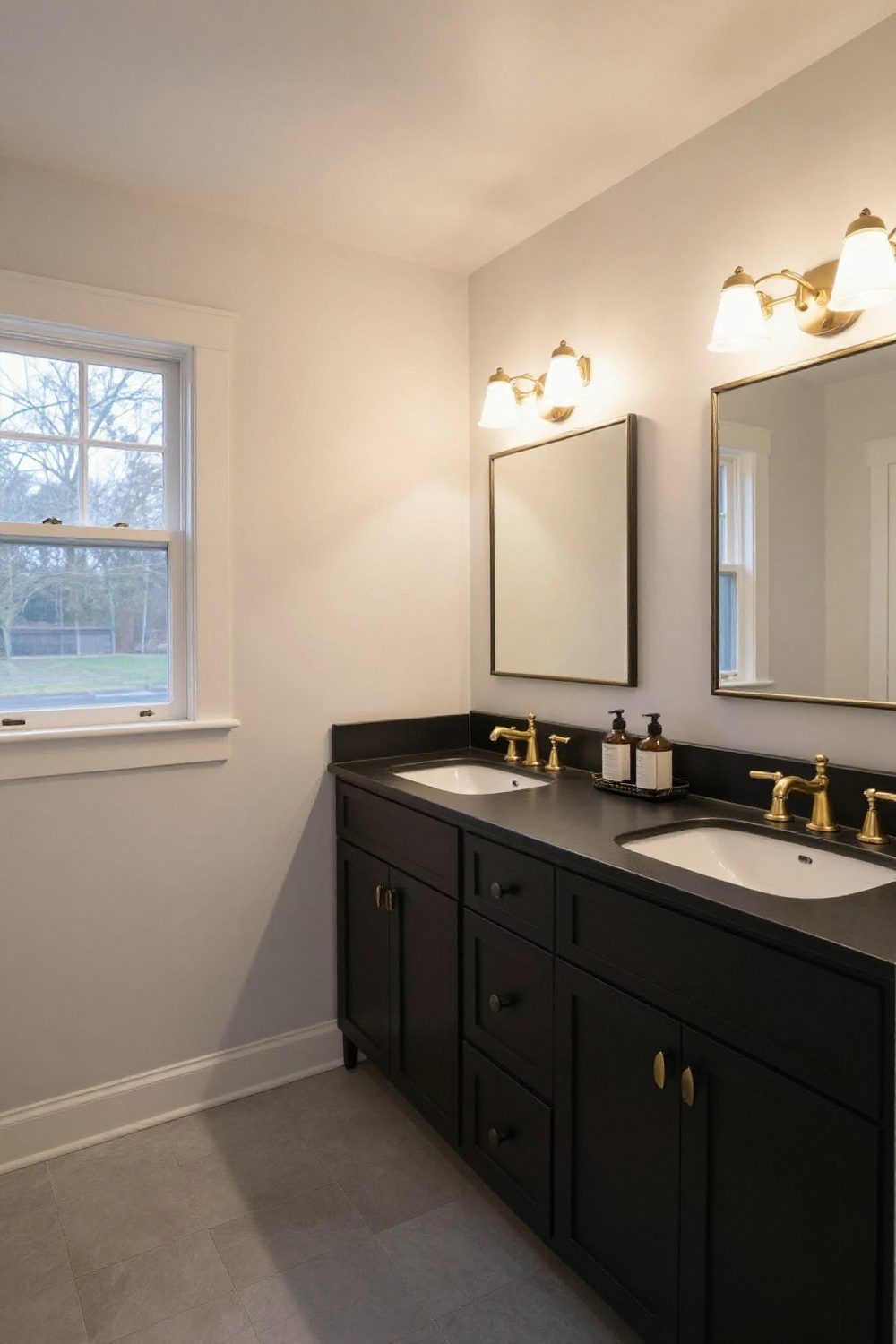
1. Black and gold on white
White walls, a black vanity and brushed brass fixtures is the classic black and gold bathroom, following 60-30-10 almost exactly. It's dramatic but still bright.
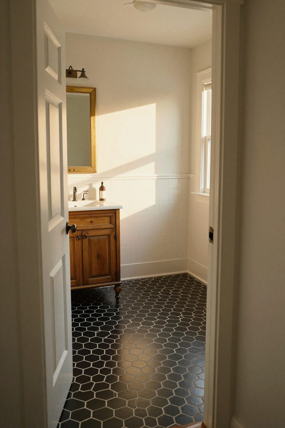
2. Black floor, light walls
Putting black on the floor grounds the room and keeps the walls light. A black hexagon or penny tile adds pattern without color.
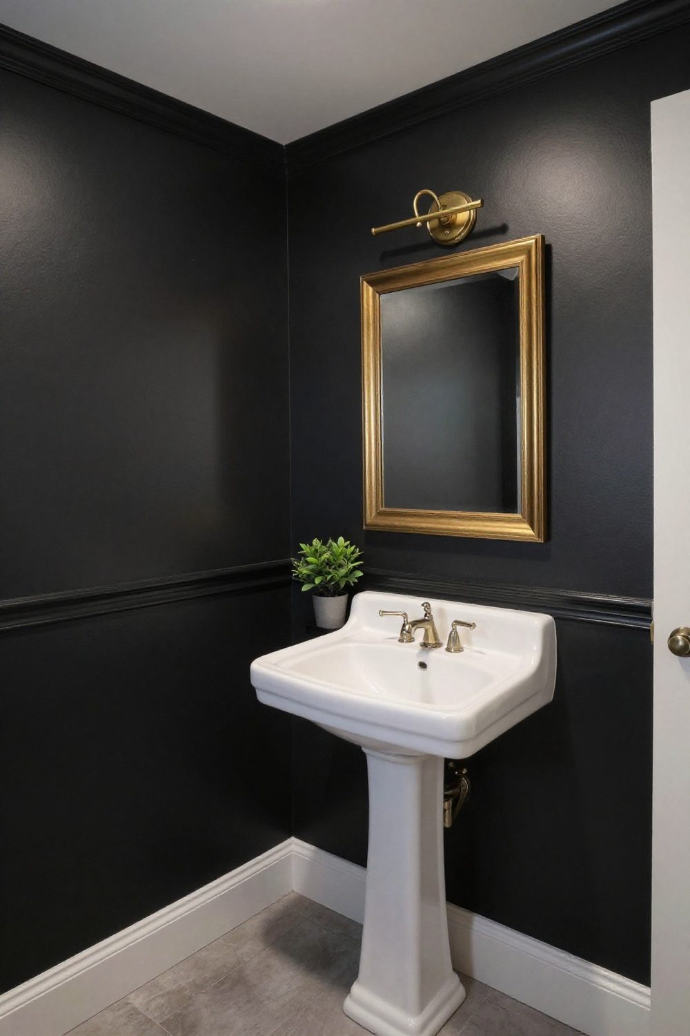
3. All-black powder room
A powder room with no shower can take black walls. Brass lights and a brass-framed mirror glow against the dark, and the room feels like a jewel box.
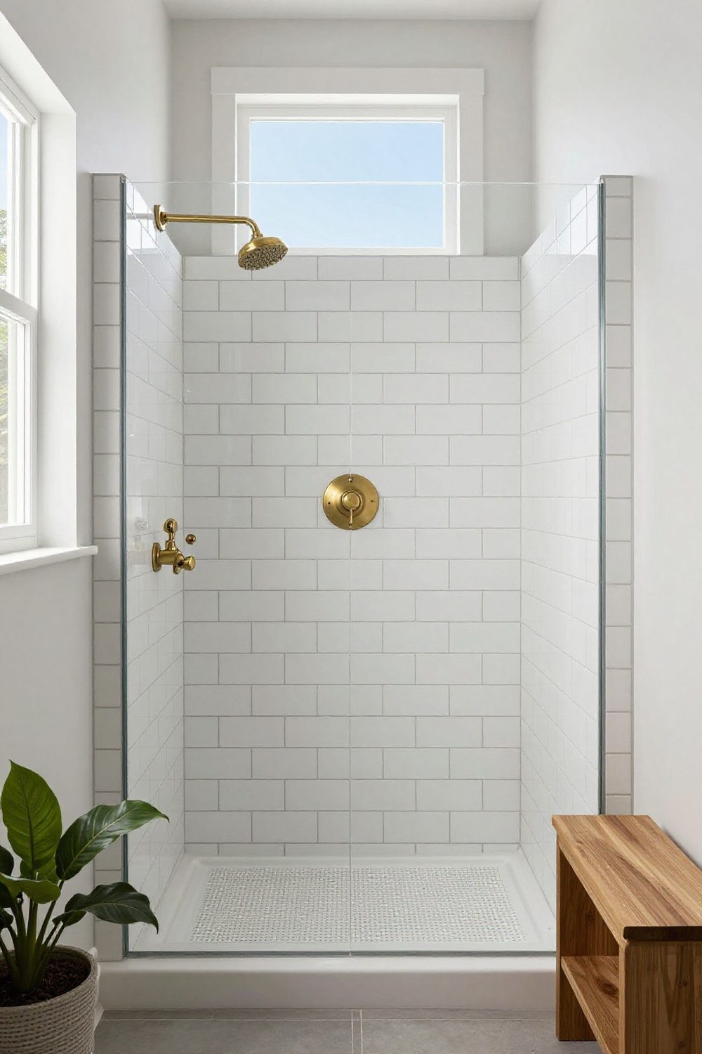
4. Brass in a white shower
White subway tile with brushed brass shower fixtures brings the gold half of the palette into the shower; for more contrast, choose charcoal grout so every tile is outlined.
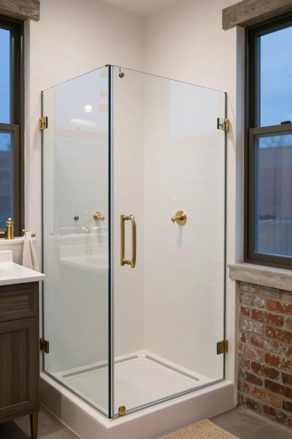
5. A framed shower screen
A thin metal frame on a glass shower enclosure draws crisp lines through a white bathroom. Brass frames warm the room; black frames sharpen it — match whichever metal the faucets use.
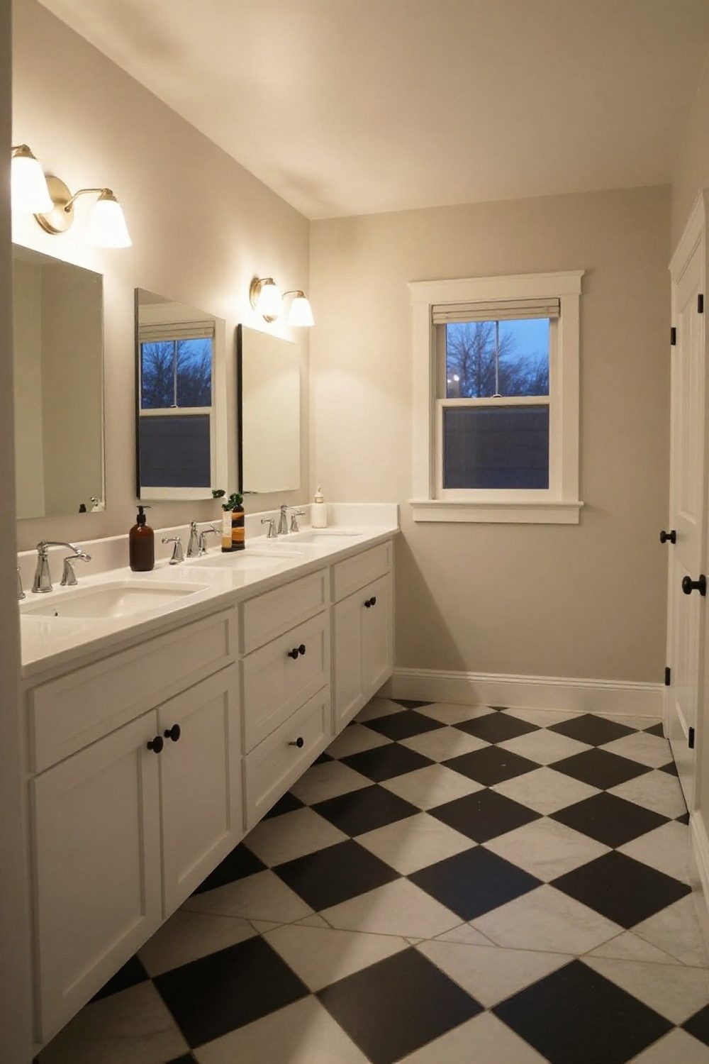
6. Black and white checkerboard
A black and white checkerboard floor is a timeless bathroom choice. Keep walls white and fixtures simple, and add one plant for life.
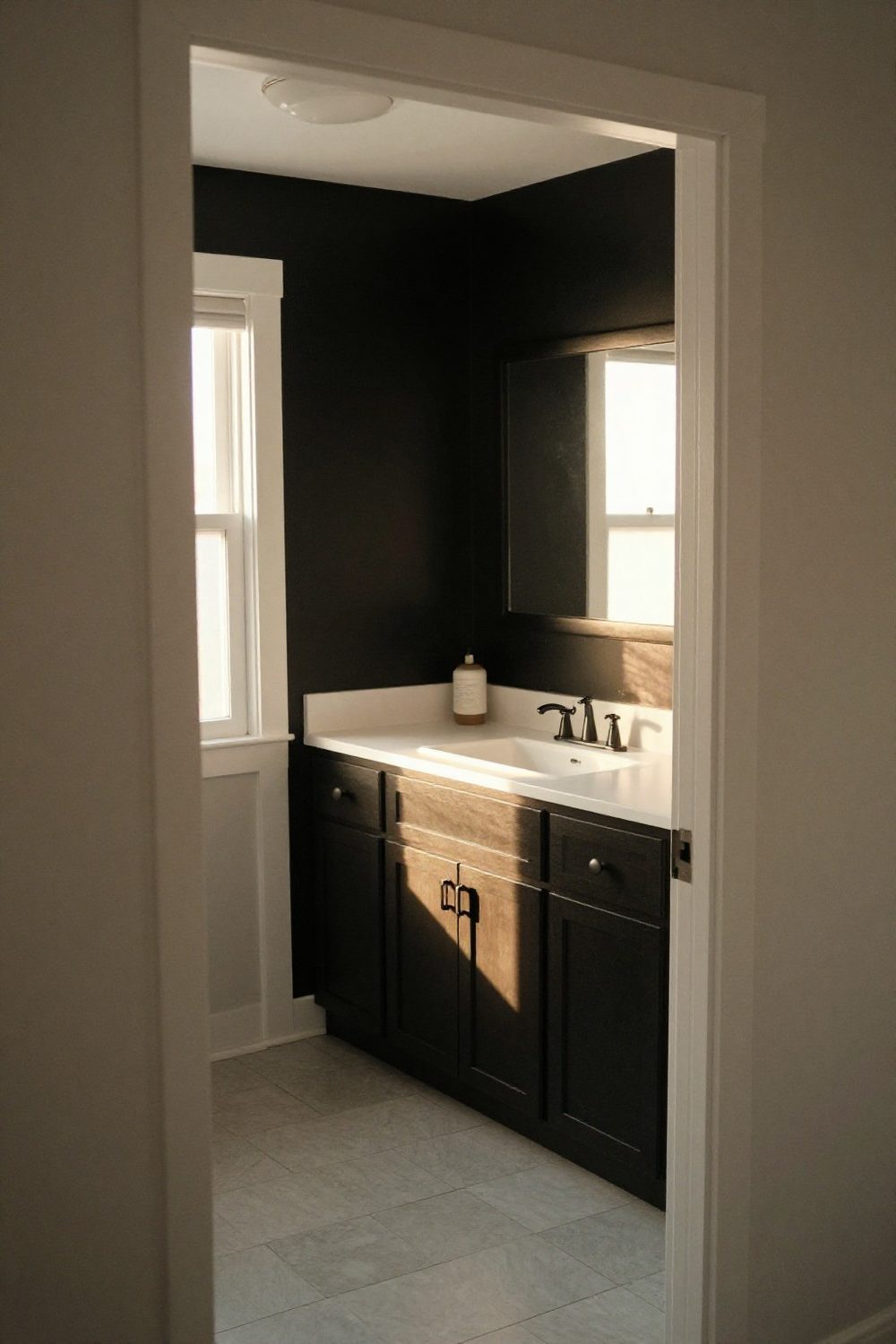
7. One black wall
Painting just the vanity wall black creates a focal point and makes white fixtures and a mirror pop. The other walls stay light.
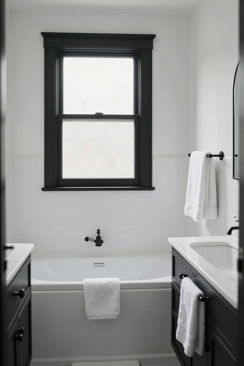
8. Black as an outline
Using black only for lines — window frame, mirror frame, hardware, light fixtures — gives a white bathroom definition without heaviness.
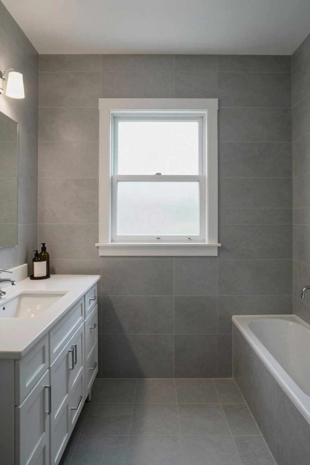
9. Soft grey and white
Light grey tile with white fixtures is calm and forgiving. Choose warm greys with a hint of beige if the bathroom lacks daylight.
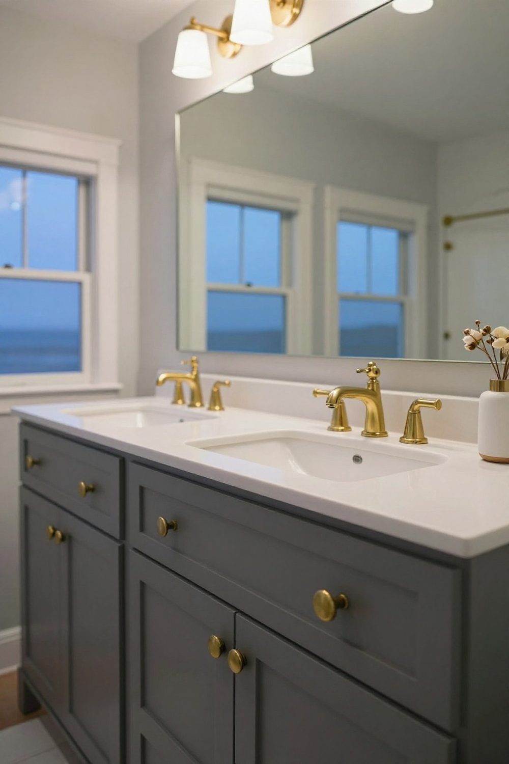
10. Charcoal and brass
A charcoal vanity with brass pulls is a softer alternative to black and gold — same drama, less contrast.

11. Black and grey, layered
Layering several greys with black fixtures creates a moody, modern bathroom. Mix tile textures so the room doesn't flatten.
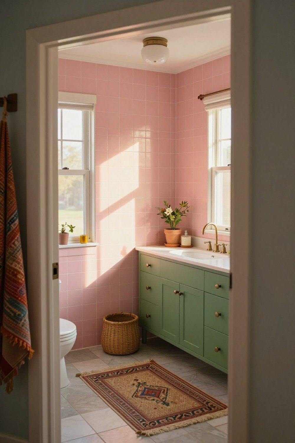
12. Pink and green
Pink and green is a bold but balanced pairing. Use one as the 60 and the other as the 30, with brass as the accent.
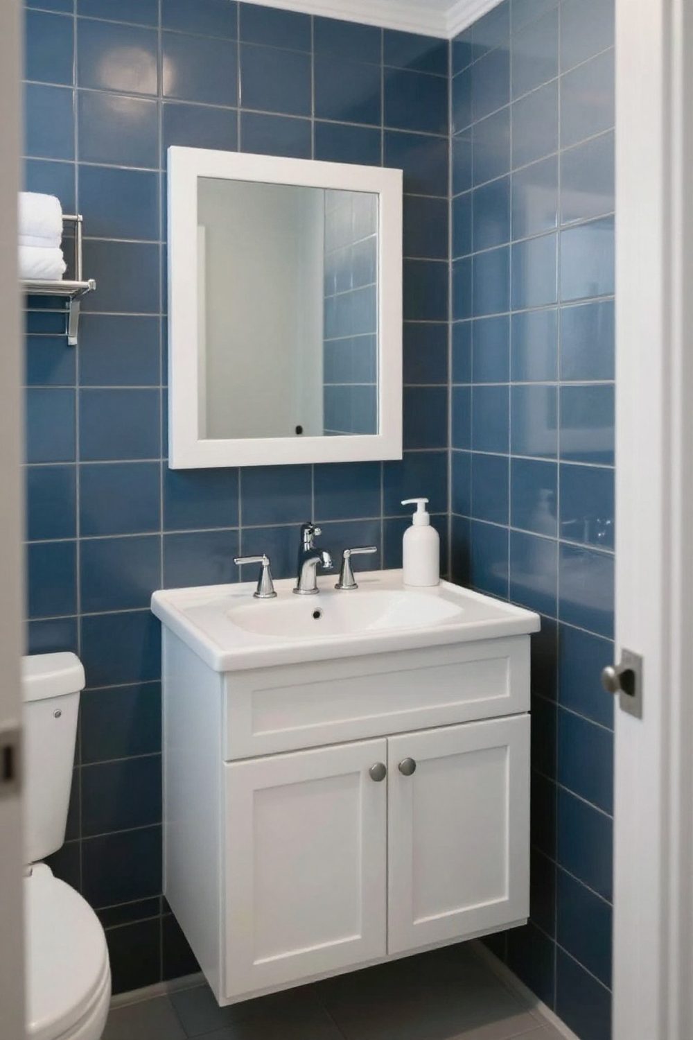
13. Deep blue tile
A deep blue tile wall gives a bathroom color that never feels sugary. Pair with white fixtures and brass or nickel.

14. Sage green and wood
Sage green walls with natural wood feel calm and spa-like. Sage pairs easily with both brass and black.
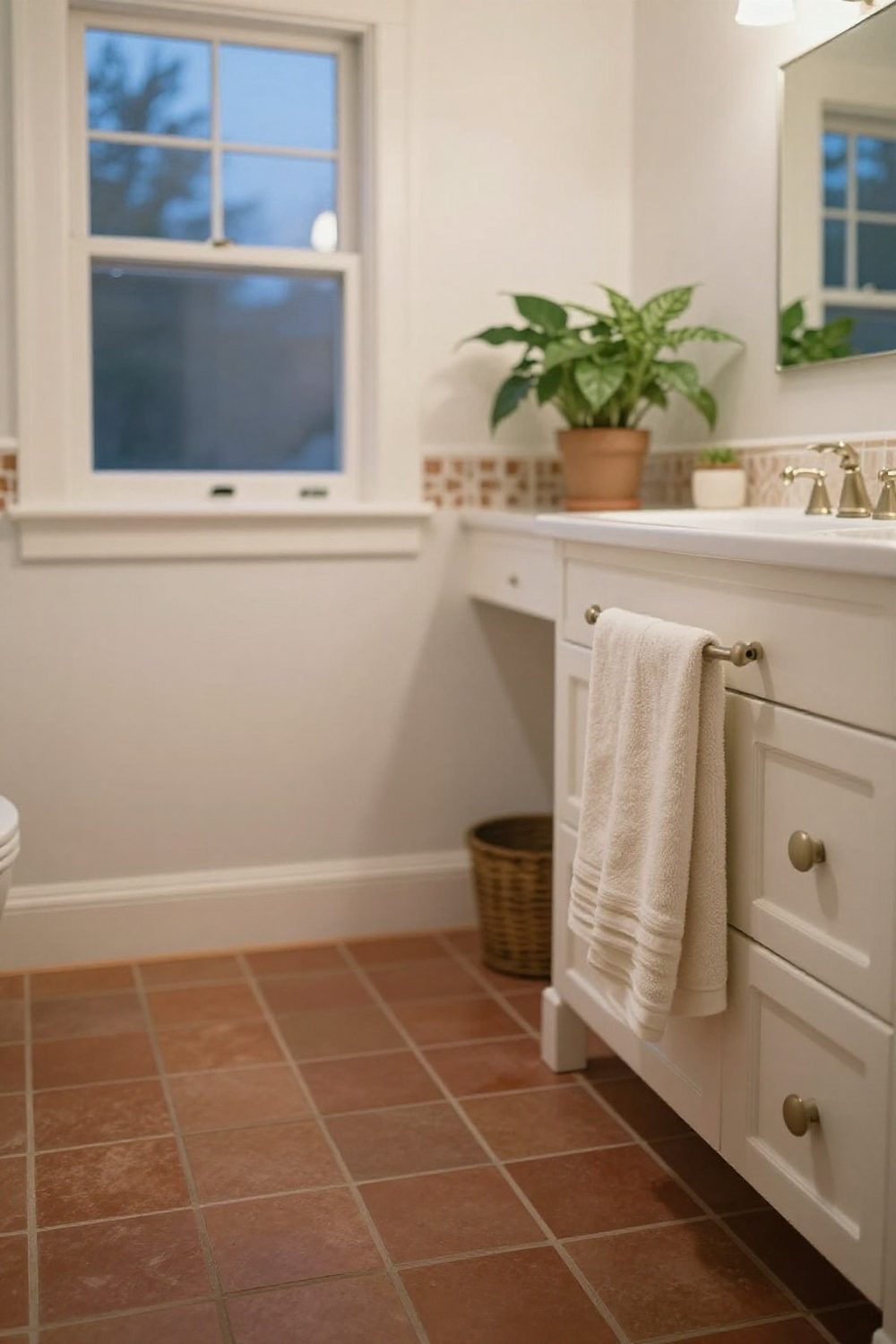
15. Warm terracotta
Terracotta floor or wall tile brings warmth and a Mediterranean feel. Keep walls light and add green plants.

16. A patterned cement tile floor
A multicolor patterned floor lets you bring in several colors at once. Pull one color from the pattern for the towels.

17. A colored vanity
Painting the vanity a bold color — yellow, green, navy — adds color that's easy to change later.

18. All white, many textures
An all-white bathroom works when textures vary: glossy tile, matte paint, linen, wood. Without texture, white looks clinical.
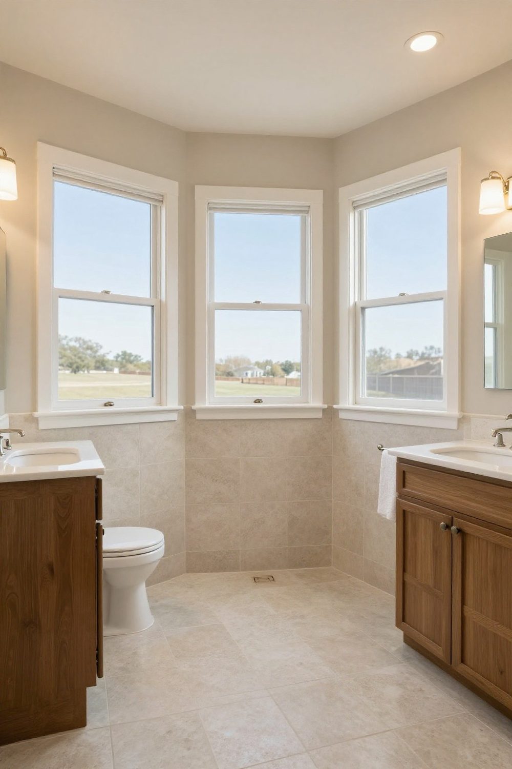
19. Warm neutrals
Cream, beige and travertine create a soft, warm bathroom. Brass fixtures suit warm neutrals better than chrome.
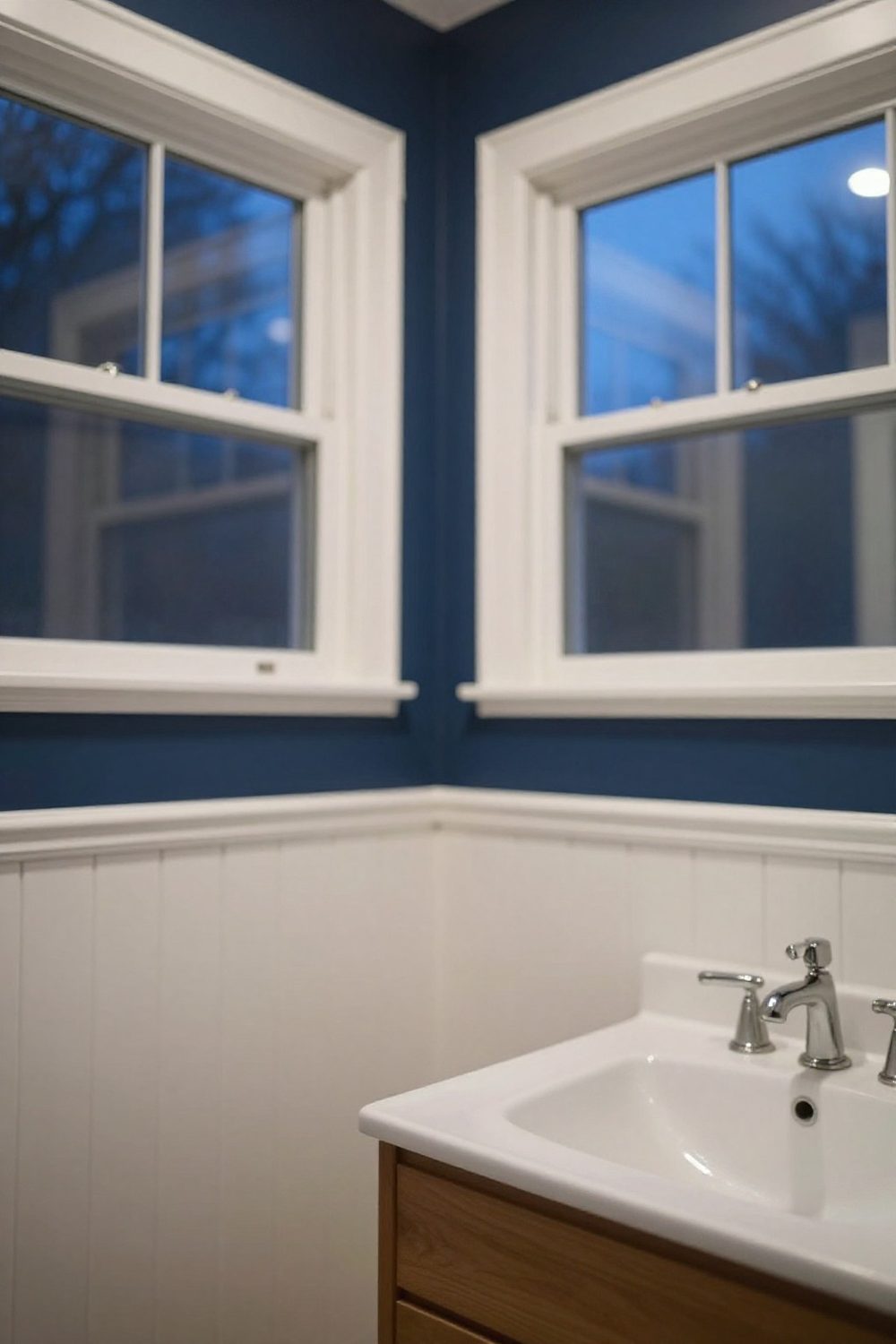
20. Navy over white wainscoting
Navy above white wainscoting is a classic pairing. The white lower wall keeps the room bright and protects against splashes.
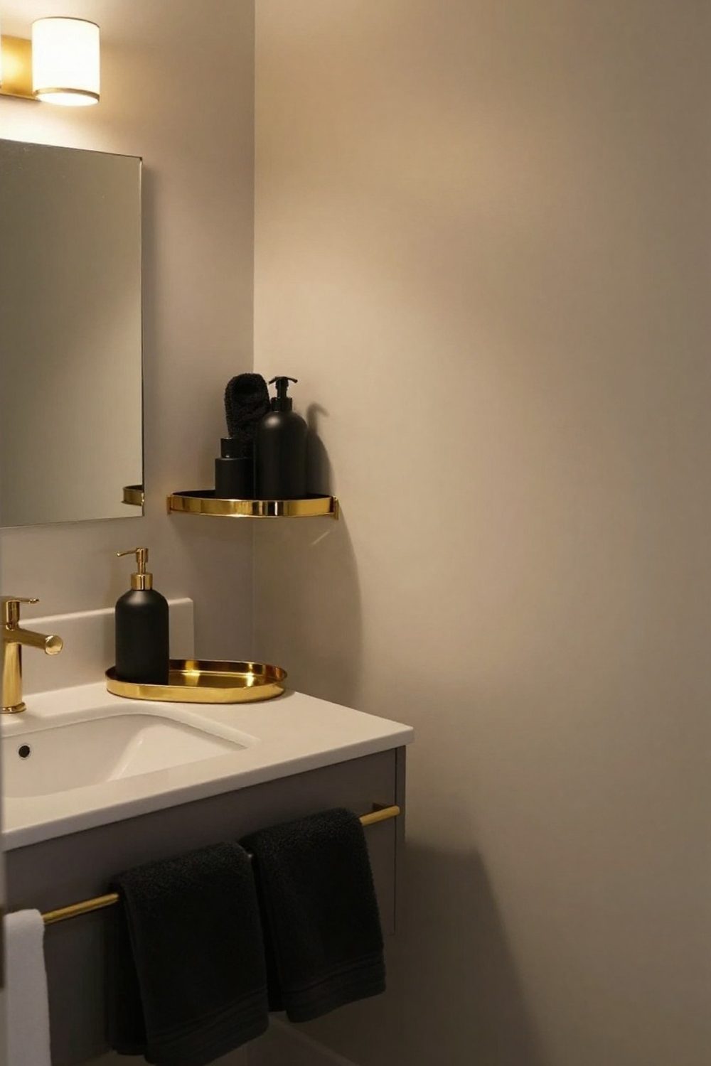
21. Black and gold — accessories only
For renters, black and gold can live entirely in accessories: black towels, a brass tray, a black soap dispenser and a gold mirror.
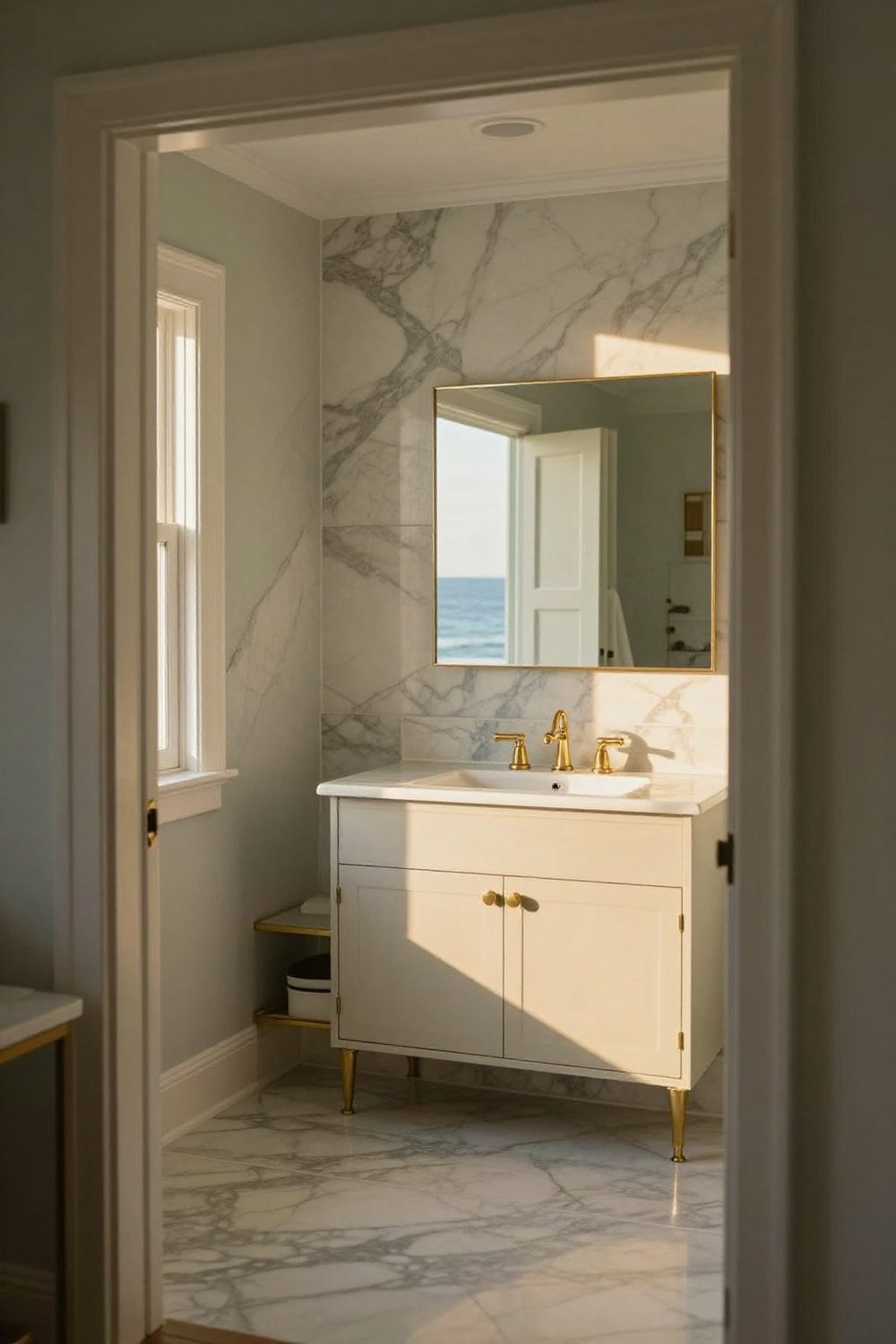
22. Marble with gold
White marble with grey veining and gold fixtures is the luxurious version of the palette. Marble-look porcelain gives the look with less maintenance.
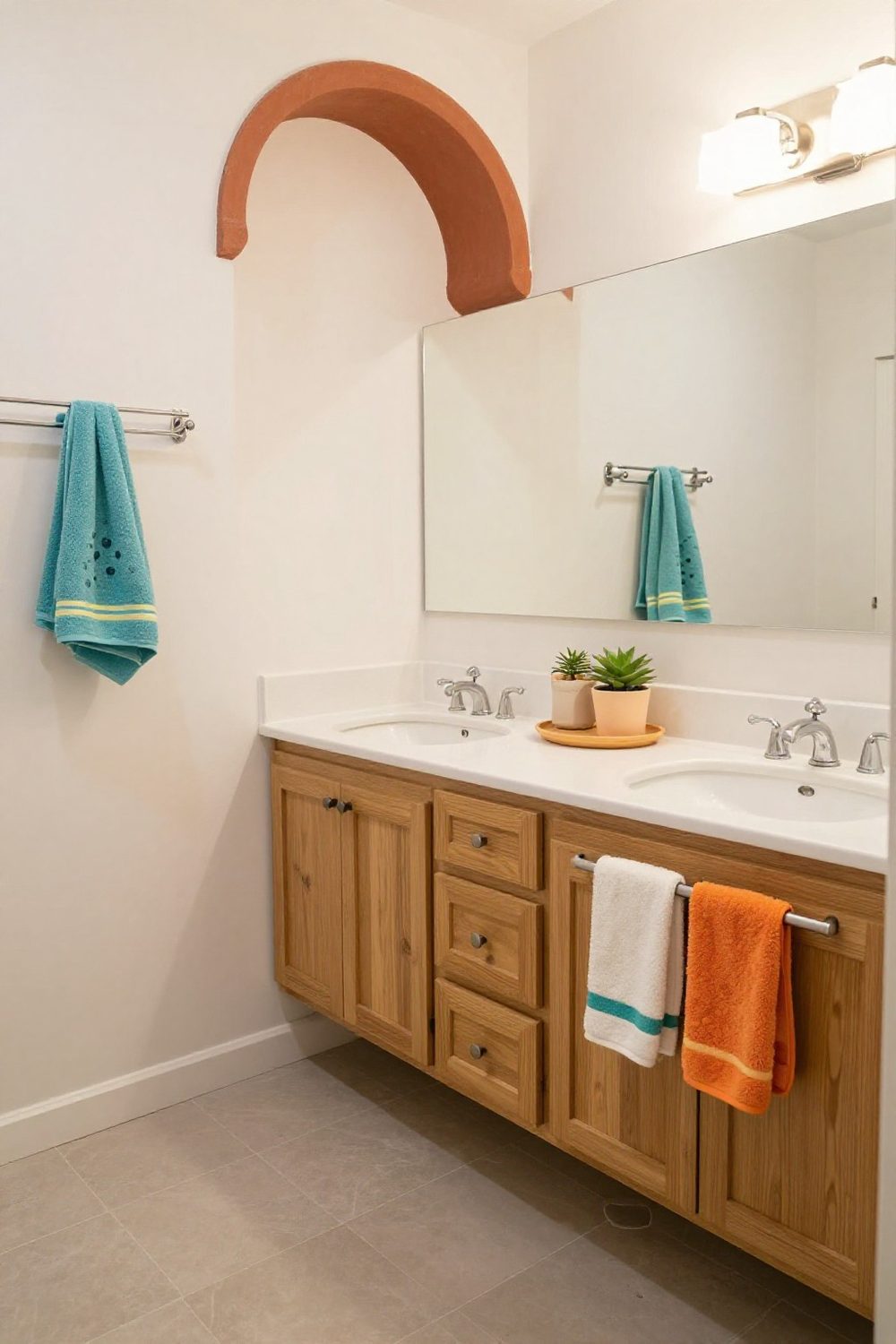
23. A bright kids' bathroom
Kids' bathrooms can carry bright colors in towels, bath mats and accessories while tile stays neutral — easy to update as they grow.

24. Olive and black
Olive green with matte black fixtures is earthy and modern. Wood accents keep it warm.

25. Light the dark palette warmly
Dark palettes depend on lighting. Warm, layered light on brass and black makes the room glow in the evening instead of feeling dim.
How to choose a bathroom color palette
- Start with what won't change — tile, tub, vanity.
- Assign 60-30-10 to walls, large pieces and accents.
- Check the LRV of wall colors against how much light the room gets.
- Choose one metal finish and use it everywhere.
- Test samples under the bathroom's own lights, day and night.
Common bathroom color mistakes
- Dark walls in a windowless room with one weak light.
- Mixing metal finishes at random.
- Flat paint in a steamy bathroom.
- Too many bold colors at once — keep the bold one to the 10%.
- Choosing paint under store lighting — test at home.
Final thought
A bathroom's color palette is mostly a question of proportion, light and finish. Give the dominant color to the largest surfaces, the boldest to the smallest, check how much light the room actually gets, and choose a metal that suits your water and your patience for wiping. Black and gold, grey or full color — any of them will look deliberate.

Sources & principles referenced
- The 60-30-10 color rule — dominant, secondary and accent color proportions.
- Light reflectance value (LRV) — paint scale from 0 (black) to 100 (white); colors below about 50 read as dark.
- Fixture finish comparisons — matte black shows hard-water spots; satin and brushed brass are more forgiving.
Images in this article are AI-generated visualizations of each idea, not photographs of finished projects.