
Adding gold to a monochrome kitchen solves the one problem black and white can't solve on its own: coldness. Warm metal against high-contrast neutrals is why this combination reads as luxurious rather than clinical. But "gold" isn't a single colour, and choosing the wrong finish is the most common way these schemes go wrong. These 28 black, white and gold kitchen decor ideas come with the practical guidance on which metal to choose, how much to use, and where it actually earns its place.
Why gold works with black and white
Black and white are both cool, hard and high-contrast — visually striking but emotionally cold. Warm metal introduces the missing temperature without adding a competing colour, because metallics read as neutrals rather than hues. Gold also catches and reflects light, which adds movement and depth to a scheme that would otherwise sit flat. It's the same logic that made black, white and brass the signature palette of Art Deco a century ago.
"Gold" is at least four different finishes
This is the decision most people skip, and it matters more than quantity:
- Polished brass / bright gold — high shine, strongly yellow, unmistakably glamorous. Superb on lighting and decorative pieces; less forgiving on things you touch constantly, since it shows every fingerprint.
- Brushed or satin brass — the current default in kitchen design. Muted, warm and matte enough to hide marks, which makes it the practical choice for handles and taps.
- Champagne or soft gold — pale and slightly cool-leaning. It reads modern and subtle, and sits comfortably in a mostly-white kitchen.
- Antique or aged brass — darker and patinated, with a traditional, collected feel. It suits period kitchens and hides wear extremely well.
Unlacquered brass deserves a special mention: it's a living finish that darkens and patinas with handling. If you want a kitchen that develops character, it's wonderful. If you want it to look identical in five years, choose a lacquered or PVD-coated finish instead.
Commit to one metal family
The single most effective rule: pick one metal and use it consistently across handles, taps, lighting and accessories. Mixing brass with chrome and black steel in the same kitchen is what makes an expensive scheme look accidental. If you do want to mix, keep it to two metals with a clear hierarchy — one dominant, one as a deliberate accent — rather than three or four scattered at random.
Gold is the 10%, not a third colour
Apply the 60-30-10 rule and let gold be the accent. In practice: black and white handle the large surfaces (cabinets, worktops, walls, floor), while gold appears in hardware, the tap, light fittings and a few small objects. When gold expands into large surfaces — gold splashbacks, gold-fronted cabinetry — the effect tips quickly from elegant into ostentatious.
Where gold delivers the most
If you're spending selectively, the priority order is clear. Hardware comes first: handles are cheap, easy to change, and you touch and see them constantly. The tap is second, being a focal point at eye level. Lighting is third, since a warm metal fitting glows beautifully against a monochrome backdrop. Everything else — trays, frames, small accessories — is optional layering.
28 black, white and gold kitchen ideas — and why each works

1. Patterned Tiles with Gold Accents
Monochrome pattern supplies the drama while gold warms it. Keep the metal to hardware and fittings so the tile remains the focal point rather than competing with it.
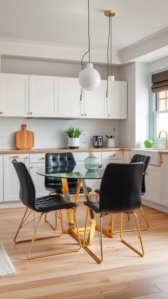
2. A Gold-Framed Dining Table
Glass and slim gold framing feels light rather than heavy, which matters in an open-plan kitchen. Black chairs anchor it and tie the dining zone back to the kitchen.

3. Gold Accessories
Utensils, canisters and small pieces are the easiest way to test the palette before committing to fittings. They're also simple to change if the trend moves on.

4. Black Cabinets with Gold Handles
The defining combination of this whole palette. The contrast is maximal, the warmth is immediate, and swapping handles is one of the cheapest transformations in any kitchen.

5. Gold-Framed Art
Monochrome artwork in a warm frame lets you introduce the metal at eye level without touching the fittings. Frame under glass so it survives kitchen conditions.

6. A Black Backsplash
Inverting the usual arrangement — dark splashback against white cabinets — gives you drama at worktop level. A wooden floor keeps the whole scheme grounded and warm.

7. White Worktops Against Black
Pale worktops are the practical half of this palette — they show crumbs and spills far less than dark stone, which is genuinely relevant in a kitchen you cook in daily.

8. Gold Pendant Lights
Warm metal fittings glow against a monochrome backdrop and become the room's jewellery. Hang them 75–90 cm above the worktop for the right proportion and useful light.

9. Simple Gold Knobs
Small, restrained hardware suits minimal cabinetry better than long bar pulls. Choose brushed rather than polished for anything handled daily — fingerprints are relentless on shiny brass.

10. Monochrome Utensil Storage
Matching your everyday tools to the palette turns necessary clutter into deliberate styling. Black utensils in a white holder read as intentional rather than accidental.

11. Wood Among the Metal
Wooden boards add a second kind of warmth that metal alone can't provide. Wood and brass together are what make this palette feel welcoming rather than showy.

12. Monochrome Cookware on Display
If your pans match the scheme, open shelving becomes decor rather than clutter. Wooden shelves supply the warm counterpoint to all that black and white.

13. Gold Shelf Brackets
Slim metal brackets add the accent structurally rather than decoratively. It's a subtle detail that reads as considered design rather than added ornament.

14. A Black Island with Gold Stools
The island is the natural home for the boldest version of this palette. Allow about 60 cm per stool and check the overhang — 30 cm knee room at standard counter height.

15. A Black-and-Brass Range
A statement cooker with brass trim becomes the room's centrepiece and justifies carrying the metal through the rest of the scheme. Expensive, but genuinely anchoring.

16. Patterned Textiles
Curtains and fabrics carry the monochrome pattern softly and improve the acoustics of a hard-surfaced room. They're also the cheapest element to change seasonally.

17. Flowers in a Black Vase
White blooms in a black vessel keep strictly to the palette while adding life. It's the most affordable way to make a monochrome kitchen feel cared for.

18. A Gold Wall Clock
Useful when you're timing food and a strong graphic shape against a dark wall. One well-scaled object fills wall space more elegantly than several small ones.

19. Consistent Brass Throughout
Repeating the same metal across handles, tap and lighting is what makes a scheme look professionally designed. Consistency matters more here than the specific shade you pick.

20. A Graphic Rug
A monochrome rug adds pattern underfoot and softens the acoustics. It's also kinder to your back during long stretches at the worktop.

21. Artisan Black Ceramics
Handmade pieces bring slight irregularity and matte texture — exactly the imperfection a glossy, high-contrast scheme needs to feel human.

22. A Gold Tap
After hardware, the tap is where gold earns its keep — highly visible, at eye level, and used constantly. Choose brushed over polished, since taps are handled with wet hands all day.

23. Long Bar Pulls
Elongated handles emphasise horizontal lines and suit modern slab cabinetry. Their length also makes them a stronger accent than knobs on large drawer fronts.

24. A Warmer Eating Nook
Letting the dining corner run warmer — soft cushions, a hint of colour — makes a monochrome kitchen far more liveable. Zoning by temperature works beautifully.

25. A Bar Cart
A black-and-gold cart is a self-contained piece of the palette that needs no installation — and it can move to wherever you're entertaining.

26. Gold-Framed Mirrors
Mirrors bounce light around a dark kitchen — genuinely useful when black surfaces are absorbing it. A matched pair also delivers instant symmetry.

27. Decorative Bowls
Sculptural objects in the palette give the worktop a focal point that isn't an appliance. Group in odd numbers and vary the heights.

28. A Statement Pantry Door
Doors are an overlooked surface. A black door with gold hardware turns a purely functional element into part of the design scheme.

Bonus: Black, White, Gold and Wood
The complete formula. Wood is the fourth element that turns a striking palette into a genuinely warm kitchen — and it's the one most people leave out.
Black, white and gold FAQ
Which gold finish should I choose for handles and taps? Brushed or satin brass. It's warm, hides fingerprints and water marks, and suits both modern and traditional cabinetry. Save polished brass for lighting and decorative pieces you don't handle constantly.
Can I mix gold with black hardware? Yes, if it's deliberate and hierarchical — for example black window frames and appliances with brass handles and tap. What doesn't work is three or four metals scattered randomly with no dominant choice.
Will gold hardware date? Brass has moved in and out of fashion for a century but has never truly disappeared, largely because warm metal solves a real problem in cool schemes. Hardware is also among the cheapest things to change, so it's a low-risk commitment either way.
How much gold is too much? Once it moves beyond roughly 10% of the scheme — onto large surfaces like splashbacks or cabinet fronts — it stops reading as an accent. Gold works because it's rationed.
What is unlacquered brass and should I use it? It's brass with no protective coating, so it darkens and patinas with handling. Choose it if you like a living finish that changes over time; avoid it if you want the tap to look the same in five years as it did on day one.
Common mistakes
- Mixing several metals with no hierarchy — the fastest way to make an expensive kitchen look uncoordinated.
- Polished brass on handles and taps — beautiful in photos, a fingerprint magnet in daily use.
- Too much gold — beyond about 10% it reads ostentatious rather than elegant.
- Forgetting wood — metal alone doesn't fully warm a monochrome kitchen; timber does.
Final thought
Black, white and gold works because each element does a specific job: black provides drama, white provides light, and gold provides the warmth the other two lack. Choose one metal finish, use it consistently, keep it to the 10%, and add wood — and you'll get a kitchen that looks expensive without ever tipping into flashy.
Sources & principles referenced: metallic finish types (polished, brushed/satin, champagne, antique brass) and lacquered versus unlacquered/living finishes; fingerprint and water-mark behaviour by finish; metal consistency and hierarchy in interior schemes; the 60-30-10 accent rule; Art Deco's black-white-brass palette; pendant mounting height (75–90 cm) and bar-stool spacing (60 cm) with 30 cm counter-height knee room.