

Black is the boldest choice you can make in a bedroom — dramatic, cocooning and genuinely sophisticated. Handled well it feels like a luxury hotel; handled badly it feels like a cave. The difference is light, contrast and texture. These 30 black bedroom ideas show how to make it stunning.
Light it generously, and light it warm
Black absorbs almost everything that lands on it. A matte black wall returns something in the order of five per cent of the light that hits it, where a soft white returns around eighty. That single fact drives every other decision in a black bedroom: the room does not get to rely on one ceiling fitting.
Three separate sources is the working minimum — bedside lamps, something at the far side of the room, and either a wall wash or a shaded overhead. Keep them all warm, around 2700 K, and look for bulbs with a colour rendering index of 90 or above. Cheap low-CRI bulbs make black surfaces look grey and slightly dirty rather than deep, and against black the difference is far more visible than it would be on a pale wall.
Put the light where it can graze a surface rather than fill the middle of the room. Light skimming down a black wall reveals its texture; light thrown across the space just gets swallowed.
Finish does more work than colour
Two blacks from the same tin can produce completely different rooms depending on sheen, and this is the part most people skip.
Matte black reads as depth. It absorbs, softens edges and makes a wall recede — good for the plane behind the bed, where you want the wall to disappear and the bed to be the object. Satin and gloss do the opposite: they catch light, hold a highlight and read as objects rather than voids — good on joinery, window frames, a door, a metal bed frame.
Mix them deliberately. An all-matte black room looks flat and slightly unfinished; an all-gloss one looks like a nightclub. The combination — matte on the large planes, satin on the details that frame them — is what produces the hotel effect people are actually after.
Practical note before you commit: black takes more coats than you expect, and it wants a tinted grey primer under it. Rolling black straight onto white will show every lap mark, and on a bedroom wall you will see them every morning.
Contrast and texture keep it from becoming a void
Black is not a decorating scheme by itself; it is a background that makes other things visible. Without something light in the room the eye has nowhere to rest and the space reads as closed rather than enveloping.
The partner does not need to be much. White bedding, a pale rug, brass hardware, a strip of natural oak — one clearly lighter element in each sightline is enough. Brass and warm metals work particularly well because they carry a highlight; chrome against black tends to read cold.
Texture does the rest. Velvet, boucle, linen, brushed wood, aged metal, matte ceramic — each one takes the same black and returns it differently, and it's that variation that makes the room look considered instead of painted. A black room with five textures reads rich. A black room with one reads like a wall you haven't finished.
30 black bedroom ideas — and why each works

1. Black Accent Wall
One black wall behind the bed is the safest, most dramatic way to use the colour.

2. Black & White Photography
Monochrome art brings black in graphically without darkening the room.

3. Black & White Contrast
High contrast is crisp and modern — white keeps black feeling intentional.

4. Black & Grey Minimalism
Grey softens the jump from black to white for a calmer minimalist scheme.

5. Black Canopy
A black frame with white sheers is dramatic yet airy — the best of both.

6. Black & Gold
Gold is black's classic warm partner — together they read pure luxury.

7. Black Furniture
Black furniture adds drama as an accent while the walls stay light.

8. Black Rug
A black rug grounds the room from below without darkening the whole space.

9. Black Velvet Bedding
Velvet gives black richness and warmth — texture is what saves an all-black bed.

10. Black & Silver
Silver hardware gives black a sleek, contemporary edge.

11. Black & Wood
Warm wood is the natural antidote to black's coolness, making it cosy.

12. Black Window Treatments
Black frames the view and controls light while keeping the room bright by day.
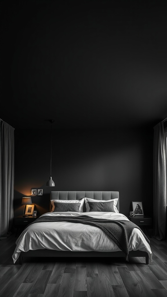
13. Black Ceiling
A black ceiling is unexpectedly cocooning — keep the walls light to balance it.

14. Black Light Fixtures
Black fixtures add graphic punctuation without committing the walls.

15. Vintage Black Furniture
Soft textures and warm light keep vintage black pieces cosy, not gloomy.

16. Black Reading Nook
Contained to a corner with warm light, black feels intimate and enveloping.

17. Black Floral Wallpaper
Pattern breaks up black into something rich and decorative rather than heavy.

18. Black Bedside Tables
Warm lamp light against black bedside pieces is exactly the lighting black needs.

19. Black Textured Wall
Texture stops a black wall from reading as a flat void.

20. Black Bed Frame
A black frame with soft grey bedding is dramatic yet easy to live with.

21. Statement Black Art
A bold black artwork anchors a white wall with graphic impact.

22. Layered Black Pillows
Varying textures in black adds depth so it never looks like one flat block.

23. Black with Greenery
Plants and daylight soften black, keeping a dark room feeling alive.
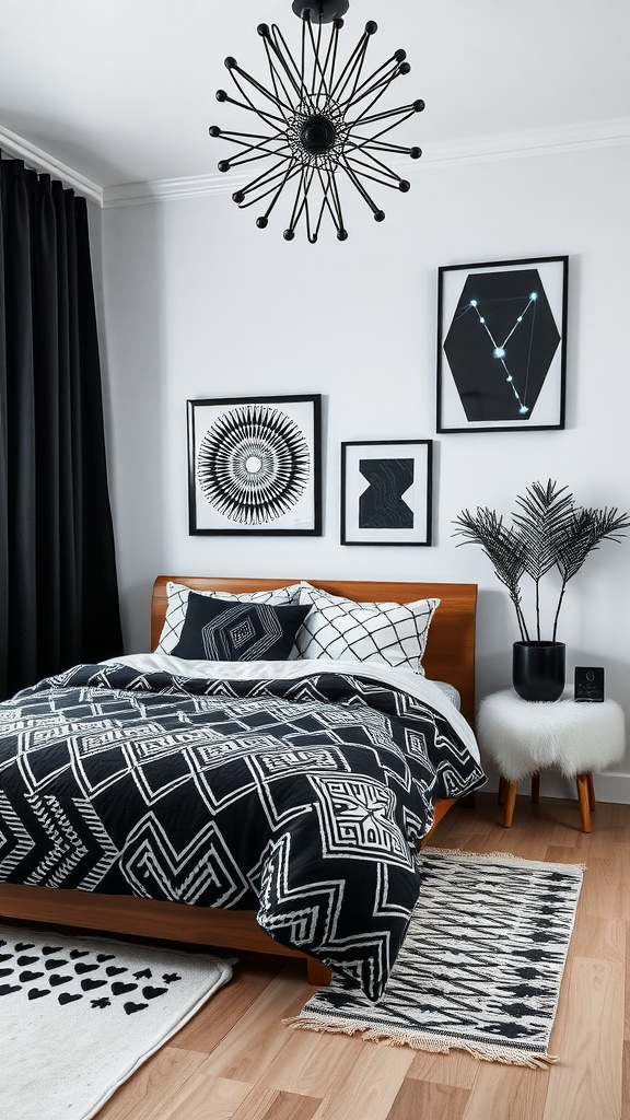
24. Black Geometric Patterns
Geometric black-on-white is crisp, modern and graphic.

25. Black & White Botanicals
Botanical prints bring black in softly, keeping the room serene.
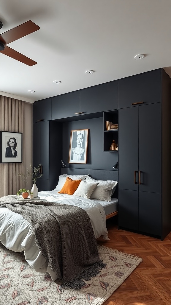
26. Black Storage
Black storage adds drama while warm wood floors keep it grounded.

27. Art Deco Black
Deco's gold and pattern make black feel opulent and deliberate.

28. Black Faux Fur
Soft, tactile black turns dramatic into warm and inviting.
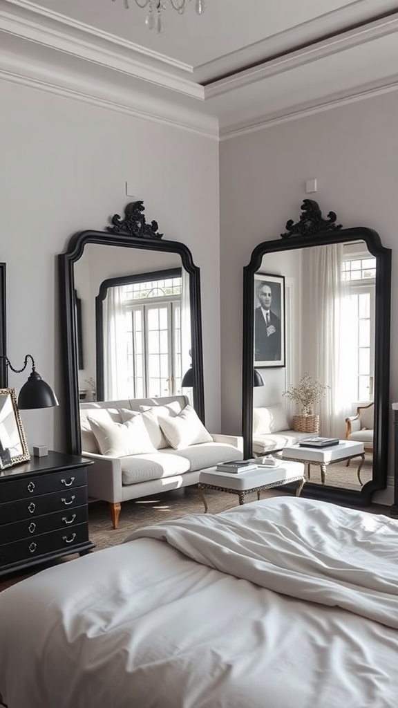
29. Black-Framed Mirrors
Black frames add definition while the mirror keeps the room bright and open.

30. Black & Pastels
Soft pastels are a surprising, playful foil that lightens black's mood.
How much black? Three levels of commitment
Almost every regret with a black bedroom comes from choosing the wrong level for the room you actually have, rather than from black itself. Pick your level before you buy anything.
Level one — accent. Black in the hardware, the lamp bases, the picture frames, the throw. Roughly a tenth of what you see. It sharpens a light room and costs nothing to undo. This is the right level for a small room with one window, where black on the walls would genuinely close the space in.
Level two — the anchored wall. The wall behind the bed in matte black, joinery and frames in satin, everything else pale. This is the highest-return option in most bedrooms: the bed becomes the focal point, the room gains depth, and the other three walls keep the light moving. It suits rooms with reasonable daylight and works even at modest sizes, because the black plane is behind you when you're in the bed.
Level three — full envelope. All four walls, often the ceiling too. Done properly this is the most restful version of the three — there are no edges for the eye to catch, so the room reads as one continuous space. But it demands the lighting plan in full, several textures, and honestly a window worth having. In a north-facing box room it produces exactly the cave everyone warns about.
One rule spans all three: whatever level you choose, keep the floor and the ceiling from both going dark unless you're at level three deliberately. Dark above and below with pale walls between is the one combination that reliably feels oppressive.
Three combinations that reliably work
Black needs a partner, and the choice of partner sets the character of the room far more than the black does. Three combinations come up again and again because each solves a different problem.
Black, white and oak. The most forgiving version and the easiest to live with. Matte black behind the bed, white bedding, oak in the floor, frame or nightstops — the wood keeps the contrast from turning graphic and stops the room reading as a monochrome set. This is the one to choose if you're nervous, because the wood does the warming for you.
Black, brass and deep green. The richest of the three and the closest to the hotel look. Black on the walls, unlacquered or antique brass in the lighting and hardware, and a green — forest, olive, something with real depth — in the headboard or curtains. Green sits next to black without competing for attention the way blue or red will, and brass supplies the highlight that stops the whole thing going matte.
Black, cream and clay. The softest, and the best answer if you like black but not drama. Swap pure white for cream and add a terracotta or clay tone in a rug or throw. The result reads warm and slightly aged rather than sharp — closer to a farmhouse than a gallery, but still anchored by the black.
What all three have in common: one dark anchor, one genuinely light element, one warm material. Keep that structure and you can substitute almost any colour into the third slot.
Common black-bedroom mistakes
One black wall chosen at random. Black on the wall you happen to face from the door, with nothing else in the room acknowledging it, reads as an accident. Black should sit behind the bed or frame something — it needs a reason.
Cool light. Bulbs at 4000 K and above turn warm black into a flat, bluish grey and make the whole room feel like a car park at night. This is the single most common failure and the cheapest to fix.
Matte everywhere. Without a satin or metallic element to catch a highlight, the room has no sparkle and photographs as a dark rectangle.
No light-toned partner. Black plus dark grey plus charcoal is not contrast, it's mud. Something has to be genuinely light.
Ignoring the practical side. Black bedding shows lint, dust and pet hair far more than any other colour, and matte black paint scuffs where it meets a bedframe. Neither is a reason not to do it — both are reasons to choose the finish and fabric with your actual life in mind.
Final thought
Black is the most dramatic colour a bedroom can wear and the most rewarding when it's handled properly. Light it warmly and from several directions, mix matte planes with satin details, give it one genuinely light partner and as many textures as you can justify.
Get that right and black stops being a bold choice at all — it becomes the quietest room in the house, the one where the walls stop demanding attention and you actually sleep.

Sources & principles referenced
- Light reflectance of matte black surfaces (around 5%) against soft white (around 80%) as the basis for the lighting load.
- Warm 2700 K lamps at CRI 90 or above, and why low-CRI light makes black read grey.
- Grazing light along a surface versus fill light across a room.
- Sheen levels: matte for recessive planes, satin and gloss for framing details and joinery.
- Tinted grey primer under black paint, and lap marks on insufficiently primed walls.
- Warm metals against black versus cool chrome.
- Texture variation as the substitute for colour variation in a monochrome room.
- Levels of commitment — accent, single anchored wall, full envelope — matched to daylight and room size.