

An earthy bedroom isn't just a beige one. The look works because it borrows from how being in nature actually makes us feel — grounded, calm, unhurried — and it does that through specific means: the pigments of soil and stone, genuine natural materials, and a real connection to the outdoors. These 33 earthy bedroom ideas are organised around those means, so you end up with a room that feels like a retreat rather than one that just happens to be brown.
Earthy isn't "beige" — it's the palette of the natural world
The most common mistake is treating "earthy" as a synonym for bland neutrals. It isn't. Earthy colour is drawn from the ground and the landscape: terracotta and clay, ochre and mustard, olive and sage green, warm browns and taupe, sand and stone, rust and umber. These are richer and more varied than plain beige, and crucially they're the colours of natural pigments — the same iron oxides and earth minerals used in paint for millennia. That's why they feel timeless and calming: we're wired to read them as safe and natural.
The one rule that ties them together is warm undertones. Earth tones share a warmth, so they mix freely with each other — terracotta, olive and sand sit together happily because they all lean warm. Introduce a cool, blue-grey neutral and it fights the whole palette. Stay in the warm earth family and you almost can't go wrong.
Natural materials do half the work
Earthy is as much about material as colour. The look leans on genuine natural substances — wood, stone, clay and ceramic, jute and sisal, rattan and cane, linen and cotton, wool, leather — because they bring the real textures, imperfections and variation of the outside world indoors. A room painted in earth tones but furnished in shiny synthetics misses the point; the same colours with real timber, a jute rug and a hand-thrown pot suddenly read authentic.
This is also why earthy overlaps so naturally with sustainable decorating. Reclaimed wood, natural fibres, handmade ceramics and low-VOC natural-pigment paints all serve the aesthetic and happen to be the greener choices — the look and the ethics point the same way.
Texture is the depth, because the palette is quiet
A calm, tonal earth palette has little colour contrast, so — as in any restrained scheme — texture becomes the main source of interest and depth. Layer the rough against the smooth: a chunky wool throw, nubby linen, a jute rug, smooth ceramic, grainy timber, a soft leather. The variation is what stops an earthy room reading flat and keeps it feeling rich and enveloping. When an earth-toned room looks dull, it's almost always short on texture rather than short on colour.
Bring nature in — actually, not just in colour
The aesthetic is rooted in biophilia — the idea that we feel calmer and better with a genuine connection to the natural world — so the most effective earthy rooms bring real nature inside, not just its colours. That means living plants, natural light, a view of greenery where possible, natural materials you can touch, and organic elements like stone, driftwood or dried grasses. Plants especially do double duty: they add the one fresh colour (green) the earth palette benefits from, and they make the biophilic connection literal. A room of earth tones with no living thing in it feels like a stage set; add plants and daylight and it becomes the restorative retreat the look promises.
Favour organic shapes and soft light
Two finishing principles complete the feel. Organic, rounded shapes — curved furniture, arched mirrors, irregular ceramics, a knobbly piece of driftwood — echo the forms of nature and feel calmer than hard geometry. And warm, soft lighting at 2700 K mimics the low golden light of dawn and dusk that the palette is built for; cool white light drains earth tones of their warmth and makes them look muddy. Keep the light layered and warm and the whole scheme glows.
33 earthy bedroom ideas — and why each works

1. Layered Textured Fabrics
Stacking different weaves in earth tones on the bed builds the depth a quiet palette needs. Vary rough and smooth — a wool throw over crisp linen over a nubby cushion — so the layers read rich.

2. A True Earth Palette
Soft greens, warm browns and wood together are the aesthetic in one image — richer than plain beige. Keep every colour warm-toned and they'll mix effortlessly.

3. An Indoor Plant Oasis
Plants make the biophilic connection literal and supply the fresh green the earth palette loves. Group several by a window for the most impact and the healthiest plants.

4. Artisan Handmade Decor
Hand-thrown pottery and woven baskets bring the human, imperfect touch that suits natural materials. Their slight irregularity is exactly the organic quality the look wants.

5. Maximised Natural Light
Daylight is central to biophilia and flatters earth tones better than any bulb. Keep windows unobstructed and treatments light so the sun does the work.

6. Stone and Mineral Accents
Stone brings the literal earth indoors and adds cool, solid texture against soft textiles. A little goes a long way — a few pieces read grounding, a lot reads cold.

7. Natural Wood Accents
Wood is the backbone of the earthy look — warm, grained and organic. Let the grain show rather than hiding it under heavy stain or paint.

8. Rustic Wood, Modern Lines
Pairing rough natural wood with clean modern furniture keeps the room from tipping into full rustic cabin. The contrast makes the earthiness feel current and deliberate.

9. A Full Range of Textures
Woven, knitted, grainy and smooth textures together are what give a low-contrast palette its depth. Aim for four or five distinct textures across the room.

10. Organic-Shaped Furniture
Rounded, curved pieces echo the forms of nature and feel calmer than hard angles. Round side tables and softened edges suit the aesthetic's unhurried mood.

11. Warm Lighting
2700 K light mimics the golden low sun the palette is built for and keeps earth tones warm. Cool white would drain them; warm and layered makes them glow.

12. Vintage Earthy Accessories
Aged pottery, old wood and worn metals bring patina and earth tones together in objects with history. Second-hand finds suit both the palette and the sustainable spirit.

13. A Landscape Mural
A mural of canyons, rock or forest makes the connection to nature explicit on one wall. Keep the rest of the room quiet so the scene reads as a window, not wallpaper noise.

14. A Grounding Reading Nook
A quiet corner with soft light and a plant suits the retreat-like calm the aesthetic aims for. Natural textures on the chair and a warm lamp complete the grounded feel.

15. Soft Natural-Fibre Rugs
A jute, wool or sisal rug adds warmth underfoot and a key natural texture. Layering a soft rug over a coarse one gives you two textures in one move.

16. Sustainable Materials
Reclaimed wood, organic cotton and natural fibres serve the look and the planet at once. The aesthetic and the eco-choice genuinely point the same way here.

17. A Consistent Nature Theme
Tying the decor to one landscape — forest, desert, coast — gives the earthiness a coherent story. A theme keeps a collection of natural elements feeling intentional.
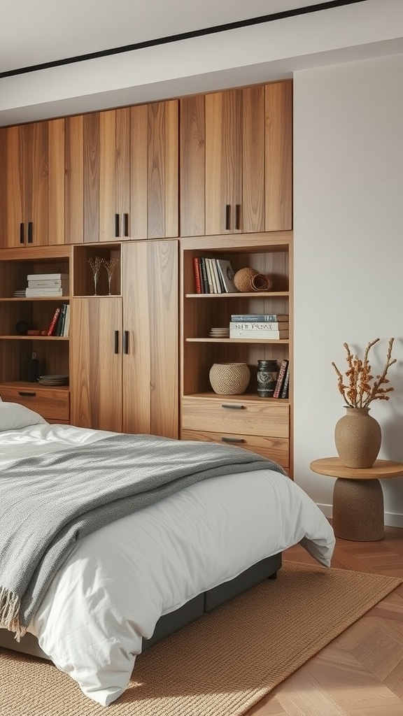
18. Wooden Storage
Natural-wood storage keeps clutter down — essential to the calm — while staying on-material. Warm timber storage reads as part of the scheme rather than a functional afterthought.

19. One Muted Cool Accent
A soft, earthy blue or slate — the colour of sky, water or stone — can join the palette if it's muted rather than bright. Kept desaturated, it reads as another natural tone, not a clash.

20. Open Shelving of Natural Objects
Displaying pottery, plants and books turns storage into a curated earthy still life. Leave space between objects so the display reads calm, in keeping with the mood.

21. Dried Flowers and Grasses
Dried stems and pampas bring organic form and texture and last indefinitely. They add the sculptural, natural touch the look loves with zero upkeep.

22. Soft Linen Curtains
Natural linen filters daylight into a soft glow and adds its own slubby texture. The fabric's gentle movement and imperfect weave suit the organic feel.

23. A Zen Touch
A small water feature or a simple stone arrangement leans the earthiness toward calm minimalism. It reinforces the retreat-like stillness the aesthetic is chasing.

24. Wood-Framed Earthy Art
Natural-toned art in a wooden frame extends the palette to the walls in-material. Landscape, botanical or abstract-earth pieces all suit the scheme.

25. Indoor-Outdoor Flow
Where the room opens to a garden or plant-filled patio, the biophilic connection becomes real rather than suggested. Even a doorway framing greenery blurs the line beautifully.

26. Natural-Pigment, Low-VOC Paint
Earth-pigment and low-VOC paints give authentic, characterful colour and cleaner indoor air. Clay and limewash finishes also add subtle texture flat modern paint lacks.

27. Personal Touches
Framed photos and meaningful objects keep an earthy room feeling lived-in rather than like a spa showroom. Warm-toned frames tie them into the palette.

28. Natural-Fibre Bedding
Linen, cotton and other natural-fibre bedding feels good, breathes well and suits the material story. Its relaxed, slightly rumpled look is part of the unfussy charm.

29. Sculptural Driftwood
A piece of driftwood or branch is natural sculpture — organic form and texture in one object. Its irregular shape is exactly the imperfection the look celebrates.

30. A View of Green
A window framing greenery is the strongest biophilic element of all, and free where you have it. Arrange the room so the bed or a chair enjoys the view.

31. Comfort First
Soft layered bedding and warm tones make comfort the priority — the whole point of an earthy retreat. Pile on the throws and cushions; cosiness is on-brief here.

32. Small Natural Elements
Pebbles, shells, seed pods and small found objects add grounding detail and personal story. Grouped in a bowl or on a tray, they read as a considered collection.

33. The Complete Peaceful Retreat
Wood, white bedding, plants and daylight together show the whole aesthetic working as one. It's proof the earthy look is ultimately about calm — every element serving stillness.
Building an earthy palette that isn't boring
The failure mode of earthy is "flat and beige". Avoid it with a few deliberate choices:
- Reach past beige. Use the richer earth pigments — terracotta, ochre, olive, rust, umber — not just sand and taupe. The saturated earth tones are what give the palette life.
- Vary the tone. Range from pale to deep within the warm family so surfaces read separately and the room has light and shade.
- Climb the texture ladder. Aim for four or five textures — wool, linen, jute, ceramic, wood, leather. In a low-contrast palette, texture is the depth.
- Keep undertones warm. One cool blue-grey neutral will spoil the mix. If you want a cool note, use a muted earthy blue or slate that reads natural.
- Add the green. Living plants supply the one fresh colour the palette benefits from, and make the nature connection real.
- Light it warm. 2700 K, layered. Cool light turns earth tones muddy.
Earthy bedroom on a budget
Earthy is naturally cheap: it favours natural, second-hand and found materials over anything glossy or new.
Nearly free. Bring in plants or cuttings. Collect natural objects — driftwood, stones, dried grasses. Swap cool bulbs for warm. Restyle the bed with your warmest-toned textiles and box away anything cool or synthetic-looking.
Under $80. A jute rug, a couple of natural-fibre or wool throws and cushions, a hand-thrown pot or woven basket, and a bunch of dried pampas. This alone shifts a plain room firmly earthy.
Under $250. A can of an earth-pigment, low-VOC paint (terracotta, olive or clay) for a feature wall, linen curtains, a warm-wood or rattan piece to add the key natural material, and a warm lamp. Spend on real natural materials rather than earth-coloured synthetics — the authenticity is the whole effect.
Earthy bedroom FAQ
What colours count as earthy? The pigments of the natural world: terracotta and clay, ochre and mustard, olive and sage, warm browns and taupe, sand and stone, rust and umber — plus green from plants. They're richer than plain beige, and they all share warm undertones, which is why they mix so easily.
How is earthy different from a plain neutral or vanilla scheme? A neutral/vanilla scheme is about a narrow band of pale tones and tonal texture; earthy is about the saturated pigments of nature and genuine natural materials plus a real connection to the outdoors (plants, light, stone, wood). Earthy is warmer, more saturated and more material-driven.
Why does my earthy room look flat and boring? Usually two things: too much plain beige instead of the richer earth pigments, and not enough texture. Add saturated earth tones (terracotta, olive, rust), vary the tone from pale to deep, and layer four or five natural textures. Then add a plant for fresh green.
What materials should I use? Natural ones: wood, stone, clay and ceramic, jute, sisal, rattan and cane, linen, cotton, wool and leather. Real materials are half the aesthetic — earth-coloured synthetics miss the point. This also makes earthy an easy match for sustainable, second-hand and handmade choices.
Is an earthy bedroom good for sleep? Yes — the warm, low-contrast palette, natural materials and biophilic connection are calming by design, and warm lighting reinforces a restful, wind-down mood. It's one of the most sleep-friendly aesthetics there is.
Common earthy bedroom mistakes
- Reading "earthy" as "beige". Plain neutrals alone are flat. Use the richer earth pigments.
- Too little texture. A low-contrast palette needs texture for depth — layer wool, linen, jute, ceramic, wood.
- Synthetic materials. Shiny or plastic finishes undo the natural feel. Use real wood, stone, fibre and clay.
- A cool neutral in the mix. Blue-grey fights the warm earth family. Keep undertones warm, or use a muted earthy blue.
- No living nature. Earth tones with no plants, light or organic objects feel like a stage set. Bring nature in for real.
- Cool lighting. It turns earth tones muddy. Go warm (2700 K) and layered.
Final thought
An earthy bedroom works because it does more than borrow nature's colours — it borrows its materials and its calm. Reach past beige for the real earth pigments, build depth with layered natural textures, favour genuine wood, stone, clay and fibre over anything synthetic, and bring living nature into the room through plants, light and organic objects. Light it warm and low, and let the shapes stay soft. Do that and the room stops being merely brown and becomes what the aesthetic actually promises: a grounded, restorative retreat from everything outside it.

Sources & principles referenced
- The earthy palette as the pigments of the natural world (terracotta, clay, ochre, olive, sage, warm browns, taupe, sand, rust, umber) and their shared warm undertones.
- Natural earth/iron-oxide pigments and their long use in paint.
- The centrality of genuine natural materials (wood, stone, clay, jute, rattan, linen, wool, leather) and the overlap with sustainable, reclaimed and handmade choices.
- Texture as the primary source of depth in a low-contrast palette.
- Biophilic design — the calming effect of a real connection to nature through plants, daylight, views and organic materials.
- Organic/rounded forms and warm (2700 K) layered lighting mimicking low natural sunlight.
- Low-VOC and natural-pigment paints for authentic colour and indoor air quality.