
Checkerboard is having a major revival, but it's one of the few patterns where getting it wrong is genuinely easy — and the culprit is almost always scale. These 28 black and white checkered kitchen decor items range from a full checkerboard floor to a single tea towel, and the guidance below explains how to choose the right check size, where to put it, and the one rule that keeps a checkered kitchen looking designed rather than dizzying.
A pattern with real heritage
Checkerboard isn't a passing trend — it's one of the oldest decorative floor patterns in European interiors. Black-and-white stone floors appear throughout Dutch Golden Age painting, laid in grand halls and merchant houses in the 1600s. Georgian and Victorian entrance halls used the same pattern in marble and later encaustic tile. In the 1950s it crossed the Atlantic into American diners and became shorthand for retro Americana. That long history is exactly why checkerboard reads as classic rather than gimmicky — it has been continuously in use for four centuries.
Scale is the decision that matters most
The size of each square changes the entire character of the pattern:
- Large checks (30 cm / 12 in and up) — architectural and contemporary. Large squares read as bold graphic blocks and suit modern kitchens and bigger rooms. This is the scale currently dominating design magazines.
- Medium checks (roughly 20 cm / 8 in) — the classic, historically accurate scale for a hall or kitchen floor. It's the safest choice and the one that dates most slowly.
- Small checks (10 cm / 4 in and under) — distinctly retro and diner-like. Small checks are busy across a large floor and can feel visually noisy, so they work best on accessories, textiles or a small area.
A practical rule: the smaller the room, the larger the check should be. Small squares in a small kitchen create visual chaos, whereas a few large squares read calm and deliberate.
Straight or diagonal?
Laying a checkerboard floor straight (squares parallel to the walls) is formal, grid-like and emphasises the room's geometry. Laying it diagonally at 45° makes a narrow room read wider, disguises out-of-square walls, and feels more dynamic. Diagonal is the traditional choice for entrance halls for exactly that reason — though it generates more cut tiles and therefore more waste.
The one-checkerboard rule
This is the single most useful piece of guidance here: use checkerboard once per room. Choose your surface — floor, backsplash or accessories — and keep everything else plain. Checkerboard is a dominant pattern with maximum contrast; two competing checkerboards in one kitchen will fight rather than coordinate. If you love the pattern and want more of it, vary the scale dramatically between uses so they read as different elements rather than duplicates.
28 checkered kitchen ideas — and why each works
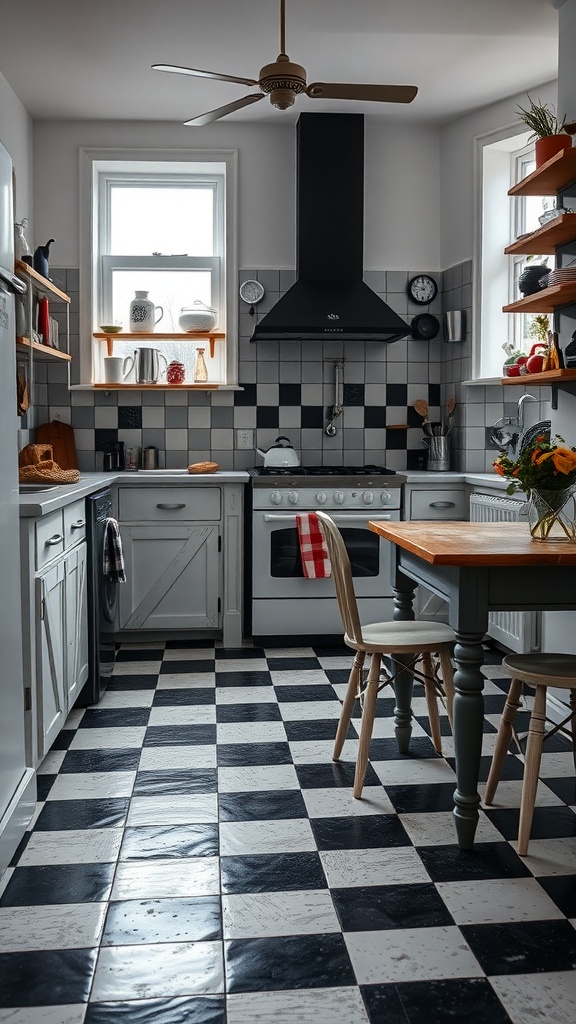
1. A Classic Checkered Floor
The definitive use of the pattern, and the one with four centuries of history behind it. A wooden table warms the scheme and stops the high-contrast floor feeling severe.

2. Large-Scale Modern Checks
Oversized squares read as contemporary graphic design rather than retro pastiche. This is the scale that suits modern kitchens and makes small rooms feel calmer, not busier.

3. Checkered Curtains
Textiles are the lowest-commitment way to try the pattern — no installation, easily changed, and instantly reversible if you tire of it.

4. Checkered Wall Art
Framed checkerboard graphics nod to the pattern without committing a whole surface. Frame under glass so it survives kitchen grease and steam.

5. A Checkered Utensil Holder
A small object that carries the theme onto the worktop. Wooden utensils inside add the warm contrast that stops black and white feeling cold.

6. Monochrome Tableware
Plain white dishes on a checkered cloth is the correct hierarchy — let the textile carry the pattern and keep the crockery quiet so food looks its best.

7. Towels and Aprons
The cheapest possible entry point. A few checkered textiles signal the theme clearly and can be swapped seasonally for the price of a coffee.

8. A Checkered Backsplash
The splashback must be wipeable regardless, so pattern here costs you nothing in practicality. If you check the backsplash, keep the floor plain — one checkerboard per room.
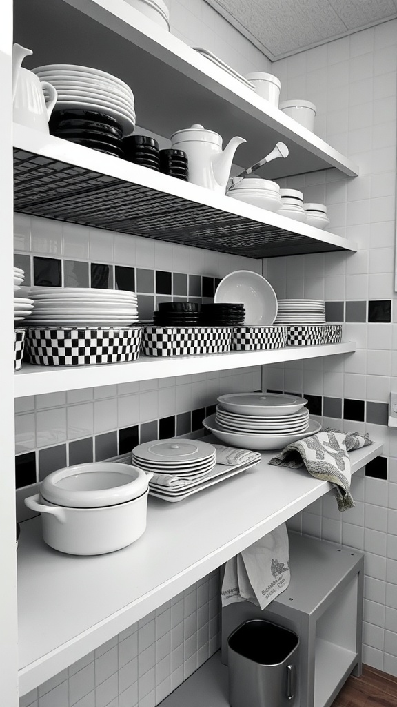
9. Checkered Shelf Liners
A hidden detail revealed when cupboards open — playful, protective and completely reversible. It's also renter-friendly, since nothing is permanent.

10. Pot Holders and Oven Mitts
Functional items that double as decor when hung on hooks. They're used constantly, so choosing ones you like looking at is a genuinely practical decision.

11. A Checkered Island Base
Confining the pattern to the island base makes it a feature piece while the rest of the kitchen stays calm — and a marble top keeps the working surface plain and practical.

12. A Checkered Accent Wall
A bold, maximalist choice. If you do a checkered wall and floor, change the scale dramatically between them so they read as deliberately layered rather than accidentally matched.

13. Checkered Wallpaper
Easier and cheaper to install than tile, and straightforward to remove when tastes change. Choose a wipeable or vinyl finish for anywhere near cooking.

14. Checkered Accessories
Mugs, jars and small items let you build the theme gradually and cheaply. Group them together on one shelf so they read as a collection rather than scattered oddments.

15. Patterned Small Appliances
A checkered kettle or toaster is a statement on the worktop. Keep it to one or two pieces — several patterned appliances start to look like a novelty shop.

16. Seasonal Checkered Touches
Checkerboard is a neutral pattern, so it sits happily under any seasonal colour scheme. Autumn oranges and Christmas greens both read well against it.
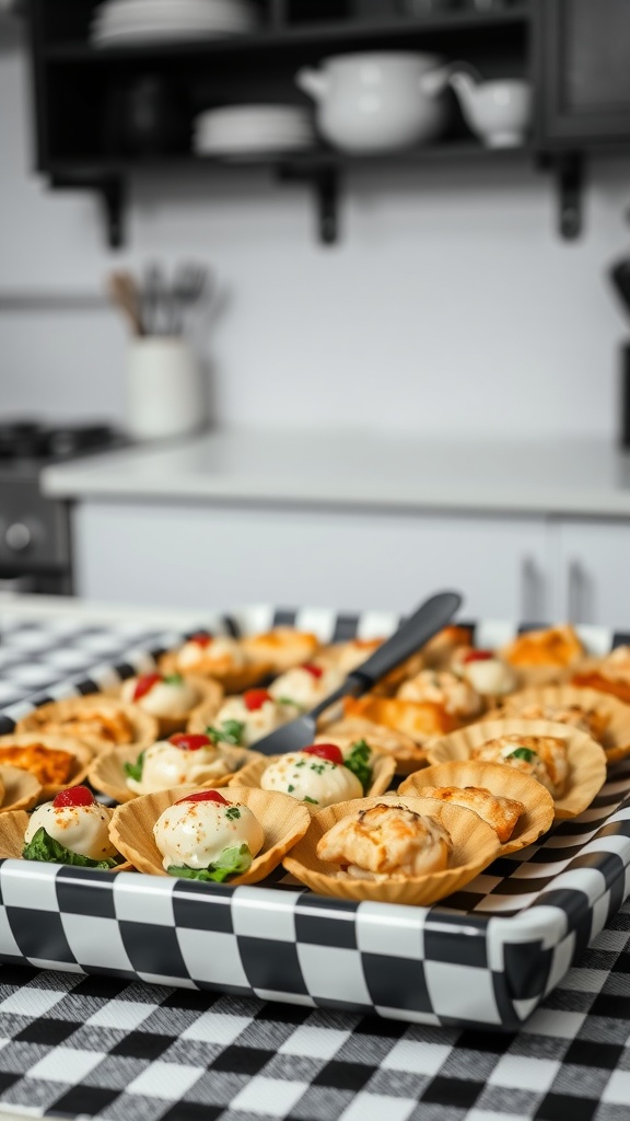
17. A Checkered Serving Tray
Decorative when it's out, useful when you're entertaining, and stored flat when it isn't. Trays are the most practical patterned object you can own.
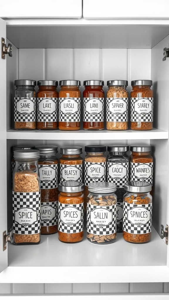
18. Checkered Labels
A tiny detail that unifies mismatched jars into a coordinated set. Cheap, quick, and it makes the inside of a cupboard look deliberately organised.

19. Checkered Bar Stools
Upholstered stools carry the pattern at seating height. Allow about 60 cm per stool and check your island overhang before buying — comfort first, pattern second.

20. Checkered Plant Pots
Green foliage against black and white is one of the most reliable colour combinations there is. The pots carry the theme; the plants supply the warmth.

21. A Checkered Tablecloth
The most nostalgic use of the pattern, and instantly reversible. On a wooden table it hits the sweet spot between graphic and warm.

22. Patterned Light Shades
Bringing the pattern overhead is unexpected and draws the eye up. Keep the rest of the room plain, as ceiling-level pattern is highly visible from everywhere.
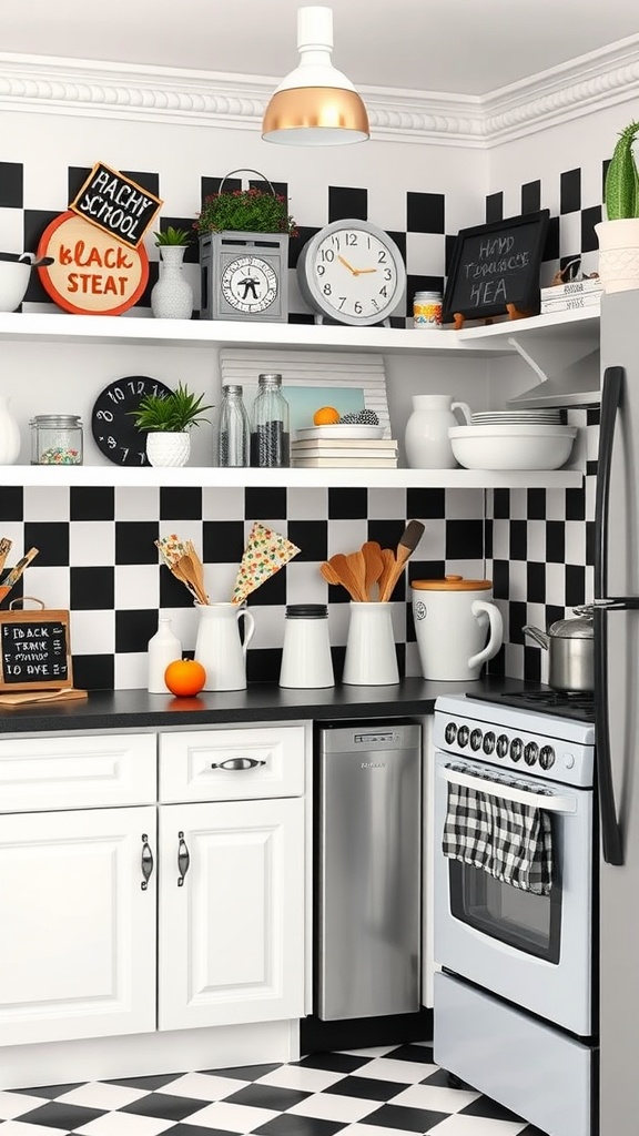
23. A Playful Family Corner
Checkerboard's diner associations make it naturally family-friendly. A checkered noticeboard or corner works well as the household's message hub.

24. Switch and Socket Covers
The smallest possible commitment to the theme. It's the kind of detail nobody consciously notices but which makes a scheme feel thoroughly considered.
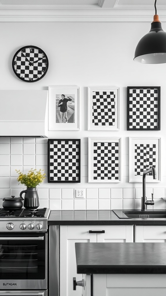
25. A Checkered Gallery Group
Combining checkered prints with a clock and other objects creates a display with varied shapes. Mixing two-dimensional art with three-dimensional items keeps it interesting.

26. Holiday Layering
Because checkerboard is effectively neutral, festive greenery and metallics layer over it without clashing — a real advantage over a strongly coloured kitchen.

27. Checkered Storage Bins
Patterned bins turn necessary storage into part of the scheme. On open shelving, matching containers are what separate "organised" from "cluttered".
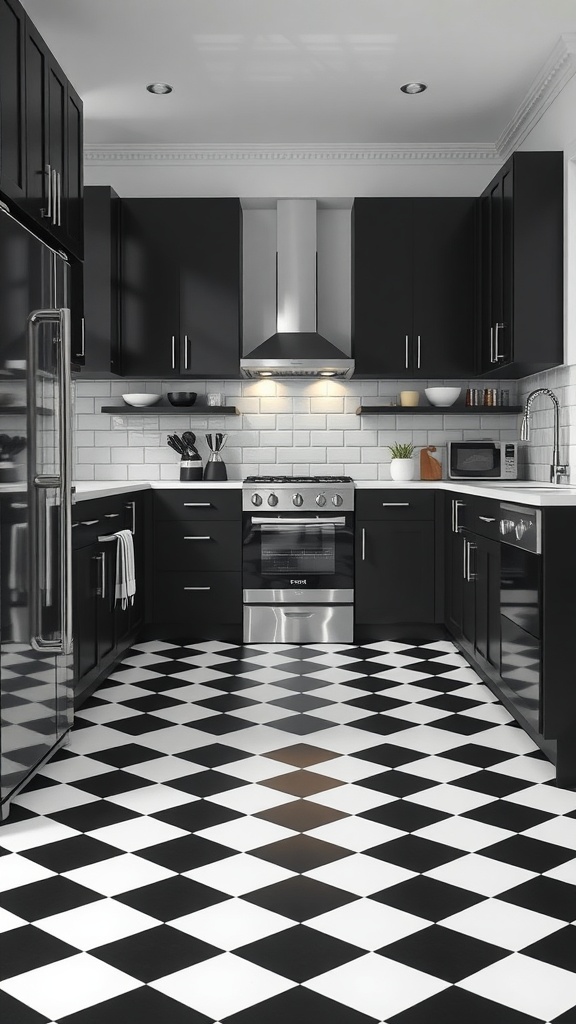
28. Checkered Floor with Black Cabinets
A confident, high-contrast combination. It needs excellent lighting to work — dark cabinets plus a busy floor absorb a lot of light, so layer it generously and keep it warm.
Which material for a checkered floor?
If you're committing to a checkerboard floor, the material affects cost, comfort and durability far more than the pattern does.
Vinyl and LVT are the practical favourites for kitchens. Luxury vinyl tile comes in convincing stone and marble effects, is warm and quiet underfoot, tolerates dropped crockery, and is genuinely waterproof. It's also the cheapest route to the look and the easiest to lay yourself. The trade-off is that it can dent under heavy appliance feet and won't last as long as stone.
Porcelain tile is the durability winner — hard-wearing, waterproof and effectively permanent. It's cold and unforgiving underfoot, so it pairs well with underfloor heating, and anything dropped on it will break. Grout lines are the maintenance point, which is why grout colour choice matters so much.
Natural stone — marble or limestone — is the historically authentic option and looks superb, but it's expensive, heavy enough to need a suitable subfloor, and porous. Marble in particular stains from lemon juice, wine and oil unless it's properly sealed and resealed periodically. Beautiful, but a genuine commitment in a working kitchen.
Painted floorboards are the budget-friendly, characterful option: mask out squares and paint directly onto existing timber. It costs very little, suits period and cottage kitchens, and can be redone when it wears. Expect to refresh it every few years in a busy kitchen, and seal it well.
Checkered kitchen FAQ
What size checks should I choose? Larger than you think. Squares of 30 cm and up read as contemporary and calm; around 20 cm is the classic historical scale; under 10 cm is distinctly retro and can look busy over a large floor. In small kitchens, go bigger — small checks in a small room create visual noise.
Straight or diagonal layout? Straight is formal and grid-like; diagonal makes narrow rooms feel wider and hides walls that aren't square. Diagonal produces more cut tiles and more waste, so budget slightly more material.
Is checkerboard a passing trend? It's currently in a revival, but the pattern has been used continuously since the 1600s in European interiors. At classic scales and in classic locations — particularly floors — it has consistently outlasted trend cycles.
Can I use checkerboard in a small kitchen? Yes, with two adjustments: use large squares, and use it once. A large-scale checkerboard floor with plain cabinetry works well; small checks on multiple surfaces will overwhelm the room.
What grout colour should I use? Mid-grey is the practical choice — it hides dirt far better than white and doesn't create a third strong colour the way a dark grout can. Bright white grout looks superb initially but shows every mark in a kitchen.
Common checkered kitchen mistakes
- Checks too small for the space — the most frequent error; small squares over a big area read as visual noise.
- Two checkerboards competing — one per room, unless the scales differ dramatically.
- No warm materials — wood, brass and greenery are what keep a checkered kitchen from feeling like a chessboard.
- White grout on the floor — beautiful for a month, then permanently grubby.
Final thought
Checkerboard earns its place because it's genuinely historic, not merely fashionable. Choose your scale to suit the room, decide between straight and diagonal, use it once, and warm it with wood and greenery. Do that and the pattern will feel timeless rather than trend-led — exactly as it has for the last four hundred years.
Sources & principles referenced: historical use of black-and-white checkerboard flooring (Dutch Golden Age interiors, Georgian and Victorian entrance halls, mid-century American diners); pattern-scale effects on perceived room size; straight versus diagonal tile layouts and associated cutting waste; grout-colour selection for high-traffic areas; single-dominant-pattern discipline; bar-stool spacing (60 cm).