
There's a version of farmhouse decor that comes flat-packed: three distressed signs, a galvanised tray and a piece of word art, all bought the same afternoon from the same shop. It photographs fine and it convinces nobody. The farmhouse kitchen wall decor ideas below are organised around the opposite approach — understanding why the original farmhouse wall looked the way it did, so the one you build reads as collected rather than ordered.
Why farmhouse walls were full in the first place
A working farm kitchen had very little fitted storage. There were no runs of wall cabinets, no dedicated pantry cupboard in most cases, and no reason to hide equipment that was used several times a day. So the walls did the work: tools hung on nails and rails, boards and baskets on hooks, herbs drying from a beam, plates on a rack, a clock where everyone could see it because the day was organised around meals and milking.
That's the logic worth borrowing. Farmhouse wall decor reads authentic when it echoes utility — objects that were used, hung where a hand would reach them, at a height that made sense for the job. It reads fake when it's a wall of objects that have never done anything. This is why a rail of well-used pans looks more convincing than an expensive print of a rooster, and it's the single most useful test to apply before hanging anything.
The distressed-repro problem
Farmhouse style was simply how country houses looked in Europe and America for centuries. Its modern revival started as shabby chic in the late 1980s, then reinvented itself as "modern farmhouse" in the early 2000s on the back of television renovation shows — and the demand that followed was met, inevitably, by factories. New objects were manufactured to look old: pre-chipped paint, pre-rusted metal, machine-sanded edges, sepia-printed "vintage" signage.
The result reads flat for reasons you can name:
- The wear is in the wrong places. Genuine wear appears where hands, cloths and tools touched an object — handles, rims, edges, the middle of a board. Manufactured distressing is distributed evenly, including on surfaces nothing would ever have rubbed.
- Everything ages identically. A real collection accumulated over decades has mismatched finishes, different degrees of fading and several eras of hardware. A bought-in-one-go collection has one consistent artificial patina.
- Nothing has provenance. Even in a photograph, objects with history sit differently: odd proportions, obsolete purposes, repairs. Reproductions are designed to be decorative and read that way.
The fix isn't to buy everything vintage — that's expensive, slow and usually unnecessary. It's the anchor principle: one genuinely old object with real history on a wall carries a group of new, plain, well-made pieces around it. One is enough. A wall of reproductions has no anchor at all.
Four farmhouses, not one
Most disappointing farmhouse walls are a collision of sub-styles that don't share a palette. It helps to pick one:
- Modern farmhouse. White or off-white walls, black metal, clean-lined shaker cabinetry, one or two natural-timber accents. Sparse walls — a large clock, a single oversized frame, slim open shelves. The most restrained version, and the easiest to keep looking current.
- Classic country. Buttermilk, sage or soft blue paintwork, floral and gingham textiles, plate racks, painted dressers, botanical prints. Fuller walls, warmer palette, more pattern.
- Primitive or rustic. Unfinished and reclaimed timber, dark iron, dough bowls, old tools, stoneware. Rough textures and visible age; the least polished and the most genuinely agricultural.
- Industrial farmhouse. Galvanised and blackened steel, factory-style lighting, enamel signage, wire baskets. Cooler and harder than the others — the version that survives a very modern kitchen best.
They can be mixed, but only deliberately: choose one as the base and let a second contribute no more than a couple of pieces.
The material palette does the work
What makes a farmhouse wall read as a scheme rather than a pile of objects is material repetition. The traditional palette is small and forgiving: galvanised and blackened metal, unfinished or whitewashed timber, enamelware, ironstone and creamware, wicker and woven baskets, wrought iron, and cotton in gingham, ticking or grain-sack stripe.
Pick two or three and repeat them across the whole wall. Three enamel jugs, two timber boards and a wire basket hang together as a composition; one item from every material available hangs together as a clearance shelf. This single discipline separates most convincing farmhouse walls from most unconvincing ones — more than any individual purchase does.
Scale and asymmetry
Farmhouse tolerates — actually wants — objects at a scale that would look absurd in a contemporary scheme. An oversized clock, a metre-wide sign, a huge dough bowl or an enormous timber platter all read as normal here, because in a working building things were sized for work, not for decoration.
Practical rules that hold up:
- One dominant object per wall. Let it be genuinely large, then group smaller things around it rather than competing with it.
- Odd numbers, uneven spacing. Perfect symmetry signals a showroom. Three, five or seven objects in a loose arrangement signals accumulation.
- Mix silhouettes. Round plates against rectangular frames against the long horizontal of a shelf — variation in shape is what stops a wall reading as a grid.
- Fill the vertical. Farmhouse walls historically ran high, with the top of the wall used for the things needed least often.
One inherited constraint applies to every kitchen regardless of style: grease and steam settle on everything near the hob, so keep paper, delicate textiles and anything precious out of the cooking zone and favour metal, sealed timber, ceramic and glazed frames.
Farmhouse isn't all white
The all-white farmhouse kitchen is a recent invention, and a slightly odd one — historically, country kitchens were painted in whatever pigment was cheap and durable. The traditional palette is far richer than the current cliché: buttermilk and bone, milk-paint blue, sage and olive, barn red, iron oxide, mustard, and black ironwork. If your kitchen already feels like a showroom, adding one of these on a single wall or a dresser interior does more for authenticity than another white sign will.
25 farmhouse kitchen wall decor ideas — and why each works
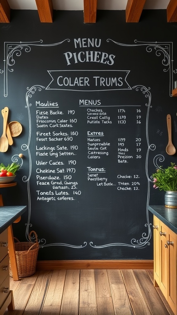
1. A Chalkboard That's Actually Used
Slates and chalkboards were genuine kitchen equipment for lists, orders and prices, which is why they belong here more than most farmhouse signage. Write on it in your own hand — printed "menu" boards are the version that reads staged.
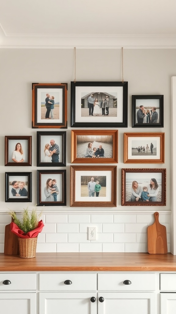
2. Family Photographs in Mismatched Frames
The one wall element no shop can sell you, and therefore the most authentic thing available. Mismatched frames in a shared finish read as accumulated rather than bought as a set.
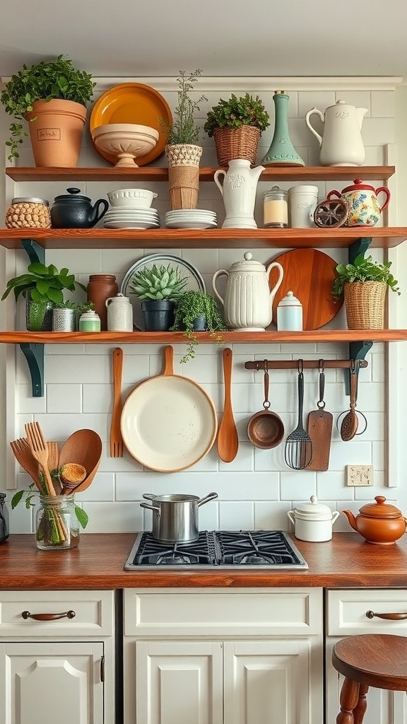
3. Timber Shelves Carrying Real Crockery
Open shelving is the original farmhouse storage: cheap to build, easy to reach, and it turns everyday pieces into the display. Stock it with what you use so it gets washed and doesn't collect grease.
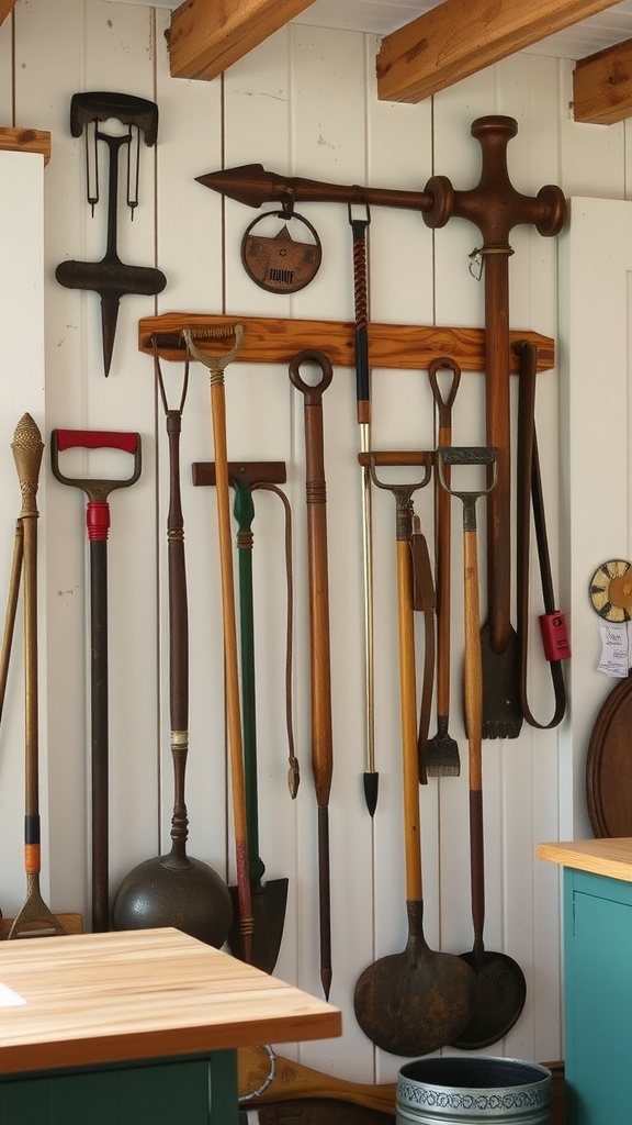
4. Old Farm Tools, Hung As They Were Stored
Tools carry the wear pattern nothing manufactured can fake — worn handles, sharpened blades, repairs. Hang them the way a barn would, on a rail or hooks, rather than arranged into a decorative motif.
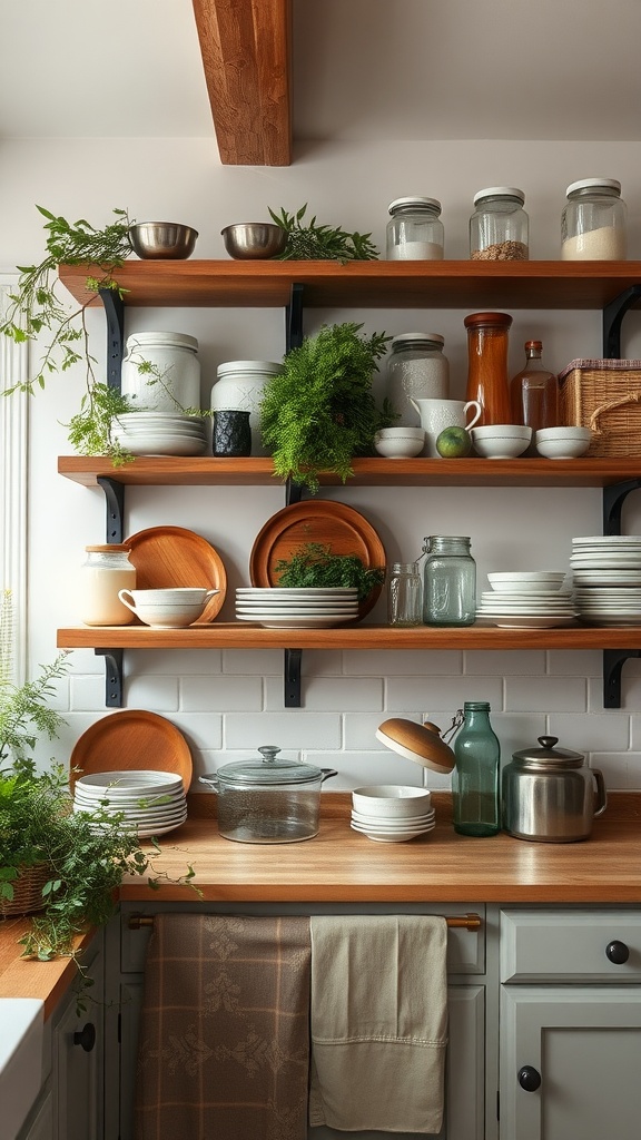
5. Open Shelves With Living Things On Them
Plants, herbs and cut greenery stop a shelf of ceramics looking like a museum case. Anything growing signals a kitchen in use, which is the whole point of the style.
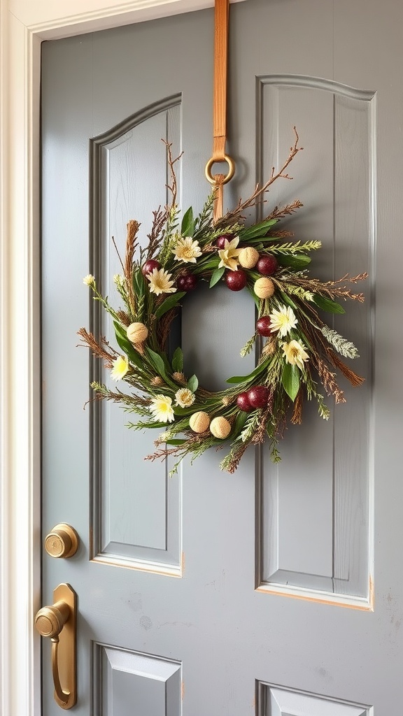
6. A Wreath of Whatever's in Season
Wreaths began as seasonal use of what the land gave — dried grasses, wheat, herbs, berries. One made from real dried material outperforms a plastic one at every distance closer than the far side of the room.
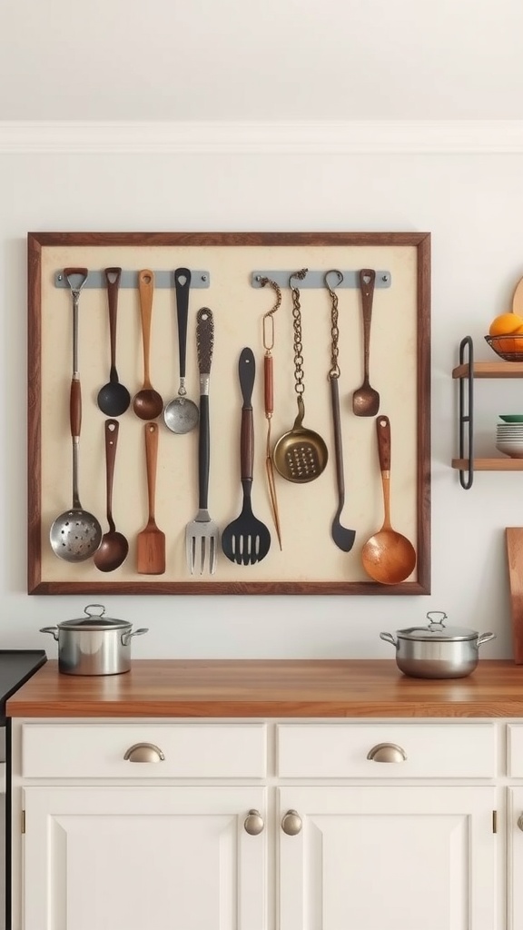
7. Utensils Framed as a Group
Old whisks, spoons and moulds share a material and a silhouette, so grouping them makes a composition instead of clutter. Obsolete tools are the cheapest genuine antiques in any flea market.
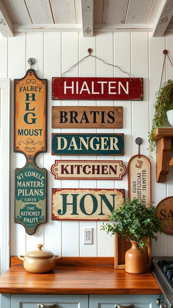
8. Signage With a Real Origin
Enamel advertising, feed-store signs and old trade lettering worked hard outdoors and show it. The test is simple: does it name a real product, place or business, or does it just say something pleasant?
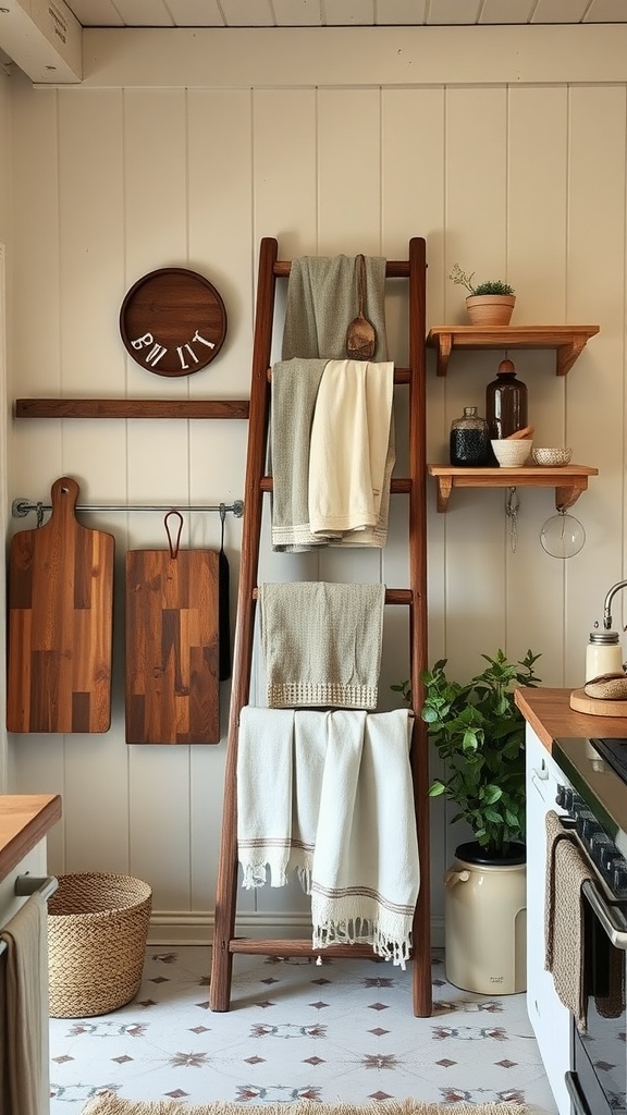
9. A Ladder Used as a Rail
Leaned against the wall it becomes hanging space for towels and cloths in a room that never has enough. Bring in a genuinely old one and it also works as the wall's anchor piece.
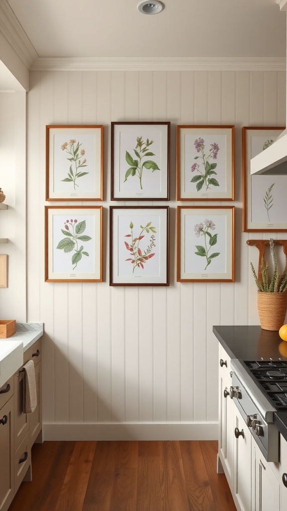
10. Botanical Prints in a Loose Grid
Botanical plates were practical reference material long before they were decor, which is why they never feel decorative-only. Keep the frames in one finish and the mounts generous so the group holds together.
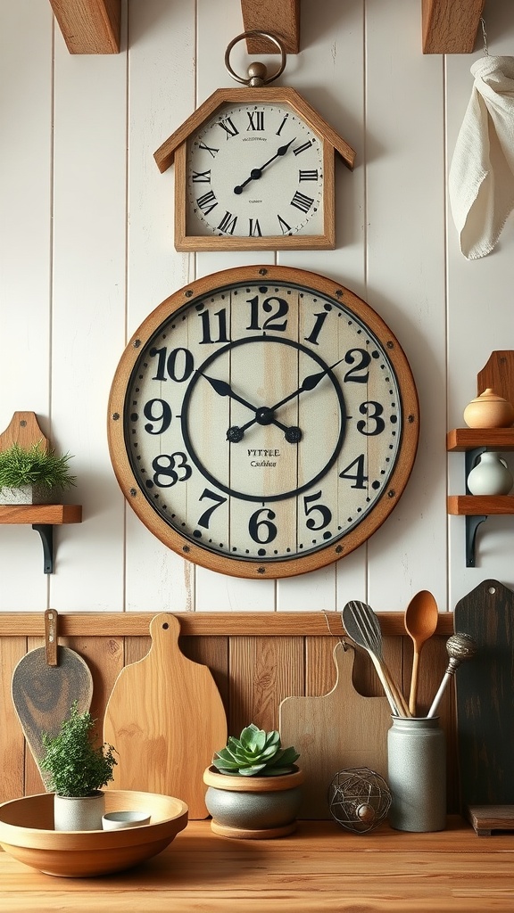
11. One Oversized Clock
The classic farmhouse anchor: large, functional, and the reason the whole wall composes. Go bigger than feels comfortable — a small clock on a large wall looks like a mistake.
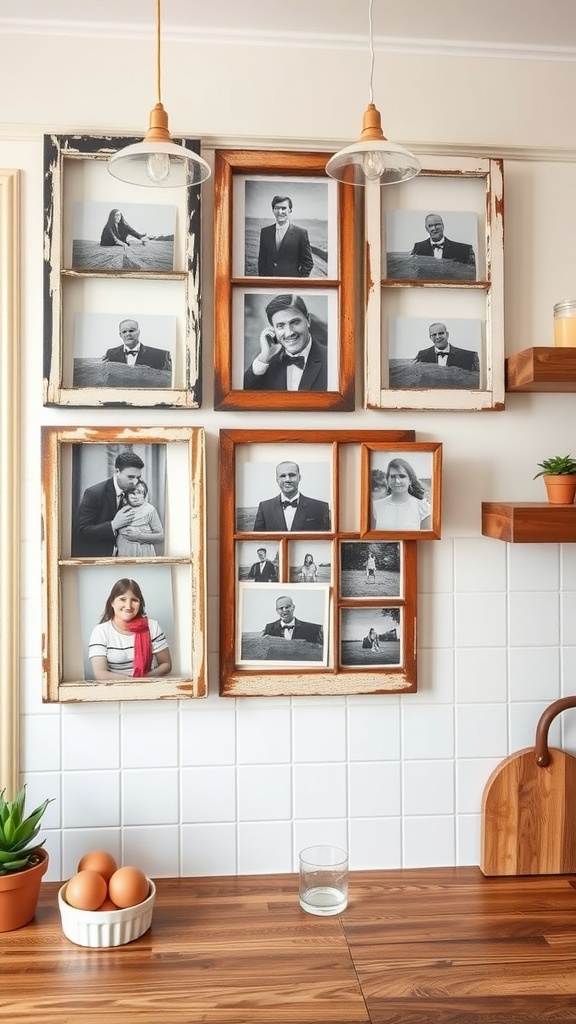
12. Salvaged Window Frames as Frames
Architectural salvage brings genuine age, odd proportions and real paint layers — everything reproduction can't supply. Old glazing bars also divide a photograph in a way no modern frame does.
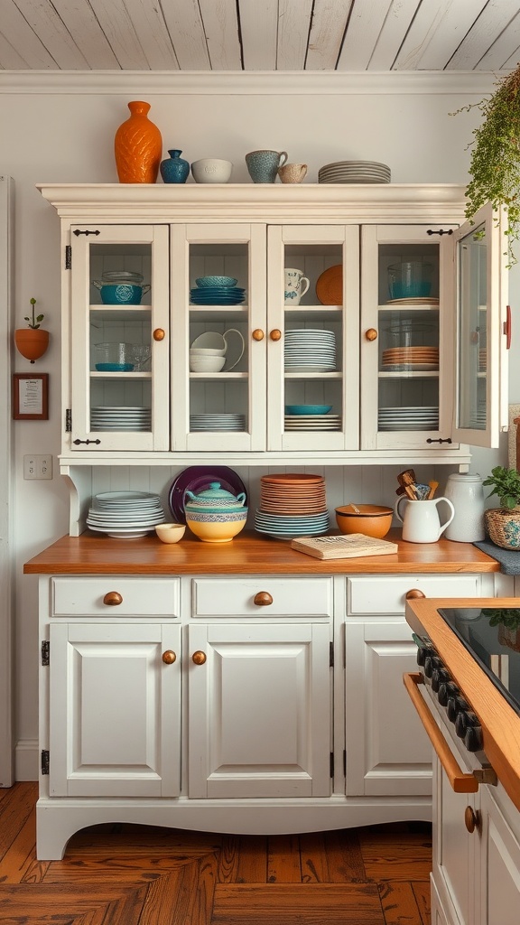
13. A Glazed Dresser Instead of Fitted Units
Freestanding furniture is how farmhouse kitchens were always equipped, and glass fronts show the crockery while keeping the grease off it. It's also the most renter-friendly move on this list.
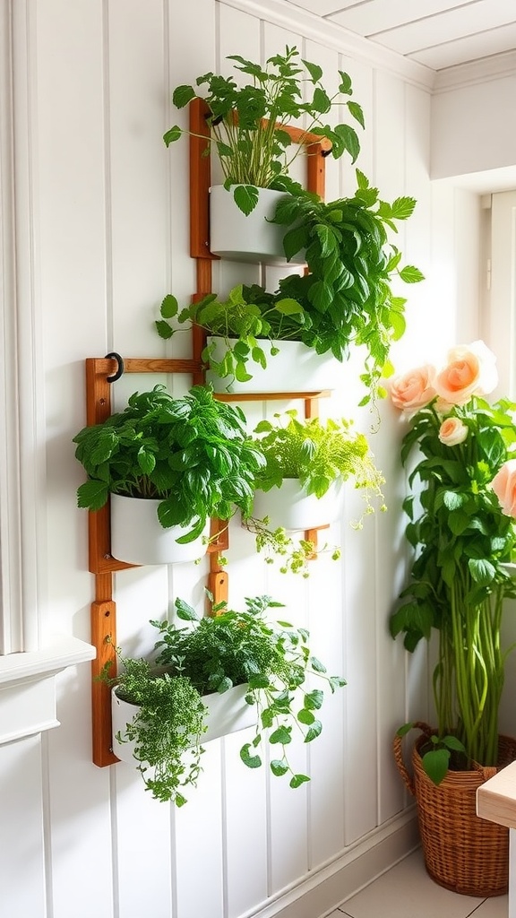
14. Herbs Growing on the Wall
Wall-mounted pots use vertical space you weren't using and keep cooking herbs within arm's reach. Decor that goes into dinner is the most farmhouse idea there is.
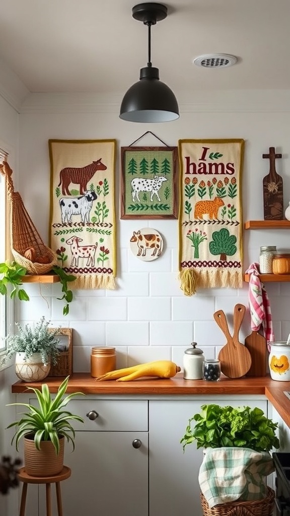
15. Animal Imagery, Used Sparingly
One good cow, hen or sheep portrait at proper scale is charming; a herd of small ones tips straight into theme-park. Treat it as a single artwork, not a collection.
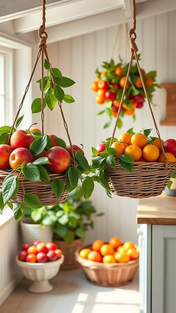
16. Hanging Baskets for Produce
Wire and wicker baskets on a hook store onions, apples and root vegetables exactly as a farm pantry would, ventilated and off the worktop. Function first, and it happens to look right.
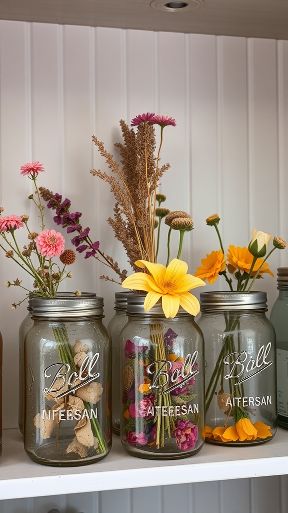
17. Preserving Jars, Doing Something
Jars are the emblem of farm kitchens because preserving was the point of them. Filled with dried flowers, grains or actual preserves they earn their place; empty and dusty, they're the most obvious prop in the style.
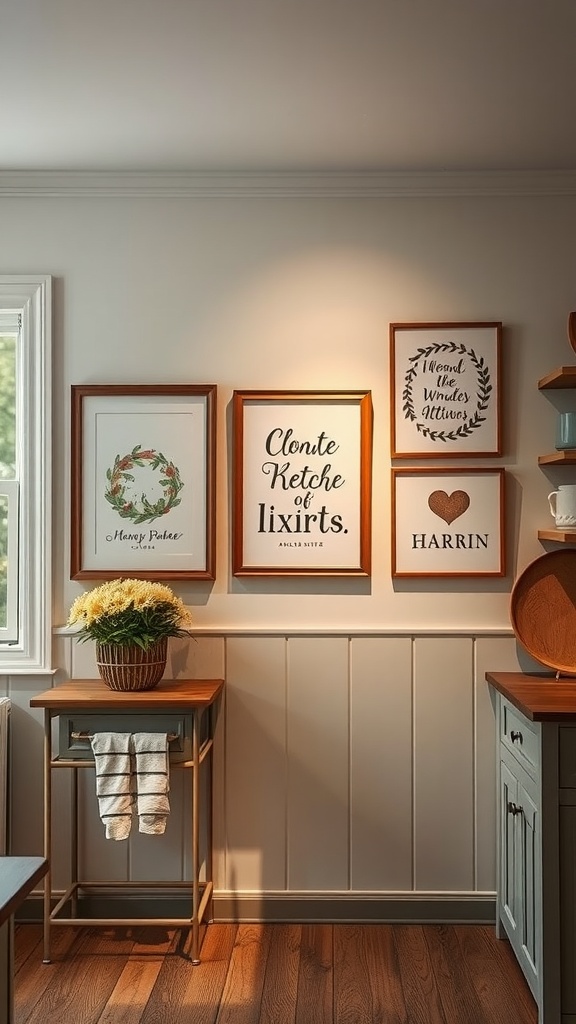
18. Country Prints With a Timber Surround
A plain timber frame ties a print into the room's material palette instead of leaving it floating. Glaze anything paper — a kitchen wall is a hostile environment for it.
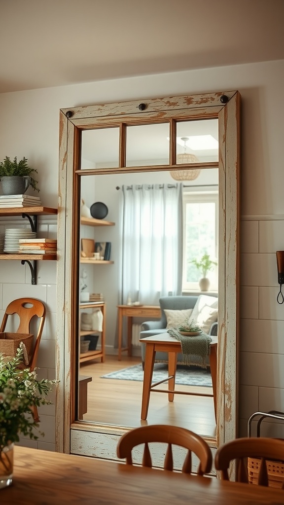
19. A Weathered-Frame Mirror
Mirrors are unusual in a kitchen, which makes them effective — particularly in the dark, deep-plan rooms farmhouses often have. Hang it to reflect a window rather than a run of cupboards.
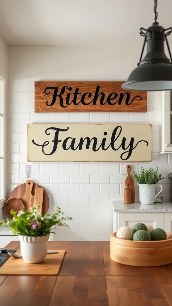
20. A Name, Date or Place — Not a Sentiment
Personalised lettering works when it records something specific: a surname, the year the house was built, a farm or village name. Generic word art is the single most recognisable marker of shop-bought farmhouse.
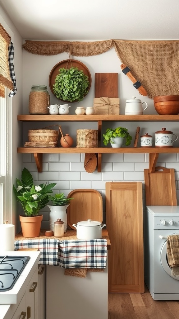
21. Gingham, Ticking and Grain Sack
These were cheap, hard-wearing utility cloths, not decorative fabrics, and that's exactly why they read as authentic. Repeat one of them two or three times around the room rather than using all three once.
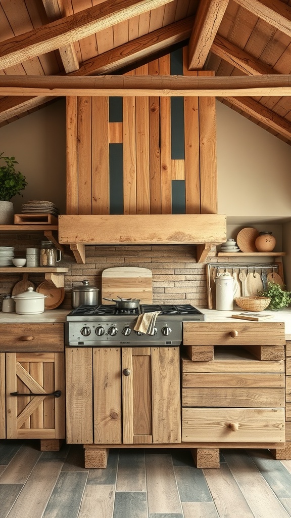
22. Reclaimed Boards as a Wall Panel
A section of mixed reclaimed timber gives you genuine age, colour variation and grain in one move, and it's a good backdrop for hanging things on. Seal it if it's anywhere near the cooking zone.
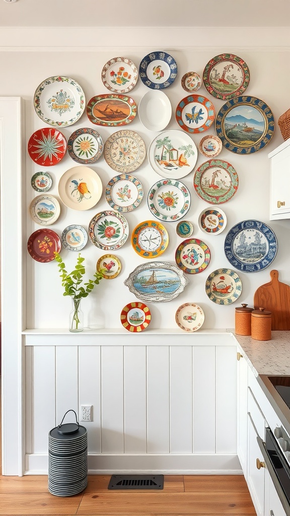
23. A Plate Wall From Odd Survivors
Plate walls are old practice — display and storage at once — and mismatched survivors of broken sets look better than a matching set ever will. Keep to one palette across the group and let the patterns differ.
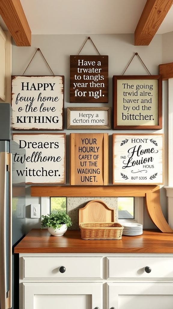
24. Hand-Painted, Not Mass-Printed
A genuinely handmade sign has uneven lettering and visible brushwork, and that irregularity is what factory printing removes. If it's going to say something, better it be said by hand — ideally yours.
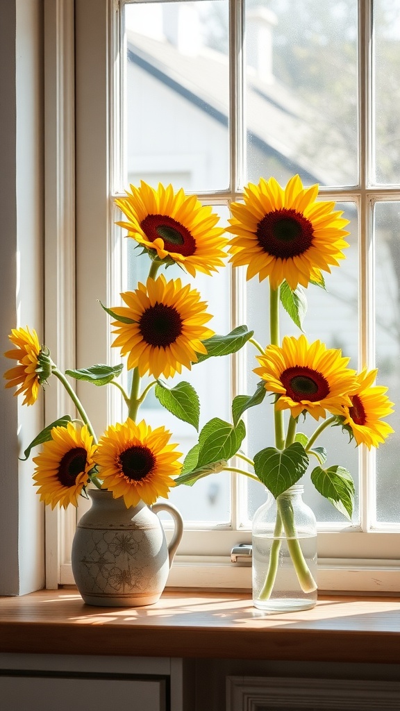
25. Cut Flowers in a Jug, Not a Vase
A stoneware jug or an old bottle is what a farm kitchen would have reached for, and it suits loose, uneven, garden-picked stems. This is the cheapest farmhouse detail in existence and the hardest to get wrong.
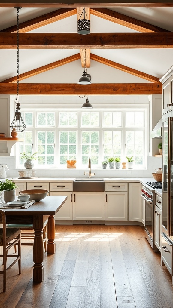
Bonus: Let the Structure Be the Decor
Beams, brickwork, a chimney breast or an exposed lintel are the most authentic farmhouse features a room can have, and they cost nothing to display. When the architecture is doing the talking, the walls need far less on them.
How to tell real vintage from reproduction
You don't need one genuinely old piece per wall for the sake of purity — you need it because it makes everything around it convincing. A few checks that work in a market or a thrift shop:
- Wear follows the hand. Look for thinning and polish on handles, rims, edges and the centre of boards. Even distressing all over a surface nothing touched is manufactured.
- Paint should be layered. Old painted timber usually shows two or three colours where earlier coats show through in the chips. Repro distressing typically reveals bare wood under a single colour.
- Enamelware chips dark. Genuine enamel over iron shows a dark grey-black substrate at the chip and often surface rust; painted steel imitations chip to bright metal or primer.
- Check the marks. Ironstone, creamware and stoneware normally carry maker's stamps, and they're easy to look up. Reproductions have modern printed labels or nothing at all.
- Look at the fixings. Hand-cut nails, mismatched screws with worn slots, and hand-cut dovetails are hard to fake convincingly. Uniform modern screws in an "antique" piece are the giveaway.
- Weight and imperfection. Old metalwork and stoneware are heavier and slightly irregular. If a set of five items is identical, it isn't old.
Where to find them: estate and house-clearance sales, farm and agricultural auctions, architectural salvage yards, charity and thrift shops in rural areas, car boot and flea markets, and — best of all — relatives' garages and attics. Obsolete tools and utensils are consistently the cheapest genuinely antique objects on any of those tables, because nobody else wants them.
Farmhouse kitchen wall decor FAQ
How do I make farmhouse decor look authentic instead of mass-produced? Include at least one genuinely old object with real history per wall, repeat two or three materials rather than one of everything, favour pieces that had a function over pieces made to be decorative, and cut the generic word art. One real anchor makes plain new pieces around it read as a collection.
Is farmhouse style dated in 2026? Mass-produced modern farmhouse — the identical distressed signs and word art — dates fast, because it was a trend. The underlying approach of honest materials, visible utility and pieces gathered over time predates the trend by a couple of centuries and doesn't go out of date.
What colours suit a farmhouse kitchen? Wider than the all-white cliché: buttermilk and bone, milk-paint blue, sage and olive, barn red, iron oxide, mustard, with black ironwork as the constant. Historically these were simply the cheap, durable pigments available.
How much should I put on a farmhouse kitchen wall? Enough that it doesn't look staged, and not so much that the working surfaces get colonised. One dominant object per wall, an odd number of supporting pieces, and nothing precious in the grease and steam zone around the hob.
Can farmhouse work in a modern or rented kitchen? Yes — it's mostly freestanding and reversible. A glazed dresser, a leaned ladder, a plate rack, timber-framed prints, a big clock and honest textiles need no fixings at all, and the industrial-farmhouse variant sits comfortably against modern cabinetry.
Where do I start if I only do one thing? Hang one large, genuinely old object and take down anything that says something sentimental. That's usually the whole difference.
Common farmhouse wall decor mistakes
- Word art as the main event. Sentimental lettering is the fastest way to make a wall look shop-bought. Specific names, dates and places survive; slogans don't.
- A matching set bought in one trip. Uniform artificial patina is the tell. Vary the source, the finish and the age.
- Everything the same size. Farmhouse needs one oversized object to compose around; a wall of medium-sized pieces reads as filler.
- Whitewashing every surface. Without a contrasting timber, iron or coloured element, all-white farmhouse just reads as a showroom.
- Mixing all four sub-styles at once. Primitive tools plus industrial signage plus floral country textiles plus modern black metal is four schemes, not one.
- Ignoring where the cooking happens. Paper, dried textiles and unsealed timber directly beside the hob will be ruined by grease and heat.
Final thought
The difference between a farmhouse kitchen wall that convinces and one that doesn't has almost nothing to do with budget. It's whether the objects on it look like they were used and gathered, or bought and arranged. Find one genuinely old thing, hang it big, repeat two or three honest materials around it, and let the room look like somebody cooks in it. That's the whole style — everything else is shopping.

Sources & principles referenced
- Historical use of farmhouse kitchen walls for tool, board and produce storage in the absence of fitted cabinetry.
- The lineage of the style from late-1980s shabby chic to early-2000s "modern farmhouse" popularised by television renovation programmes, and the resulting market in factory-distressed reproduction goods.
- Distinctions between modern farmhouse, classic country, primitive/rustic and industrial farmhouse sub-styles.
- Traditional material palette (galvanised and blackened metal, unfinished and whitewashed timber, enamelware, ironstone and creamware, wicker, wrought iron, gingham, ticking and grain-sack cotton).
- Historical country paint palettes.
- Antique-identification checks — wear patterns at contact points, layered paint, dark iron substrate visible in enamelware chips, maker's marks on ironstone and stoneware, hand-cut nails and dovetails.
- Grease and steam exposure in kitchens and suitable wipeable materials.
- Composition principles of a dominant object, odd-numbered groupings and mixed silhouettes.