
Most kitchens that feel dark aren't short of windows — they're short of surfaces that give light back. That's genuinely good news, because reflectance is a decorating decision rather than a building one. These 27 simple kitchen decor ideas are organised around one measurable goal: getting more usable light out of the kitchen you already have, using paint, bulbs, textiles and restraint rather than a builder.
Brightness is a decorating problem, not a window problem
Every kitchen gets its light from three places: daylight coming through the glazing, artificial light from fittings, and light bounced back by walls, worktops, splashback and floor. The first is fixed unless you're prepared to cut a hole in a wall. The second and third are almost entirely decorating decisions — and together they account for most of what people describe as a "bright" or "gloomy" room. A kitchen with one small window and high-reflectance surfaces routinely reads brighter than a kitchen with two windows, dark units and a matt charcoal splashback.
So the useful question isn't "how do I get more light in?" It's "how much of the light I already have am I throwing away?"
LRV: the number that tells you how bright a colour is
Light Reflectance Value is a 0–100 scale where 0 is a theoretical pure black that absorbs everything and 100 is a pure white that reflects everything. Real paints land in between, and most manufacturers — Farrow & Ball and Benjamin Moore among them — publish the LRV of every colour on the chart or the tin. It's the single most useful number in decorating, and almost nobody looks at it.
Practical thresholds worth knowing:
- LRV above 60 — the working minimum for a kitchen with limited daylight: north-facing, basement level, or hemmed in by neighbouring buildings.
- LRV 70+ — what you want if the room is genuinely dark and brightening it is the priority.
- LRV 75–85 in a warm white — the reliable choice for a north-facing kitchen, because it lifts the light level without turning the room cold.
- LRV below 40 — dramatic and often beautiful, but it will absorb light. Fine on an island or lower units; expensive on every wall of a dim room.
The liberating part: LRV is not the same as "white". Plenty of soft greens, blues, clays and buttermilks sit in the 60s and 70s. You can have colour and reflectance — you just have to check the number instead of guessing from the swatch.
Which "white" works depends on which way the room faces
Daylight is not neutral, and the same paint behaves differently depending on orientation. North-facing kitchens receive cool, slightly blue light all day, which reads colours darker and greyer than the chart suggests — which is why a crisp brilliant white so often turns out flat and clinical there, and why a warm white with a mid-to-high LRV is the safer choice. South-facing rooms get strong warm light and can carry cooler, cleaner whites without feeling cold. East-facing kitchens are bright in the morning and flat by evening; west-facing do the reverse and go golden late in the day.
The only reliable test is to paint a sizeable patch — an A3 area at minimum, ideally on two different walls — and look at it at breakfast, mid-afternoon and under your evening lights. A colour that works at all three times is a colour that works.
Sheen is the reflectance nobody accounts for
Two tins of the same colour in matt and eggshell do not deliver the same brightness. Matt scatters light and absorbs a measurable share of it; eggshell, satin and gloss bounce it. In a kitchen you want the wipeable finish anyway, which means the practical choice and the bright choice happen to agree.
Extend the logic beyond the walls. A glossy splashback tile, glass cabinet fronts, a polished or semi-polished worktop and satin-finish cabinet doors all act as secondary reflectors, quietly redistributing whatever daylight arrives. The honest trade-off: the higher the sheen, the more it shows every ripple in the surface underneath and every fingerprint on top. Gloss rewards good preparation and punishes bad.
Three numbers on the bulb box
Artificial light is where dark kitchens are most often lost, and the specification matters more than the fitting:
- Lumens, not watts. Watts measure consumption; lumens measure output. A kitchen needs considerably more total output than a bedroom, and most are underlit by half.
- 2700–3000 K colour temperature. Warm white. Anything above about 4000 K reads blue and institutional in a domestic kitchen, no matter how bright it measures.
- CRI 90 or higher. Colour Rendering Index describes how truthfully a bulb shows colour. Low-CRI light makes food look grey, timber look muddy and your carefully chosen paint look like a different colour. It's the cheapest upgrade on this entire list.
Then get the layers right: ambient light from the ceiling, task light under the wall cabinets — because upper units always shadow the worktop directly beneath them — and one decorative or low-level source for the evening. Put the ambient layer on a dimmer.
Clutter reads as darkness
This is the part that costs nothing. A crowded worktop is not just untidy: it breaks up the largest continuous reflective plane in the room, casts dozens of small shadows across it, and adds visual noise that the eye interprets as heaviness. Clearing the counters is measurably the brightest thing you can do in an afternoon, and it's the foundation everything else on this list sits on. Decorate second.
27 simple kitchen decor ideas — and why each works

1. Pale Textiles at the Window
Light-coloured fabric filters daylight and passes most of it on; heavy dark curtains absorb the very thing you're trying to keep. In a dim kitchen, unlined linen or cotton in a neutral tone is the single best window treatment.

2. One Piece of Light-Ground Art
A print on a pale background reflects; a dark, densely inked one absorbs. One larger piece also reads calmer than a cluster of small frames, which matters in a room already full of visual information.

3. Glazed Dinnerware on Show
Glazed ceramic is a mild reflector, and behind a glass door it catches light twice. Displaying the crockery you actually use gives colour and shine without buying a single decorative object.

4. Herbs on the Sill
Small pots sit below the sightline of the glass, so they add green without shading the room. It's also the rare decor that ends up in the food.

5. One Saturated Accent
A single strong colour against high-LRV surroundings makes the pale surfaces read brighter by contrast. One chair, one kettle, one bowl — the effect collapses if you repeat it five times.

6. A Bar Cart on Castors
It takes bottles and glasses off the worktop, which is the point: the counter stays clear and reflective. Being on wheels, it also leaves entirely when you need the floor.

7. Light Timber Open Shelves
Pale wood returns far more light than dark stain, and an open shelf doesn't cast the deep shadow a wall cabinet does. Reserve it for things you use weekly, since grease and dust are the price.

8. A Low Centrepiece
Keep it below seated eye level so sightlines and light travel across the table rather than stopping at it. A wide, shallow arrangement beats a tall one in a small room.

9. A Fruit Bowl as Colour
Free, renewable and self-replacing colour that changes with the season. A shallow bowl keeps the profile low and the fruit visible enough that it gets eaten.
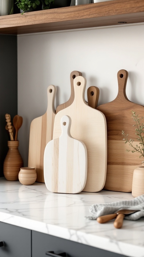
10. Boards Standing on Edge
Stored upright against the splashback, boards occupy almost no counter area while adding warm grain. Storing things vertically is the standard move whenever horizontal surface is the scarce resource.

11. Borrow Light From the Next Room
An open or widened doorway lets a second window contribute to the kitchen — often the biggest daylight gain available without adding glazing. Even keeping an internal door open helps more than people expect.

12. Matching Baskets and Containers
Repetition is how you quiet a room full of mismatched packaging. Fewer competing shapes means fewer small shadows and a surface that reads calm rather than crowded.

13. A Chalkboard, Framed and Contained
Genuinely useful decor that rewrites itself — but chalkboard paint has an LRV close to zero. In a dark kitchen keep it to one framed panel rather than a whole wall.

14. A Clock as the Only Object
Kitchens have very little uninterrupted wall, so spend it on something you look at deliberately. One functional focal point beats three decorative ones competing for the same space.

15. Mid-Tone Wood Against Pale Walls
Wood is how you add warmth without adding darkness, provided you stay in the mid-tone range rather than going walnut-dark. Pairing one warm material with high-LRV surfaces is the most reliable formula in the room.

16. Pendants Over a Surface, Not a Walkway
Hang them 75–90 cm (30–36 in) above the worktop or table so they light the task and stay out of your sightline. Warm bulbs, on a dimmer, always.

17. A Seat at the Brightest Spot
The place with the best daylight should have a use, and in most kitchens it's the window wall. Two chairs and a small round table convert wasted light into somewhere you actually sit.

18. Seasonal Swaps, Kept to Accents
Small seasonal changes keep a neutral kitchen from feeling static and cost almost nothing. Just watch the autumn and winter instinct for heavy dark textiles in a room that's already short of light.

19. Mount the Curtain Higher and Wider
Fix the rod 10–15 cm above the frame and extend it 15–25 cm beyond each side, so the fabric stacks clear of the glass instead of over it. It's the standard trick for keeping the whole window working.

20. A Handwritten Recipe Under Glass
The most personal decor in the house, and glazing both protects it from grease and adds a reflective plane. Frame it; unprotected paper does not survive a working kitchen.

21. The Clear Counter
Your worktop is the largest reflective surface at eye level in the entire kitchen. Keeping the longest continuous stretch of it empty is free, immediate and beats every purchase on this list.
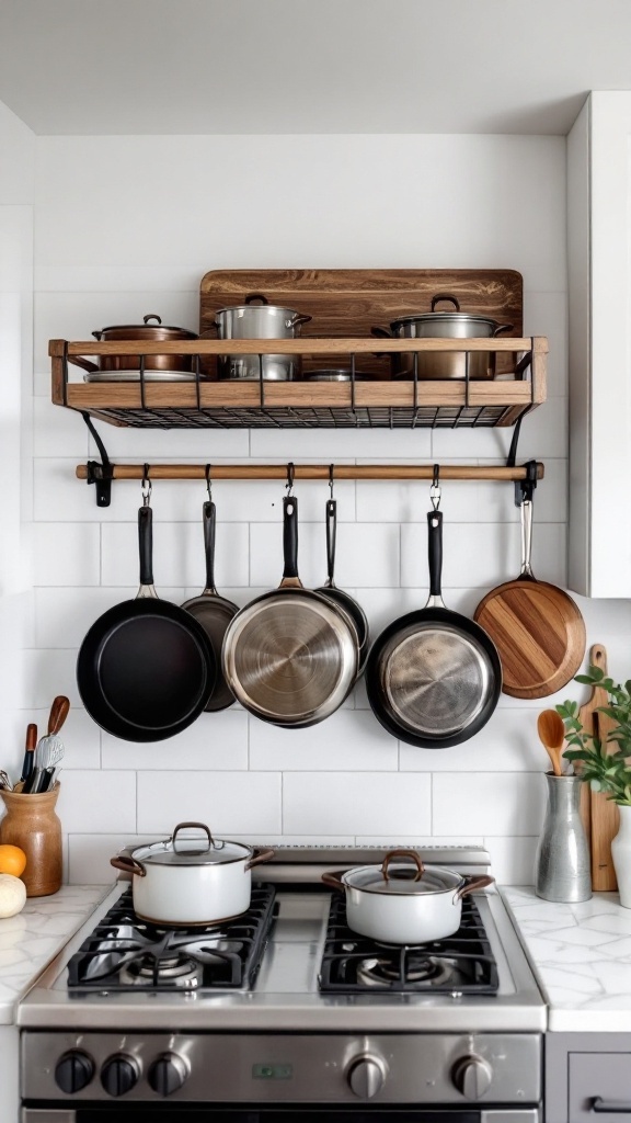
22. A Pot Rack Overhead
It empties a cupboard, puts pans within reach, and polished metal scatters light around the ceiling zone. The trade-off is real: everything hanging there needs wiping.

23. A Glossy Splashback
It's vertical, it's directly behind the worktop where you need bounced light most, and it has to be wipeable anyway — which makes it the ideal place to spend on sheen and pattern together.

24. One Crock, Not Four
Grouping the tools you reach for daily into a single vessel beside the hob is decor and function in one object. Everything used less than weekly belongs in a drawer.

25. Stools With Visible Legs
Furniture you can see under and through lets floor and light show past it, which keeps a small kitchen from feeling blocked. Allow 60 cm per stool and 30 cm of knee room at counter height.

26. Pattern on the Floor, Plain Above It
Floor level is the safest place for a busy surface, because you see it in fragments between furniture rather than all at once. Pair it with quiet walls and units and it reads confident instead of chaotic.

27. Stainless as a Reflector
Brushed steel bounces light and reads cool, so it wants a warm timber or a warm white nearby to balance it. Fingerprints are the standing cost of all that reflectance.

Bonus: A Low Warm Lamp for the Evening
Bright by day and soft by night are different jobs, and one small warm light at counter or table height covers the second. A kitchen lit only from the ceiling never feels comfortable after dark.
Brightening a dark kitchen on three budgets
Almost everything that makes a kitchen brighter is cheap. Here's the same project at three levels.
Free — one afternoon. Clear the worktops down to the appliances you use weekly. Take everything off the top of the wall cabinets. Move the fruit bowl off the counter and onto the table. Wash the windows and the light diffusers — a dusty shade can swallow a noticeable share of a fitting's output. Push the curtains fully clear of the glass. Take one decorative item off each shelf.
Under $100. Replace every bulb in the room with 2700–3000 K, CRI 90+ lamps in matching colour temperature — mismatched bulbs are why some kitchens look patchy. Add a plug-in under-cabinet LED strip over the main worktop. Buy a set of matching containers for the counter staples. Swap a heavy curtain for unlined pale cotton. Add a mirror or a metal tray to bounce light on the darkest wall.
Under $500. Paint the walls, and the ceiling, in a warm white or soft colour with an LRV of 70 or above, in eggshell rather than matt. Change the cabinet handles. Fit a hard-wired under-cabinet light with a proper switch. Replace one dark textile — blind, runner, or seat pads — with something pale. If any single element is dragging the room down, it's usually a dark worktop or a matt dark splashback; painting the units above them is the cheaper counter-move.
Simple kitchen decor FAQ
What colour makes a kitchen look brightest? Any colour with an LRV of 70 or higher, in a finish with some sheen. In a north-facing kitchen choose a warm white in the 75–85 range; in a well-lit south-facing room you can go cooler and cleaner. "Brightest" is a number, not a shade name.
Do I have to paint the kitchen white to brighten it? No. Plenty of soft greens, blues, greys and clay tones sit in the 60s and 70s for LRV. Check the published figure for the specific colour rather than judging from the swatch — some pale-looking colours reflect surprisingly little.
How do I brighten a kitchen with no natural light at all? Then artificial light is the whole job: more total lumens than you think, all at 2700–3000 K, all CRI 90+, in three layers, with under-cabinet task light as the priority. Then push wall and ceiling reflectance as high as you can, and keep the worktops clear.
What's the cheapest decor change with the biggest effect? Clearing the counters, then changing the bulbs. Both are close to free, and both change how every other surface in the room appears.
Does a mirror really work in a kitchen? Yes, if it's positioned to reflect a window rather than a run of cabinets. It's unusual in a kitchen, which is exactly why it reads as a deliberate decision rather than a decorating cliché.
Should the ceiling be a different colour? Paint it the brightest thing in the room. The ceiling is a large surface doing nothing but redistributing light, and a dark or dirty one quietly costs you a lot.
Common kitchen decor mistakes
- Choosing paint from a swatch instead of an LRV. The number is published; using it removes most of the guesswork.
- Cool-white bulbs "because they're brighter". Higher colour temperature is not more light — it's bluer light, and it makes food and timber look wrong.
- Mixing colour temperatures in one room. One 4000 K bulb among 2700 K ones makes the whole kitchen look patchy and unfinished.
- Ceiling light only. Wall cabinets shadow the worktop directly under them; no amount of ambient light fixes that geometry.
- Decorating before decluttering. Styling a crowded worktop adds to the problem it's trying to solve.
- Heavy dark curtains in a dim kitchen. They absorb the daylight you have, and kitchens rarely need the privacy anyway.
Final thought
Brightening a kitchen sounds like a construction project and almost never is. Clear the surfaces, put a high-LRV colour on the walls in a finish with some sheen, get the bulb specification right in three layers, and keep the reflective planes — worktop, splashback, ceiling — doing their job. That's a weekend and a modest budget, and it changes the room far more than most people expect from decor alone.

Sources & principles referenced
- Light Reflectance Value scale (0–100) and published LRV figures from paint manufacturers including Farrow &.
- Ball and Benjamin Moore.
- LRV thresholds for low-light rooms (above 60, 70+ for dark spaces, 75–85 warm whites for north-facing).
- Sherwin-Williams guidance on choosing colour by room orientation.
- The effect of paint sheen on reflectance and washability.
- Lamp specification — lumens over watts, 2700–3000 .
- K for domestic warm light, CRI 90+ for accurate colour rendering.
- Layered kitchen lighting with under-cabinet task light.
- Pendant mounting height 75–90 .
- Cm.
- Stool spacing 60 .
- Cm with 30 .
- Cm knee room.
- Curtain rod extension above and beyond the window frame to keep glazing unobstructed.