
"Simple" and "modern" get used interchangeably in kitchen design, but the useful version of both means the same underlying thing: a kitchen where nothing is decorative for its own sake, and where the decisions that matter — layout, materials, light — are made well. These 34 simple kitchen design ideas for a modern home focus on those durable decisions, including the one most people get backwards: where a kitchen budget is actually worth spending.
What "simple modern" really means
A simple modern kitchen rests on a few consistent principles: clean lines, function over ornamentation, a restrained palette, and quality materials left to speak for themselves. The look isn't achieved by adding modern-style objects — it's achieved by removing the unnecessary and executing the essentials well. Because there's so little decoration to hide behind, the quality of what remains becomes highly visible, which is exactly why material and workmanship matter more in a simple kitchen than in a busy one.
Where to spend, where to save
This is the decision that determines whether a kitchen budget is well used, and the priority order is clear and slightly counterintuitive:
- Spend on the worktop. It takes the most physical abuse — heat, knives, water, staining — and it's a surface you touch and look at constantly. Durable stone or quartz here is money well spent.
- Spend on the cabinet carcasses and hinges. The boxes and mechanisms are what wear out; you can replace doors and handles later far more cheaply than the frames behind them.
- Save on the doors and handles. These are the cheapest elements to change and update, so they're the wrong place to over-invest — they'll likely be swapped before they wear out.
- Save on decorative extras. Open shelving, styling and accessories cost little and can be added over time.
The general rule: invest in what wears and what you touch; economise on what's easy to change later.
Materials that last
In a simple kitchen the materials are the design, so choosing durable ones matters. Quartz worktops are non-porous, stain-resistant and low-maintenance, though heat can damage the resin binder — always use a trivet. Granite is heat-tolerant and hard-wearing but needs periodic sealing. Solid or engineered wood flooring ages well and can be refinished. For cabinetry, plywood or solid-wood carcasses outlast particleboard, particularly around the sink where moisture attacks the weakest materials first. Choosing well here is what lets a simple kitchen still look good in fifteen years.
The layout still comes first
No amount of good material rescues a poor plan. Keep the work-triangle legs (sink, hob, fridge) between 1.2 and 2.7 m, protect landing space beside the hob and sink, and hold main walkways to at least 107 cm where you work. These fundamentals decide how the kitchen feels to use far more than any finish does.
34 simple modern kitchen ideas — and why each works

1. A Neutral Palette
Neutrals date slowly and let materials and food supply the colour. It's the most practical long-term choice for a room you'll keep for years.

2. Maximise Natural Light
Daylight flatters simple materials and makes light cabinetry glow. Keep window treatments minimal so the light leads.

3. Functional Open Shelving
Lighter than wall cabinets and useful for daily crockery. Keep it uniform and sparse, and expect to wipe it — open shelves collect grease.

4. Texture for Warmth
Wooden beams and greenery stop a pared-back kitchen feeling cold. In a simple scheme, texture does the work colour would elsewhere.

5. Streamlined Appliances
Clean-fronted appliances keep the runs unbroken. Integrated versions read calmest, but even freestanding ones should share a finish.

6. A Multi-Functional Island
An island that prepares, stores and seats earns its footprint several times over — provided you can keep 91 cm clear around it.

7. A Minimal Layout
Fewer elements, cleanly arranged, read as considered. Simplicity in the layout is what makes a modern kitchen feel calm.
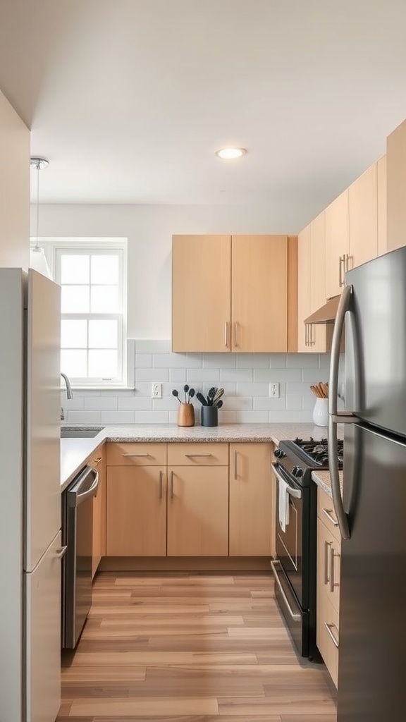
8. A Working Triangle
Sink, hob and fridge each 1.2–2.7 m apart, worktop between them. This single decision affects daily use more than any finish.

9. Layered Lighting
Pendants for the island, under-cabinet strips for the worktop, general light overhead — all warm. One ceiling light always leaves the counter in shadow.

10. Smart Storage
Pull-out drawers beat deep cupboards — everything comes to you rather than you reaching into the dark. The best value upgrade in any kitchen.

11. Function Over Ornament
The core principle of simple design: nothing decorative for its own sake. Every element should earn its place through use.
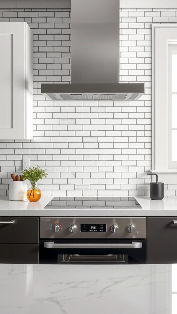
12. A Simple Backsplash
White subway tile against dark cabinets is a timeless, high-contrast combination — and the splashback has to be wipeable anyway.

13. A Touch of Green
Plants soften hard surfaces and add the only colour a simple kitchen often needs. Herbs on the sill earn their place by being used.

14. A Quality Tap
The tap is used constantly and sits at eye level, so it's worth spending on. A good one is a small luxury you notice every day.

15. An Island with Seating
Casual dining plus prep space in one. Allow 60 cm per stool and 30 cm of knee room at standard counter height.
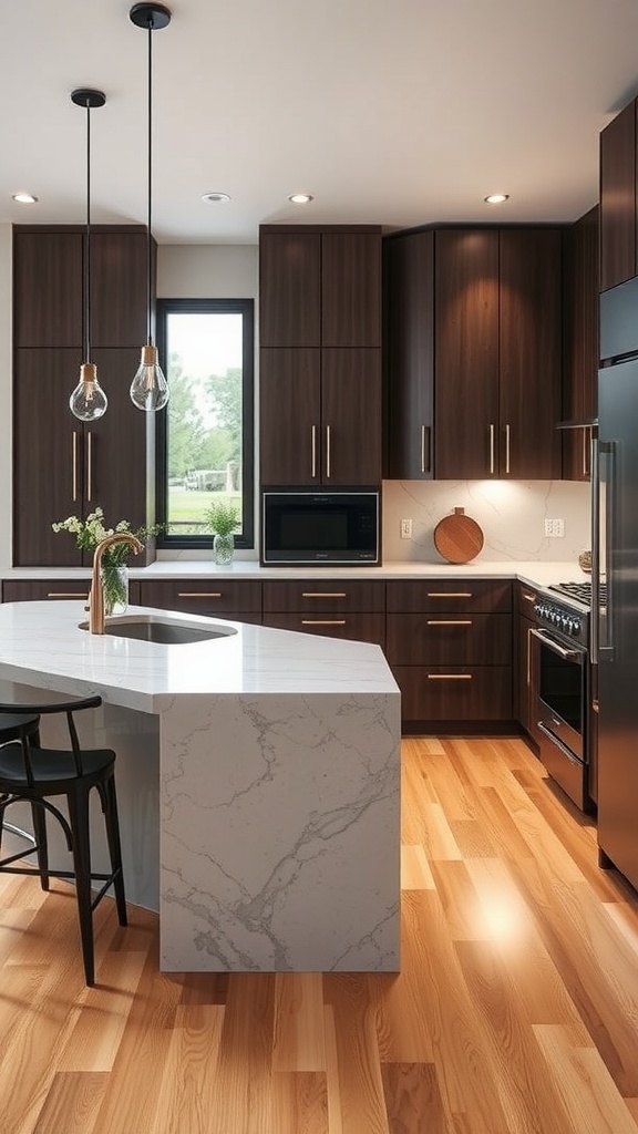
16. Durable Materials
In a simple kitchen the materials are the design, so choose ones that wear well — hard stone, solid wood, quality flooring. This is where the budget belongs.

17. Light Fabrics
Sheer curtains keep the space bright and airy — and practically, they collect less cooking grease than heavy drapes.

18. Design for Easy Cleaning
Fewer surfaces, fewer joints and wipeable materials mean less maintenance. Simplicity is a cleaning strategy as much as an aesthetic.

19. Built-In Appliances
Integration creates the continuous, uncluttered runs a modern kitchen is known for — and makes a small kitchen feel calmer and larger.

20. One Vintage Accent
A single retro appliance or older piece warms a modern kitchen and stops it feeling like a showroom. Just one — more shifts the whole style.

21. Cohesive Elements
Repeating a small number of materials and finishes is what makes a kitchen read as designed rather than assembled. Consistency over variety.

22. A Single Focal Point
A statement hood or a patterned splashback gives the eye one place to land. In a simple kitchen, one focal point is enough — two compete.

23. A Runner to Define Space
A runner adds colour, zones the room and is kinder to your back during long spells at the worktop. Choose a washable, low-pile weave.
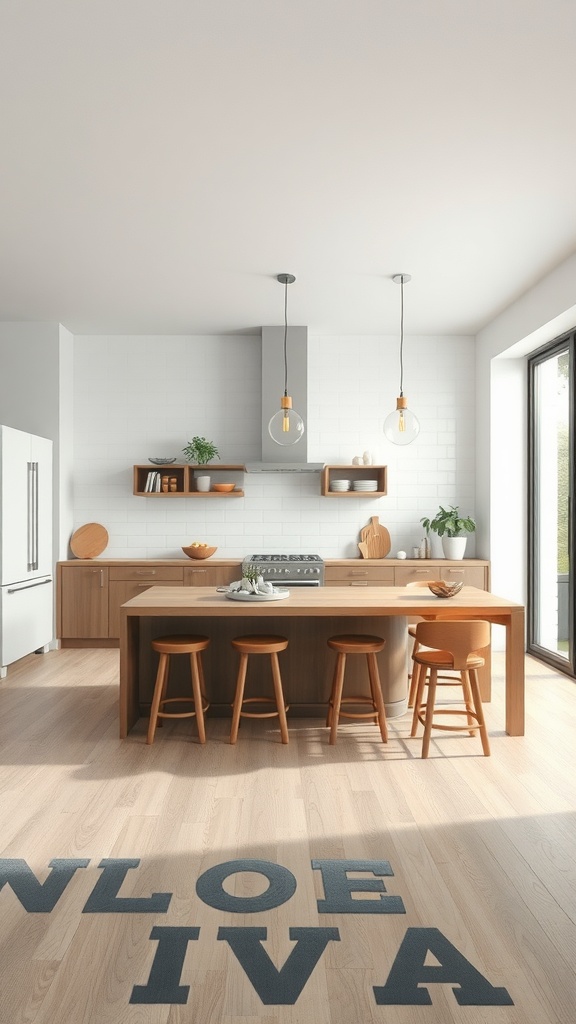
24. Visual Flow
An open layout with clear sightlines makes the whole space read larger. Keep the sightline from the door uncluttered.

25. Subtle Pattern
A patterned backsplash against plain cabinets adds interest in one controlled spot. Confine pattern to a single surface so it reads as deliberate.

26. A Welcoming Nook
A small seating spot by a window turns a working kitchen into somewhere people gather. Wood warms the modern lines.

27. A Mirror for Light
Unusual in a kitchen but effective in a dark or narrow one — position it to reflect a window rather than the worktop.

28. Balance Function and Looks
The best simple kitchens are beautiful because they work well, not despite it. Form following function is the whole idea.

29. Discreet Smart Tech
Useful when integrated and invisible. Hide the hardware and route the cables so technology supports the room rather than cluttering it.

30. Design for Interaction
An island or peninsula lets whoever's cooking face the room and talk to others. The kitchen is where households actually gather — plan for it.

31. Visible Craftsmanship
With little ornament, quality shows. Well-made cabinetry and honest materials communicate value quietly — which is exactly the modern-simple aesthetic.

32. Indoor-Outdoor Flow
Large glass doors connect the kitchen to a garden and flood it with light — and help ventilate a room that generates heat and steam.

33. Sustainable Choices
Durable materials, efficient appliances and timber from responsible sources are both greener and cheaper to run. Longevity is itself sustainable.

34. A Few Personal Touches
Simple doesn't mean impersonal. A few meaningful pieces — photos, handmade pottery — keep the kitchen human, provided the surfaces stay clear.
Simple kitchen design FAQ
What should I spend the most on in a kitchen? The worktop and the cabinet carcasses and hinges — the elements that take abuse and wear out. Doors, handles and decorative extras are the cheapest things to change later, so they're the wrong place to over-invest.
What's the difference between simple and minimalist? Overlapping but not identical. Minimalist actively strips back to the fewest possible elements; simple modern keeps things clean and functional but allows more warmth, comfort and personality. Simple is the more liveable of the two for most families.
Which worktop material is best for a modern kitchen? Quartz for low-maintenance stain resistance (but use a trivet — heat damages the resin), or granite if you want heat tolerance and don't mind periodic sealing. Both suit clean modern lines and both last.
How do I make a simple kitchen feel warm? Wood, natural texture and 2700–3000 K lighting. A simple kitchen without those reads cold; with them it reads calm and inviting.
Is a simple kitchen cheaper? Not necessarily — the point is spending where it counts. You may save on decoration and ornament, but simple modern rewards investment in good materials and workmanship, since there's nothing to hide poor quality behind.
Common simple kitchen mistakes
- Over-investing in doors and handles — the easiest things to change; spend on worktops and carcasses instead.
- Cheap materials on show — with little ornament, poor quality is highly visible.
- Cool white lighting — makes a simple kitchen clinical; stay warm.
- Ignoring the layout — no finish rescues a poor work triangle or missing landing space.
- Mistaking bare for simple — without texture and warmth, a stripped-back kitchen just feels cold.
Final thought
A simple modern kitchen is about making the important decisions well and skipping the unimportant ones entirely. Get the layout right, spend on the worktop and the carcasses, save on the things you'll change anyway, warm the whole thing with wood and 2700 K light — and let good materials, cleanly arranged, be the design. That's a kitchen that still looks right long after the trend-led ones have dated.

Sources & principles referenced
- Simple/modern design principles (clean lines, function over ornament, restrained palette).
- Budget prioritisation (worktops and cabinet carcasses/hinges over doors, handles and decoration).
- Worktop material properties (quartz non-porous but heat-sensitive; granite heat-tolerant, requires sealing) and carcass material durability.
- The kitchen work triangle (1.2–2.7 m legs), landing space and 107 .
- Cm walkways.
- Island and stool clearances (91 cm surround, 60 cm spacing, 30 cm knee room).
- Layered warm lighting including under-cabinet task light (2700–3000 K).
- Pendant mounting height (75–90 cm).